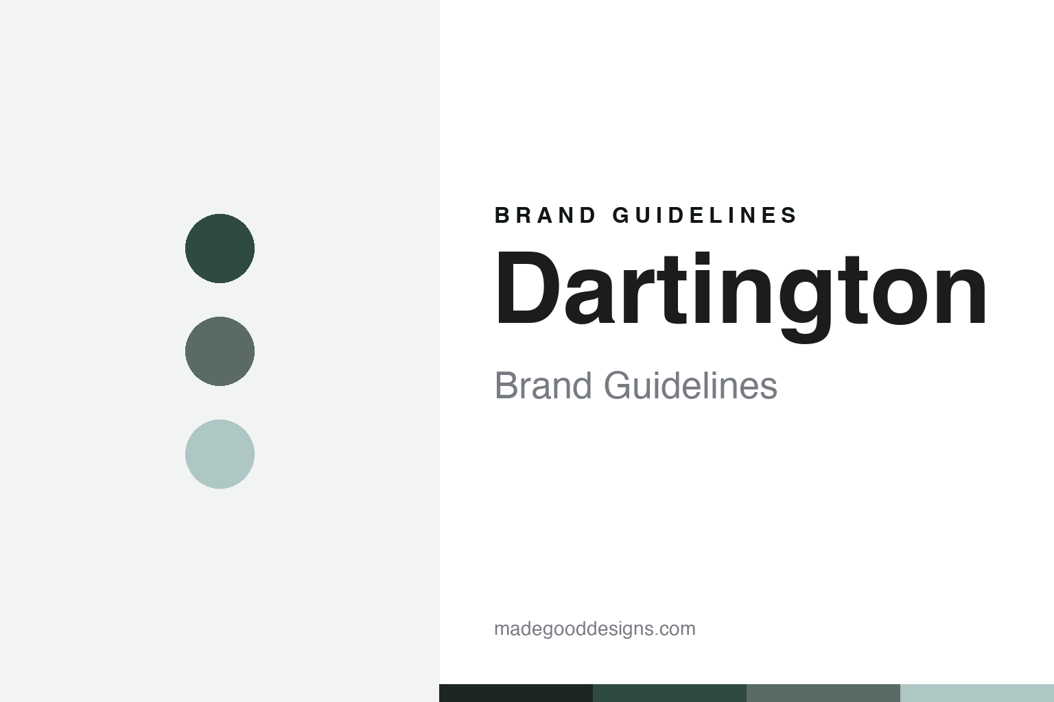
Dartington Crystal Brand Guidelines
Clean modern British glass — made in Devon since 1967.
Aa
Two constants: a clear-glass palette and a clean grotesque. Abstract homage — not the Dartington wordmark or logo.
Glass for a Devon town
Dartington made British glass with a purpose.
Dartington Crystal is a lesson in design with a social purpose. It opened in June 1967 in Great Torrington, North Devon, set up by the Dartington Hall Trust — a charity for rural regeneration — to bring jobs to a depopulating corner of England. To start the craft, the Trust recruited a Swedish managing director, Eskil Vilhelmsson, and a team of Scandinavian glassblowers, beginning with just 35 employees.
Its identity was defined by one designer: Frank Thrower (1932–1987), the founding designer who created more than 500 designs — clean, functional, unfussy modern British glass, rooted in the Scandinavian modernism he had sold earlier in his career. His hero piece, the “Sharon” wine goblet (1971), with a teardrop bubble in the stem, entered the collection of the V&A. Today Dartington calls itself the “home of British glassmaking,” one of the last hand-made crystal/tableware factories in the UK, with a Devon visitor centre.
Its ownership has passed through many hands. (Honest notes: don’t confuse Torrington (the North-Devon factory) with Dartington Hall (near Totnes, South Devon) — different places; the Trust’s control effectively ended around 1989, followed by Wedgwood and Enesco stakes and two management buyouts, so it is no longer charity-owned and its current ultimate owner is not publicly confirmed; the “Rachael” range was designed by Rachael Woodman in 1988, not Frank Thrower; much of the modern range is lead-free crystalline rather than lead crystal; and no official brand hex is published.)
Colour
Dartington lives in a clear-glass palette. Click a swatch to copy the hex.
Dartington’s identity is clean, modern and British — a clear-glass off-white, a pale glass grey-green, a deep Devon green, a slate sage, and a cool glass glint. The palette reads like clean British glass in a Devon landscape: clear and functional, grounded by moorland green and slate. It signals honest, modern craft rather than ornament. The honest caveat: with no published brand hex, these tones are an original, unofficial interpretation, not first-party values.
The lesson is a clear-glass palette signals clean modern glassware. Dartington’s world reads as functional and unpretentious. For designers, it is a reminder that clear and glass-green tones with a slate accent convey modern British craft, matching a house built on Frank Thrower’s clean, Scandinavian-rooted design. The takeaways: build from clear and restrained green tones with a dark accent; let function and clarity lead; and treat any single hex as unofficial when there is no published spec.
Typography
The wordmark spirit is a clean grotesque — modern and functional.
Dartington’s identity carries a clean, modern, functional spirit — a “DARTINGTON” wordmark whose plain forms match a house of clean British glass. A clean grotesque captures the mood: it is legible and unfussy, the register of modern, Scandinavian-rooted design rather than heritage ornament. Set against a clear-glass palette, the clean grotesque feels modern and functional — exactly the Frank-Thrower, purpose-built personality Dartington carries. It is honest rather than decorative, mirroring clean, functional glass. (Dartington’s real wordmark is a trademark we describe but do not reproduce, and the exact typeface is not something we assert.) Because the specific mark is not ours to use, the honest description is “a clean grotesque spirit,” not the Dartington logo. The type behaves like the brand: clean, modern and functional.
Aa
A clean grotesque spirit — modern and functional. (Specimen set in Hanken Grotesk, a clean grotesque sans; NOT the Dartington logo, which is a trademark.)
Purpose-built design as the difference
Dartington stands for clean, honest British glass.
Dartington Crystal is a lesson in building a brand on purpose and one clear vision. It began not as a luxury venture but as a rural-jobs project, and it succeeded by pairing that purpose with a single, coherent design voice — Frank Thrower’s clean, functional modernism — brought to life by Scandinavian craft. That gave an English factory an identity as clear as its glass: honest, modern, unpretentious, and genuinely British-made. The differentiator is coherence of vision plus a real reason to exist.
For designers and brand-builders, Dartington offers a clear takeaway: a strong purpose and a single design voice can define a brand. The lessons: let a genuine mission anchor the story (jobs for Devon); give the work one coherent voice (Thrower’s modernism); and keep the identity as clean as the product. It is also a reminder to keep the facts honest: it opened in 1967 in Torrington (not Dartington Hall), is no longer charity-owned, and much of its range is now lead-free crystalline — with the palette here an unofficial interpretation. Dartington built glass with purpose — proof that a clear vision can be the difference.
Explore & save
Keep Dartington Crystal’s identity on hand — save it to a board in the Made Good inspiration library.
Dartington Crystal identity set
Pin the clear-glass palette and the clean-grotesque spirit to your own board.