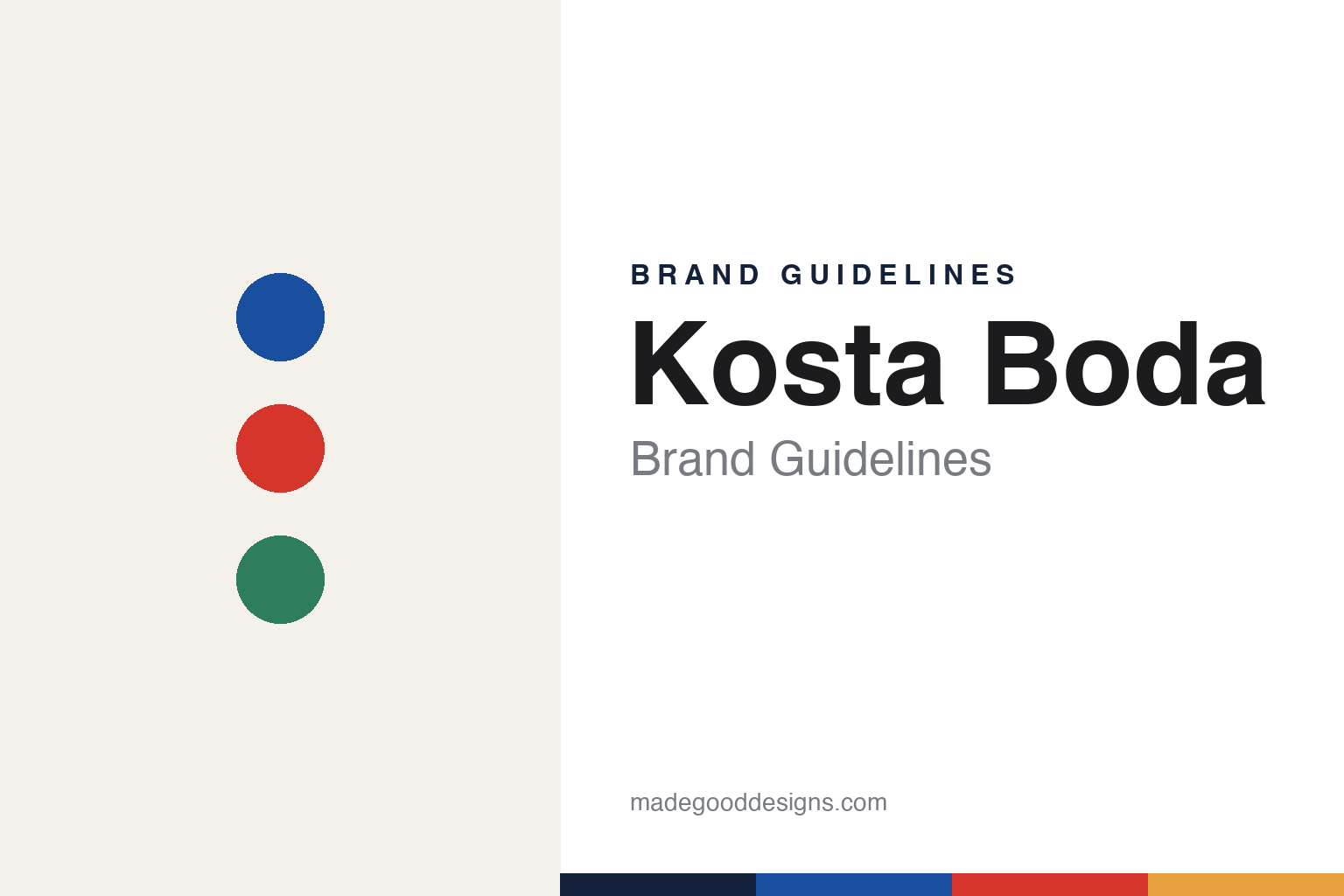
Kosta Boda Brand Guidelines
Bold, colourful Swedish art glass — from Sweden’s oldest glassworks.
Aa
Two constants: a vivid colour palette and an expressive sans. Abstract homage — not the Kosta Boda wordmark or logo.
The colourful sibling
Kosta Boda is Sweden’s bold art-glass house.
Kosta Boda is a lesson in heritage worn as colour, not restraint. Its origin, Kosta glassworks, was founded in 1742 in Kosta, Småland — Sweden’s oldest glassworks still in operation — by two officers of King Charles XII, Anders Koskull and Georg Bogislaus Staël von Holstein, whose surnames give the name (KOskull + STAël). It sits in the same “Kingdom of Crystal” (Glasriket) as Orrefors.
Where Orrefors became known for restrained, engraved clear crystal, Kosta Boda is the bold, colourful, hand-painted sibling — expressive, playful art glass. Its identity was shaped by star artist-designers: Bertil Vallien (sandcast “Boats” and “Heads”), Ulrica Hydman-Vallien (vivid painted glass, the “Open Minds” vase and the “Mine” tumbler), Göran Wärff and Kjell Engman (the “Bon Bon” series). It even makes the Eurovision Song Contest trophy.
Today Kosta Boda belongs to the New Wave Group. (Honest notes: 1742 is Kosta — the combined “Kosta Boda” name only dates to 1976 (after the Åfors-group era merged Kosta, Boda and Åfors); it is a distinct brand from Orrefors (they share a corporate parent, New Wave Group, and now the Kosta site), not the same house; Orrefors bought Kosta Boda in 1990; and after the Orrefors furnace closed around 2012, Kosta is the surviving working hot shop. No official brand hex is published.)
Colour
Kosta Boda lives in a vivid-colour palette. Click a swatch to copy the hex.
Kosta Boda’s identity is bold, saturated and expressive — a deep cobalt, an art-glass red, a forest green, a warm amber, and an orchid violet. The palette reads exactly like its hand-painted art glass: jewel-bright colour, applied with an artist’s confidence. It signals playfulness and creativity rather than restraint — the opposite of clear-crystal minimalism. The honest caveat: with no published brand hex, these tones are an original, unofficial interpretation, not first-party values.
The lesson is a vivid-colour palette signals expressive art glass. Kosta Boda’s world reads as bold and joyful. For designers, it is a reminder that saturated cobalt, red and green convey artistic, hand-made glass, matching a house whose whole identity is colour and personality. The takeaways: build from confident, saturated colour; let an artist’s hand lead over rules; and treat any single hex as unofficial when there is no published spec. (Per the loud-hue caveat, keep bright colour in the palette and let a dark ink carry small text.)
Typography
The wordmark spirit is an expressive sans — bold and modern.
Kosta Boda’s identity carries a bold, modern, expressive spirit — a “KOSTA BODA” wordmark whose confident forms match a colourful art-glass house. An expressive sans captures the mood: it is contemporary and assured, the register of Swedish art glass and named artist-designers rather than old-world crystal. Set against a vivid-colour palette, the expressive sans feels bold and modern — exactly the hand-painted, art-glass personality Kosta Boda carries. It is confident rather than delicate, mirroring colourful, expressive glass. (Kosta Boda’s real wordmark is a trademark we describe but do not reproduce, and the exact typeface is not something we assert.) Because the specific mark is not ours to use, the honest description is “an expressive sans spirit,” not the Kosta Boda logo. The type behaves like the brand: bold, modern and expressive.
Aa
An expressive sans spirit — bold and modern. (Specimen set in Outfit, a modern geometric sans; NOT the Kosta Boda logo, which is a trademark.)
Colour and personality as the difference
Kosta Boda stands for expressive Swedish art glass.
Kosta Boda is a lesson in differentiating within a shared heritage. It sits in the same Kingdom of Crystal, and now the same corporate group, as Orrefors — yet it built a completely distinct identity by choosing colour, paint and personality over engraved restraint. By putting named artists (Vallien, Hydman-Vallien, Wärff, Engman) at the centre, it made its glass expressive and collectible, instantly recognisable as the bold, colourful Swedish house. The differentiator is artistic personality: a clear, ownable position against its own sibling.
For designers and brand-builders, Kosta Boda offers a clear takeaway: a bold, distinct identity can thrive right beside a similar one. The lessons: pick an ownable position (colour and expression) and commit; let named creative talent become the brand; and keep the identity as bold as the work. It is also a reminder to keep the facts honest: Kosta dates to 1742 but the “Kosta Boda” name only to 1976, it is a separate brand from Orrefors under a shared parent, and Kosta is the surviving glassworks — with the palette here an unofficial interpretation. Kosta Boda chose colour — proof that a bold identity can be the difference.
Explore & save
Keep Kosta Boda’s identity on hand — save it to a board in the Made Good inspiration library.
Kosta Boda identity set
Pin the vivid-colour palette and the expressive-sans spirit to your own board.


