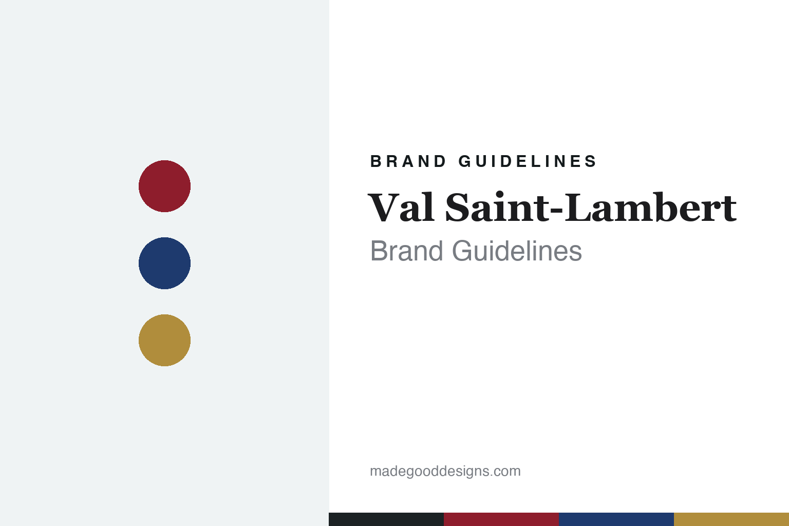
Val Saint-Lambert Brand Guidelines
Belgium’s crystal house since 1826 — master of cased “doublé” crystal.
Aa
Two constants: a ruby-and-gold palette and a high-contrast serif. Abstract homage — not the Val Saint-Lambert wordmark or logo.
Belgium’s crystal house
Val Saint-Lambert is Belgium’s premier crystal.
Val Saint-Lambert is a lesson in national craft built on a signature technique. Founded by the chemist François Kemlin and engineer Auguste Lelièvre, it bought the site of the former Cistercian Val-Saint-Lambert Abbey in 1825 and lit its furnaces in 1826, at Seraing, near Liège, in Belgium — taking its name from the abbey. It became Belgium’s premier crystal house, a holder of a Belgian royal warrant, and at its peak (1880–1914) an industrial giant of around 5,000 workers producing some 120,000 pieces a day.
Its defining signature is cased or “doublé” overlay crystal: clear crystal cased in a layer of colour, then hand-cut and wheel-engraved to cut through to the clear beneath. Its design story runs from the Art Nouveau of Léon Ledru (head of design from 1897) to the Art Deco of Joseph Simon (a gold medal at the 1925 Paris Exposition) and Charles Graffart (artistic director 1942–1958), including the 1930s pressed-glass Luxval range.
After a turbulent century, the house is much reduced from its industrial peak — a small artisanal operation at Seraing marking its 2026 bicentenary. (Honest notes: Val Saint-Lambert is Belgian, not French, though often confused with French houses; the site was bought 1825 and fired in 1826 on an existing abbey; the Luxval range was designed by Graffart with René Delvenne, not Simon or Ledru; its recent ownership has been unsettled (a 2018 majority stake, then administration in 2024), so no single clean owner is asserted; and no official brand hex is published.)
Colour
Val Saint-Lambert lives in a ruby-and-gold palette. Click a swatch to copy the hex.
Val Saint-Lambert’s identity is clear, coloured and gilded — a clear crystal ground, a signature ruby overlay, a cobalt overlay, an antique gold, and a cool glass shadow. The palette reads exactly like its cased “doublé” crystal: clear glass wrapped in a jewel colour and cut to reveal it, warmed by gilding. It signals hand craft and colour rather than plain glass. The honest caveat: with no published brand hex, these tones are an original, unofficial interpretation, not first-party values.
The lesson is a ruby-and-gold palette signals cased overlay crystal. Val Saint-Lambert’s world reads as rich and crafted. For designers, it is a reminder that a clear ground with a ruby or cobalt overlay and gilt gold conveys cased-crystal work, matching a house famous for the “doublé” technique. The takeaways: pair a clear ground with a saturated overlay and a gold accent; let colour and cutting lead; and treat any single hex as unofficial when there is no published spec.
Typography
The wordmark spirit is a high-contrast serif — noble and old-world.
Val Saint-Lambert’s identity carries a noble, old-world, crafted spirit — a “VAL SAINT-LAMBERT” wordmark whose elegant forms match Belgium’s heritage crystal house. A high-contrast serif captures the mood: it is stately and refined, the register of royal warrants and cased crystal rather than modern industry. Set against a ruby-and-gold palette, the high-contrast serif feels noble and rich — exactly the doublé-crystal, Belgian-heritage personality Val Saint-Lambert carries. It is graceful rather than plain, mirroring cut, cased crystal. (Val Saint-Lambert’s real wordmark — and the historic “VSL” marks — are trademarks we describe but do not reproduce, and the exact typeface is not something we assert.) Because the specific mark is not ours to use, the honest description is “a high-contrast serif spirit,” not the Val Saint-Lambert logo. The type behaves like the brand: noble, old-world and crafted.
Aa
A high-contrast serif spirit — noble and old-world. (Specimen set in Bodoni Moda, a high-contrast serif; NOT the Val Saint-Lambert logo, which is a trademark.)
A signature technique as the difference
Val Saint-Lambert stands for Belgian cased crystal.
Val Saint-Lambert is a lesson in a nation’s craft resting on one technique. As Belgium’s premier crystal house it built its reputation on cased “doublé” overlay crystal — clear glass wrapped in colour and cut to reveal it — carried through Art Nouveau and Art Deco by named designers. Even reduced from an industrial giant to a small artisanal workshop, that signature technique keeps the name meaningful: a Val Saint-Lambert piece is recognisable by its cased colour and deep cutting. The differentiator is a hard, ownable craft rather than scale.
For designers and brand-builders, Val Saint-Lambert offers a clear takeaway: a signature technique can outlast industrial scale. The lessons: make the craft itself the identity (the doublé overlay); let named designers carry it across eras (Ledru, Simon, Graffart); and let a noble, old-world identity match it. It is also a reminder to keep the facts honest: it is Belgian, founded 1826 on an abbey site, the Luxval range is Graffart and Delvenne’s, and its recent ownership has been unsettled as it marks its 2026 bicentenary — with the palette here an unofficial interpretation. Val Saint-Lambert kept its craft — proof that a signature technique can be the difference.
Explore & save
Keep Val Saint-Lambert’s identity on hand — save it to a board in the Made Good inspiration library.
Val Saint-Lambert identity set
Pin the ruby-and-gold palette and the high-contrast-serif spirit to your own board.


