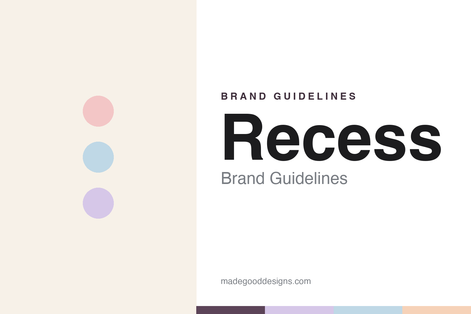
Recess Brand Guidelines
Canned calm — the relaxation drink that became a design icon.
Aa
Two constants: a dusty-pastel palette and a soft grotesque. Abstract homage — not the Recess wordmark or logo.
An antidote to modern times
Recess sells calm, and a look to match.
Recess is a lesson in selling a feeling, and designing it perfectly. It was founded in 2018 by Ben Witte in New York, pioneering the “relaxation beverage” — the anti-energy-drink, a sparkling drink meant to help you feel “calm, cool and collected.” It launched with CBD and adaptogens (American ginseng, L-theanine, lemon balm), and later expanded into Recess Mood (a magnesium line) and Zero Proof alcohol alternatives.
Its lasting fame is design. The identity — created with the agency Gin Lane (later Pattern Brands, the studio behind Harry’s, Hims and Sweetgreen) — became one of the most celebrated and imitated in modern beverages: soft dusty pastels (pink, peach, powder blue, lavender), dreamy riso-gradient graphics, and a witty, ironic, internet-native voice that gently mocks millennial burnout. It sells a lifestyle and a mood, not an ingredient list.
(Honest notes: Recess is a calm drink, not an energy drink; CBD was the origin, but the non-CBD Mood (magnesium) line now dominates sales — so it is not simply “a CBD company” today; the celebrated identity was designed by Gin Lane / Pattern Brands, not in-house; and it remains independent and founder-led. No official brand hex is published.)
Colour
Recess lives in a dusty-pastel palette. Click a swatch to copy the hex.
Recess’s identity is soft, dreamy and calm — a dusty pink, a soft peach, a powder blue, a lavender, and a warm cream. The palette reads like a daydream: gentle, low-contrast pastels that feel like a deep breath. It signals relaxation and ease, the visual opposite of a loud energy drink. The honest caveat: with no published brand hex, these tones are an original, unofficial interpretation, not first-party values.
The lesson is a dusty-pastel palette signals calm. Recess’s world reads as soft and restful. For designers, it is a reminder that muted, dreamy pastels evoke ease and de-stress, matching a brand built to sell a feeling of calm. This palette was so influential it defined an era of beverage branding. The takeaways: use soft, low-contrast pastels to signal calm; let mood lead over ingredients; and treat any single hex as unofficial — using a deeper plum for small text so the pastels stay soft.
Typography
The wordmark spirit is a soft grotesque — calm and modern.
Recess’s identity carries a calm, modern, witty spirit — a “RECESS” wordmark whose gentle forms match a relaxation brand. A soft grotesque captures the mood: it is clean and contemporary but warm, the register of an internet-native lifestyle brand rather than a clinical supplement. Set against a dusty-pastel palette, the soft grotesque feels calm and modern — exactly the dreamy, ironic personality Recess carries. It is easygoing rather than shouty, mirroring a drink that sells calm. (Recess’s real wordmark is a trademark we describe but do not reproduce, and the exact typeface is not something we assert.) Because the specific mark is not ours to use, the honest description is “a soft grotesque spirit,” not the Recess logo. The type behaves like the brand: calm, modern and witty.
Aa
A soft grotesque spirit — calm and modern. (Specimen set in Schibsted Grotesk, a grotesque sans; NOT the Recess logo, which is a trademark.)
Selling a feeling as the difference
Recess stands for canned calm.
Recess is a lesson in branding a mood rather than a benefit. Instead of leading with ingredients, it sold a feeling — calm, ease, an antidote to digital burnout — and dressed it in an unmistakable dusty-pastel, dreamy identity with a knowing, ironic voice. That look and tone were so distinctive that they became a design case study and were widely copied across the beverage world. The differentiator is a total, ownable aesthetic and voice: Recess is recognisable at a glance and sells a lifestyle.
For designers and brand-builders, Recess offers a clear takeaway: a complete, distinctive aesthetic can be the product. The lessons: brand a feeling (calm) when the category is crowded on ingredients; commit fully to a look and voice until they are unmistakable; and let the identity, not the spec sheet, carry the meaning. It is also a reminder to stay accurate: Recess is a calm drink, its business has shifted from CBD to a magnesium line, and its famous identity came from Gin Lane / Pattern Brands — with the palette here an unofficial interpretation. Recess branded a feeling — proof that a distinctive aesthetic can be the difference.
Explore & save
Keep Recess’s identity on hand — save it to a board in the Made Good inspiration library.
Recess identity set
Pin the dusty-pastel palette and the soft-grotesque spirit to your own board.


