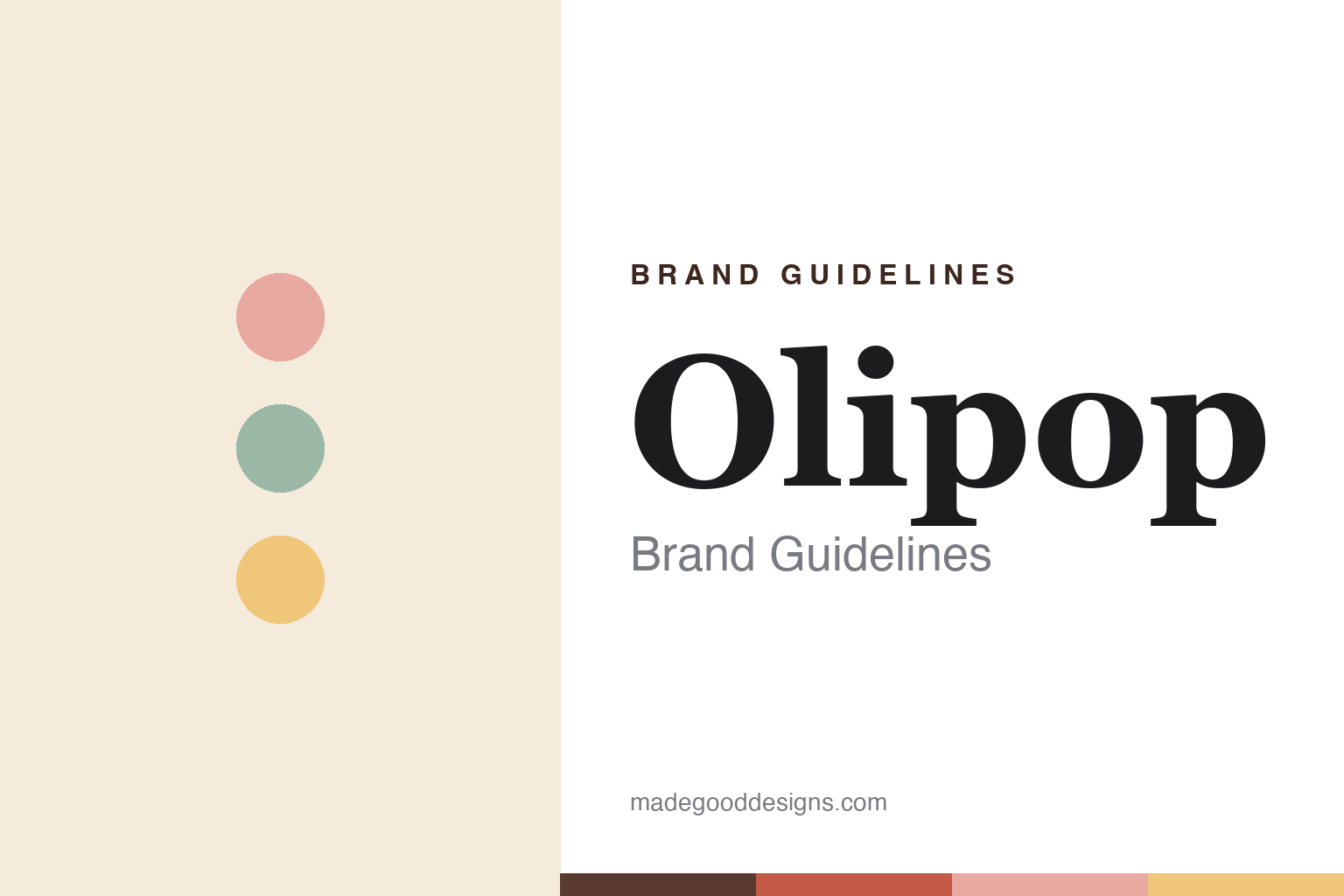
Olipop Brand Guidelines
Prebiotic “soda” dressed in a nostalgic soda-fountain look.
Aa
Two constants: a warm-pastel palette and a warm slab. Abstract homage — not the Olipop wordmark or logo.
Nostalgia with a function
Olipop is a prebiotic take on classic soda.
Olipop is a lesson in wrapping a modern product in a familiar feeling. It was founded in 2018 by Ben Goodwin and David Lester in Oakland, California. It is a “prebiotic soda” — a lower-sugar, functional alternative to conventional soda built on a proprietary blend (marketed as OLISMART) of plant fibre, prebiotics and botanicals — with roughly 2–5g of sugar and up to about 9g of fibre per can, in nostalgia-modelled flavours like Vintage Cola, Classic Root Beer, Strawberry Vanilla and Orange Squeeze.
Its brilliance is design and positioning: rather than look like a health drink, Olipop looks like a vintage soda-fountain brand — warm creams, muted dusty pastels, retro type — so it feels like the soda you grew up with, only better for you. That look helped it into 65,000+ stores and, by a 2025 funding round, a reported $1.85 billion valuation (led by J.P. Morgan), after reaching profitability in early 2024.
(Honest notes: Olipop is prebiotic — fibre that feeds gut bacteria — not probiotic (live cultures); Goodwin’s earlier brand Obi was the probiotic one; it is low-sugar, not zero-sugar (~2–5g); and both Olipop and its rival Poppi have faced class-action scrutiny over gut-health claims — Poppi settled for $8.9M and Olipop faces a similar suit — so its benefits are best read as positioning, not settled fact. No official brand hex is published.)
Colour
Olipop lives in a warm-pastel palette. Click a swatch to copy the hex.
Olipop’s identity is warm, nostalgic and muted — a cream base, a dusty rose, a butter yellow, a sage teal, and a cola brown. The palette reads like a 1950s soda fountain seen through a modern, wellness lens: soft and inviting rather than clinical. It signals comfort and nostalgia, not a health-store shelf. The honest caveat: with no published brand hex, these tones are an original, unofficial interpretation, not first-party values.
The lesson is a warm-pastel palette signals nostalgic, better-for-you soda. Olipop’s world reads as cosy and retro. For designers, it is a reminder that creams and muted pastels evoke a classic soda fountain, matching a brand that makes a functional drink feel familiar. The takeaways: use warm creams and muted pastels to soften a modern product; let nostalgia carry the function; and treat any single hex as unofficial — keeping the darker cola brown for small text so the pastels stay in the palette.
Typography
The wordmark spirit is a warm slab — friendly and retro.
Olipop’s identity carries a friendly, retro, comforting spirit — an “OLIPOP” wordmark whose warm forms match a nostalgic soda-fountain brand. A warm slab serif captures the mood: it is rounded and inviting, the register of old-fashioned soda and diner signage rather than a clinical supplement. Set against a warm-pastel palette, the warm slab feels friendly and retro — exactly the soda-fountain, better-for-you personality Olipop carries. It is welcoming rather than sterile, mirroring a familiar, comforting drink. (Olipop’s real wordmark is a trademark we describe but do not reproduce, and the exact typeface is not something we assert.) Because the specific mark is not ours to use, the honest description is “a warm slab spirit,” not the Olipop logo. The type behaves like the brand: friendly, retro and comforting.
Aa
A warm slab spirit — friendly and retro. (Specimen set in Bitter, a slab serif; NOT the Olipop logo, which is a trademark.)
Familiar packaging as the difference
Olipop stands for better-for-you soda that feels classic.
Olipop is a lesson in making a new category feel old and safe. Functional, gut-health drinks can read as medicinal; Olipop instead borrowed the visual language of the classic American soda fountain — warm, nostalgic, comforting — so a lower-sugar prebiotic drink feels like a treat, not a supplement. That emotional familiarity, not just the fibre, is what moved it onto mainstream shelves and to a multi-billion-dollar valuation. The differentiator is packaging and feeling: the same drink in a clinical wrapper would not have travelled as far.
For designers and brand-builders, Olipop offers a clear takeaway: familiar design can carry an unfamiliar product. The lessons: borrow a beloved visual language (the soda fountain) to make a new category approachable; let nostalgia do the emotional work while the function sits underneath; and keep claims honest so the trust holds. It is also a reminder to stay accurate: Olipop is prebiotic (not probiotic), low-sugar (not zero), and its health claims have drawn legal scrutiny — with the palette here an unofficial interpretation. Olipop made function feel nostalgic — proof that familiar packaging can be the difference.
Explore & save
Keep Olipop’s identity on hand — save it to a board in the Made Good inspiration library.
Olipop identity set
Pin the warm-pastel palette and the warm-slab spirit to your own board.


