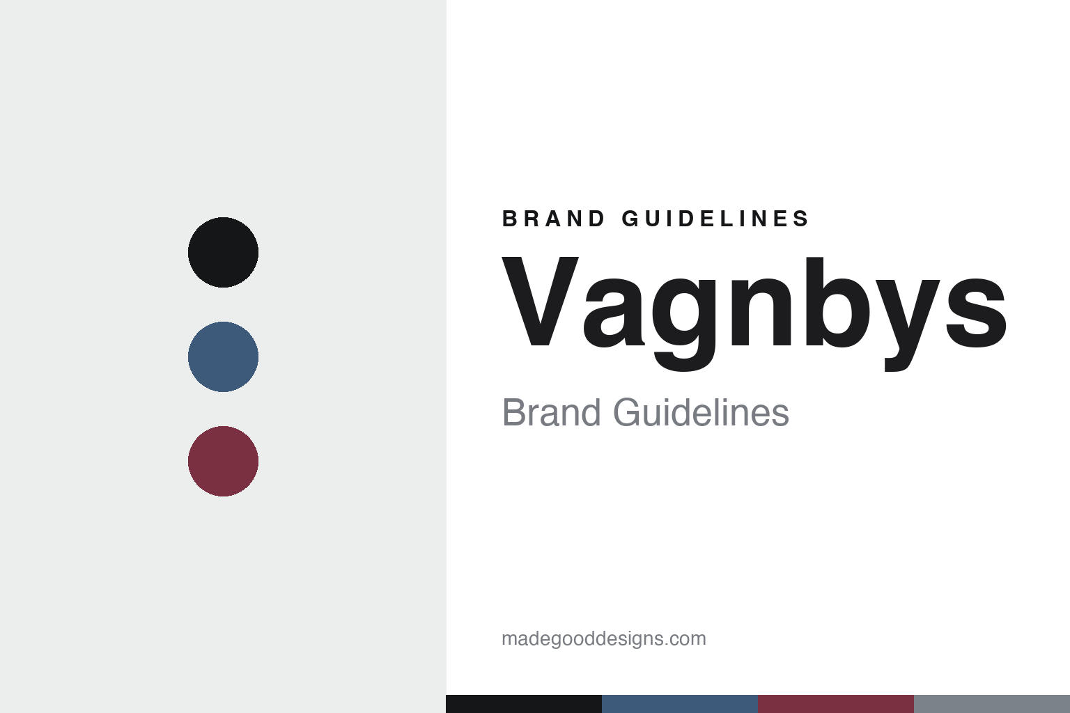
Vagnbys Brand Guidelines
The Swan line.
Aa
Two constants: a blue-and-wine palette and a Nordic sans register. Abstract homage — not the Vagnbys products or packaging.
The Swan line
Vagnbys designs wine tools as a family.
Vagnbys is a lesson in a design family. Founded in 2012 in Denmark, the brand was launched by Tavs Vagnby, a graphic designer, with his son Marcus Vagnby, an industrial designer — whose studio “mencke&vagnby,” with Karina Mencke, does the designing.
Its identity is design-led Danish wine tools, built, in the brand’s words, on “our own love of a good glass of wine.” The signature is the sculptural Swan line — the Swan Aerator and Swan Carafe — alongside the Wings Corkscrew, the Award Carafe and a Champagne Saber. Aerating, decanting and serving, made into clean, characterful objects. Wine, designed by a family.
(Honest notes: the founders are Tavs and Marcus Vagnby (with Karina Mencke) — not a “Rasmus Vagnby,” a name that circulates in error. The pieces are designed in Denmark but produced through the family’s Hong Kong sourcing house, so it’s “designed in Denmark, made in Asia.” Design awards (Red Dot, iF) belong to the mencke&vagnby studio for other work, so we credit the designers rather than the brand’s SKUs. There’s no official brand hex, so these tones are an unofficial interpretation. This is design commentary and does not promote any product.)
Colour
Vagnbys lives in a blue-and-wine palette. Click a swatch to copy the hex.
Vagnbys’ identity is clean, characterful and Danish — a Nordic blue, an ink, a wine, a smoke, and a chalk. The palette pairs a blue with a wine — the register of design-led wine tools. It signals design and wine rather than novelty. The honest caveat: with no published brand hex, these tones are an original, unofficial interpretation, not first-party values.
The lesson is a blue with a wine signals a design-led wine-tool brand. Vagnbys’ world is a sculptural set of aerators and carafes. For designers, it is a reminder that everyday wine tools can be treated as characterful design objects. Because a mid blue can fail as small text, keep type dark and let the colour live in the accents, palette and band. The takeaways: design the everyday tool; give it character (the Swan); keep it a family craft; and treat any single hex as unofficial.
Typography
The register is a Nordic sans — clean, characterful, Danish.
Vagnbys’ identity carries a clean, characterful, Danish spirit — a sculptural wine tool. A clean geometric sans captures the mood: it is modern and considered, the register of Danish design. Set in a blue-and-wine palette, the Nordic sans feels clean and characterful — exactly the personality Vagnbys carries. It is designed rather than plain, mirroring the Swan line. (Vagnbys’ real products and wordmark are works we describe but do not reproduce, and the exact typeface is not ours to use.) Because it is not ours to use, the honest description is “a Nordic sans spirit,” shown here in a stand-in. The type behaves like the brand: clean, characterful and Danish.
Aa
A Nordic sans spirit — clean and characterful. (Specimen set in Outfit, a clean geometric sans STAND-IN; NOT the Vagnbys packaging.)
A design family
Vagnbys stands for design-led Danish wine tools.
Vagnbys is a lesson in making a family craft the identity. A blue-and-wine palette, a Nordic sans and a sculptural wine tool make design-led wine tools the whole brand — clean, characterful, Danish. The design is the differentiator. The differentiator is a family designing the objects of wine.
For designers and brand-builders, Vagnbys offers a clear takeaway: treat the everyday tool as a design object. The lessons: design the everyday; give it character; keep it a family craft; and be honest about the story. It is also a reminder to stay accurate: the founders are Tavs and Marcus Vagnby (not “Rasmus”), it’s designed in Denmark and made in Asia, and the studio’s awards aren’t the brand’s SKUs. Vagnbys made a family craft the brand — proof that design can be the difference.
Explore & save
Keep Vagnbys’s identity on hand — save it to a board in the Made Good inspiration library.
Vagnbys identity set
Pin the blue-and-wine palette and the Nordic-sans register to your own board.