22 Design Studio Brand Guidelines
The concrete desk object.
Aa
Two constants: a fair-faced-concrete palette and a geometric sans register. Abstract homage — not the 22 Design Studio objects or wordmark.
The concrete desk object
22 Design Studio casts the desk in concrete.
22 Design Studio is a lesson in a single material as the identity. A Taiwanese brand founded in 2005 in Taipei, it made its name casting desk objects in raw, fair-faced concrete.
Its identity is the concrete desk object. Its 4th Dimension concrete desk clock, concrete pens and Merge pen holder are the objects it is known for — grey, industrial, architectural, patinating with use. Concrete, on the desk. A material usually poured into buildings, cast small.
(Honest notes: 22 Design Studio — styled 22STUDIO — is a Taiwanese design brand founded in 2005 in Taipei by Sean Yu and Yiting Cheng, and it is independent and founder-led. Its signature is concrete desk objects, genuinely cast in fair-faced concrete: the 4th Dimension collection (a spiral-staircase concrete desk clock, plus concrete pens and pencils), the Polygon and Module concrete pens, and the Merge pen holder, whose surface patinas and softens with use. It is a broader brand than desk alone — it also makes concrete watches, jewellery and vases — so we frame it as “22STUDIO’s concrete desk objects.” On production, it is unconfirmed: the Taipei studio suggests Taiwan, but no source states it, so we don’t assert “made in Taiwan.” The name “22 Studio” is generic enough that we specify the Taipei concrete brand at 22designstudio.net. There’s no official brand hex, and we reproduce no product or logo — these tones are an unofficial interpretation. This is design commentary and does not promote any product.)
Colour
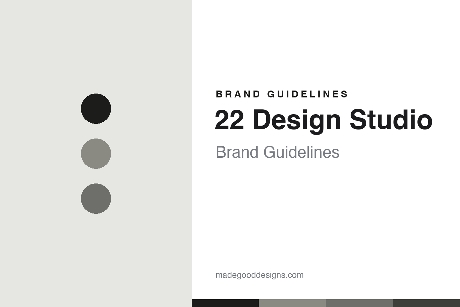
22 Design Studio lives in a fair-faced-concrete palette. Click a swatch to copy the hex.
22 Design Studio’s identity is raw, industrial and grey — a concrete, an ink, an ash, a graphite, and an off-white. The palette leans fair-faced concrete — the register of poured, unfinished, architectural material. It signals honesty and permanence rather than novelty. The honest caveat: with no published brand hex, these tones are an original, unofficial interpretation, not first-party values.
The lesson is a fair-faced-concrete palette signals material honesty. 22 Design Studio’s world is a raw, grey, architectural object. For designers, it is a reminder that committing to one honest material — concrete — can define a whole brand, and that a raw, grey palette signals that commitment. Because a concrete grey can fail as small text, keep type dark and let the colour live in the accents, palette and band. The takeaways: commit to one material; leave it raw; keep it grey; and treat any single hex as unofficial.
Typography
The register is a geometric sans — clean, architectural, modern.
22 Design Studio’s identity carries a clean, architectural, modern spirit — a raw, concrete object. A precise geometric sans captures the mood: it is structural and contemporary, the register of architectural material. Set in a fair-faced-concrete palette, the geometric sans feels clean and architectural — exactly the personality 22 Design Studio carries. It is modern rather than ornamental, mirroring poured concrete. (22 Design Studio’s real objects and wordmark are works we describe but do not reproduce, and the exact typeface is not ours to use.) Because it is not ours to use, the honest description is “a geometric sans spirit,” shown here in a stand-in. The type behaves like the brand: clean, architectural and modern.
Aa
A geometric sans spirit — clean and architectural. (Specimen set in Sora, a precise geometric sans STAND-IN; NOT the 22 Design Studio wordmark.)
A single material as identity
22 Design Studio stands for the concrete desk object.
22 Design Studio is a lesson in committing to one material. A fair-faced-concrete palette, a geometric sans and a cast desk object make material honesty the whole brand — raw, grey, architectural. The material is the differentiator. The differentiator is taking concrete — usually poured into buildings — and casting it small, into pens, clocks and holders that live on a desk.
Put to work, the identity is one material, mastered. A designer building in this spirit would pick a single, honest material and explore it across a range, so every object shares a surface, a weight and a way of ageing. The lesson 22 Design Studio teaches is that a material commitment can be a brand: casting everything in fair-faced concrete gives the range instant coherence and a story about patina and time, and a clean, architectural design language keeps that honesty consistent.
For designers and brand-builders, 22 Design Studio offers a clear takeaway: let one material carry the identity. The lessons: commit to one material; leave it raw; keep it grey; and be honest about the story. It is also a reminder to stay accurate: it was founded in 2005 in Taipei by Sean Yu and Yiting Cheng, and its material really is concrete — the palette here is an unofficial interpretation. And it is a reminder that made-where honesty means admitting the unknown: because no source confirms production, we don’t assert “made in Taiwan.” It is a reminder, too, that scope should be framed honestly: the brand makes more than desk objects — watches, jewellery, vases — so we write about its concrete desk objects specifically. 22 Design Studio made the concrete desk object the brand — proof that a single material can be the difference.
Explore & save
Keep 22 Design Studio’s identity on hand — save it to a board in the Made Good inspiration library.
22 Design Studio identity set
Pin the fair-faced-concrete palette and the geometric-sans register to your own board.