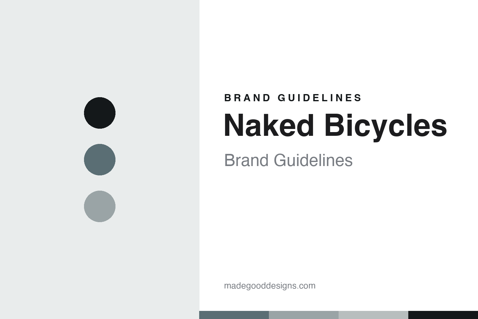
Naked Bicycles Brand Guidelines
The bare essential.
Aa
Two constants: a slate-and-raw-titanium palette and a minimal sans register. Abstract homage — not a Naked frame or wordmark.
The bare essential
Naked Bicycles builds minimalist titanium and steel frames on Quadra Island, British Columbia.
Naked Bicycles is a lesson in restraint as the identity. A Canadian frame builder on Quadra Island, British Columbia, it builds titanium and steel bicycle frames one at a time, with a philosophy of removing everything that does not add to the ride — “as naked as possible.” Metal, made essential.
Its identity is the bare essential. Naked’s clean, geometry-forward frames, stripped of anything unnecessary, are the work it is known for. A form, made a signature. A workshop that takes things away.
(Honest notes, so the story stays precise. Naked Bicycles & Design was founded in 1998 by Sam Whittingham and remains an independent, very small workshop — Sam building with his wife Andrea and one or two fabricators. Every frame is built one at a time in-house on Quadra Island, so this is a genuine objects vein, and Naked has won multiple handmade-bicycle-show awards. On method: it works predominantly in titanium and steel and TIG-welding is the mainstay, with silver-brazed lugs and fillet-brazing offered as options — so we describe it as a geometry-forward, minimalist builder, not primarily an ornate-lug artist. A separate note: Sam Whittingham is also a human-powered-vehicle land-speed record holder, which is his achievement as a rider and distinct from the framebuilding. Its frames and name are its IP, described but never reproduced, and there is no official brand hex — these tones are an unofficial interpretation. This is design commentary and does not promote any product.)
Colour
Naked lives in a slate-and-raw-titanium palette. Click a swatch to copy the hex.
Naked’s identity is minimal, cool and essential — a slate, an ink, a raw titanium, a mist, and a chalk. The palette leans slate and raw titanium: the register of bare, unpainted metal and quiet restraint. It signals essence and honesty over decoration. The honest caveat: with no published brand hex, these values are an original, unofficial interpretation, not first-party colours.
The lesson is a slate-and-raw-titanium palette signals a minimalist identity. Naked’s world is a bare, essential, considered object. For designers, it is a reminder that a stripped, material-true palette can carry a brand built on restraint — colours that are simply the metal, left honest. Because these tones can fail as small text, keep type dark and let the colour live in the accents, palette and band. The takeaways: subtract; let the material show; build one at a time; and treat any single hex as unofficial.
Typography
The register is a minimal sans — clean, essential, quiet.
Naked’s identity carries a clean, essential, quiet spirit — a bare object, not a busy one. A minimal sans captures the mood: light, even and unadorned, the register of a frame with nothing extra on it. Set in a slate-and-raw-titanium palette, the minimal sans feels clean and essential — exactly the personality Naked carries. It is restrained rather than decorated, mirroring a stripped, geometry-forward frame. (Naked’s real frames and wordmark are things we describe but do not reproduce, and the exact typeface is not ours to use.) Because it is not ours to use, the honest description is “a minimal-sans spirit,” shown here in a stand-in. The type behaves like the workshop: clean, essential and quiet.
Aa
A minimal-sans spirit — clean and essential. (Specimen set in Manrope, a minimal-sans STAND-IN; NOT the Naked wordmark or any frame design.)
Restraint as identity
Naked Bicycles stands for the bare essential.
Naked Bicycles is a lesson in making restraint the identity. A slate-and-raw-titanium palette, a minimal sans and clean, geometry-forward frames make essence the whole workshop — bare, cool and considered. The restraint is the differentiator. The differentiator is a genuine editing eye — a builder taking everything unnecessary off the frame, one at a time, in his own workshop on a small island.
Put to work, the identity is subtraction as design. A workshop building in this spirit would define itself by what it leaves out, keep the making personal and in-house, and let the material stand unpainted, so the customer buys into an idea — essence — rather than ornament. The lesson Naked teaches is that a clear editing philosophy plus real craft can build a brand: the restraint gives it a voice, and the making gives it substance. The subtraction is the personality, and the craft is the proof.
For designers and brand-builders, Naked offers a clear takeaway: let subtraction be the brand. The lessons: remove the unnecessary; let the material show; keep it personal; and be honest about the story. It is also a reminder to stay accurate: Naked Bicycles is an independent Canadian workshop founded in 1998 by Sam Whittingham, building titanium and steel frames one at a time on Quadra Island — TIG-welding as the mainstay with brazed lugs as an option, and geometry-forward rather than ornate — with the palette here an unofficial interpretation. Naked made the bare essential the workshop — proof that restraint can be the difference.
Explore & save
Keep Naked Bicycles’s identity on hand — save it to a board in the Made Good inspiration library.
Naked Bicycles identity set
Pin the slate-and-raw-titanium palette and the minimal-sans register to your own board.