Hakase Brand Guidelines
The unchanged atelier.
Aa
Two constants: an urushi-green palette and a quiet sans register. Abstract homage — not a Hakase pen or wordmark.
The unchanged atelier
Hakase makes bespoke fountain pens, fitted to the individual, in a tiny Tottori workshop since 1934.
Hakase is a lesson in bespoke craft as the identity. A tiny family workshop in Tottori, it makes fountain pens to measure — fitted to the individual’s hand and writing — by hand, over many hours, with a waiting list measured in years. A pen, made for one person.
Its identity is the unchanged atelier. Hakase’s bespoke, made-in-Japan pens, carved from ebonite, celluloid, buffalo horn and lacquer, are the work it is known for. A method, made a signature. A workshop that has not changed its way.
(Honest notes, so the story stays precise. Hakase was founded in 1934 — not earlier, as sometimes stated — by the Yamamoto family in Tottori, and established its made-to-measure system in 1982; we describe it as a small, multi-generational Yamamoto-family workshop and avoid naming a current owner, since sources differ on the generation. It is genuinely made in Tottori, Japan, each pen carved, fitted, finished and tested in-house across hundreds of steps and many hours. One important caveat: Hakase does not forge its own nibs — it uses fourteen-karat gold nibs made by Pilot and Sailor, branded Hakase and then hand-tuned, so the bespoke craft is the carving, fitting and finishing, not nib manufacture. Its designs are its IP, described but never reproduced, and there is no official brand hex — these tones are an unofficial interpretation. This is design commentary and does not promote any product.)
Colour
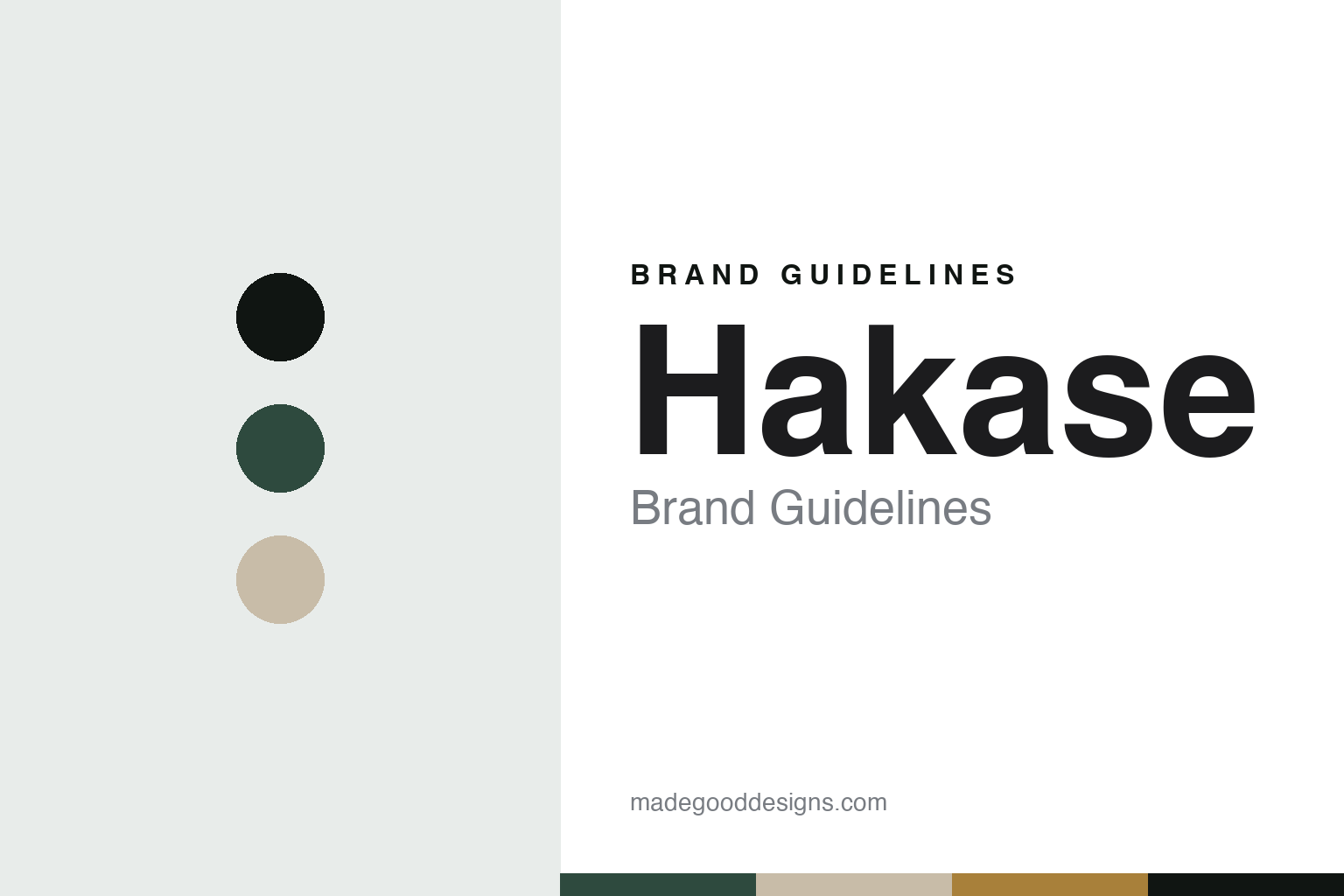
Hakase lives in an urushi-green palette. Click a swatch to copy the hex.
Hakase’s identity is refined, quiet and Japanese — an urushi green, an ink, an ecru, an amber, and a chalk. The palette leans urushi green and amber: the register of lacquer, ebonite and natural horn. It signals craft and restraint over show. The honest caveat: with no published brand hex, these values are an original, unofficial interpretation, not first-party colours.
The lesson is an urushi-green palette signals a refined, quiet identity. Hakase’s world is a bespoke, made-in-Tottori, hand-carved object. For designers, it is a reminder that a deep lacquer green and a warm amber can carry a brand built on a craft — the green of urushi and the amber of buffalo horn. Because these tones can fail as small text, keep type dark and let the colour live in the accents, palette and band. The takeaways: make to measure; keep it in Tottori; be honest about the nib; and treat any single hex as unofficial.
Typography
The register is a quiet sans — spare, calm, precise.
Hakase’s identity carries a spare, calm, precise spirit — a bespoke object, not a mass one. A quiet sans captures the mood: even, minimal and still, the register of a made-to-measure workshop. Set in an urushi-green palette, the quiet sans feels spare and calm — exactly the personality Hakase carries. It is precise rather than showy, mirroring a pen carved slowly for one hand. (Hakase’s real designs and wordmark are things we describe but do not reproduce, and the exact typeface is not ours to use.) Because it is not ours to use, the honest description is “a quiet-sans spirit,” shown here in a stand-in. The type behaves like the maker: spare, calm and precise.
Aa
A quiet-sans spirit — spare and calm. (Specimen set in Jost, a quiet-sans STAND-IN; NOT the Hakase wordmark or any pen design.)
Bespoke craft as identity
Hakase stands for the unchanged atelier.
Hakase is a lesson in making bespoke craft the identity. An urushi-green palette, a quiet sans and made-to-measure pens make one workshop the whole maker — refined, quiet and Japanese. The bespoke craft is the differentiator. The differentiator is a genuine rarity — a tiny Tottori atelier that fits each pen to its owner by hand, over many hours, and has not industrialised.
Put to work, the identity is bespoke craft as design. A maker building in this spirit would keep its scale small on purpose, make each piece for a person, and keep the making in one workshop, so the customer buys into a made-for-me object rather than a product. It would let a long waiting list be a sign of care, not a flaw. It would be honest that the nib is a tuned OEM part. The lesson Hakase teaches is that bespoke craft can build a brand: the fitting gives it meaning, and the Tottori making gives it authenticity. The craft is the personality, and the workshop is the proof.
For designers and brand-builders, Hakase offers a clear takeaway: make it for one person, and keep it small. The lessons: fit it to the hand; keep it in Tottori; stay unindustrialised; and be honest about the nib. It is also a reminder to stay precise: Hakase is a small Yamamoto-family workshop founded in 1934 in Tottori, making bespoke pens to measure — with the palette here an unofficial interpretation. Hakase made the unchanged atelier the maker — proof that bespoke craft can be the difference.
Explore & save
Keep Hakase’s identity on hand — save it to a board in the Made Good inspiration library.
Hakase identity set
Pin the urushi-green palette and the quiet-sans register to your own board.