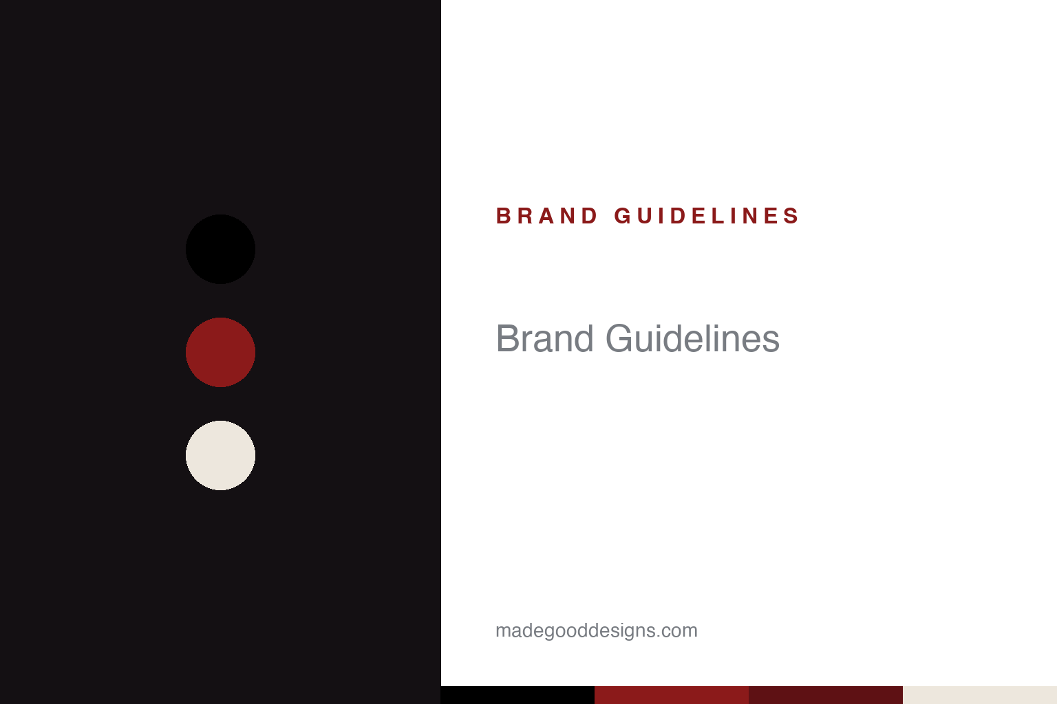
Alexander McQueen Brand Guidelines
A stacked serif with a secret in the ‘Q’, and a skull — British tailoring meets dark romance.
Aa
Two constants: a dark-romantic black-and-red and a high-contrast serif. Abstract homage — not the McQueen wordmark or skull.
A serif with a secret
McQueen’s wordmark hides a small detail — and its house hides a whole world of dark romance.
The Alexander McQueen wordmark is an elegant, high-contrast serif, set as a two-line lockup — a smaller “Alexander” stacked over a larger “McQueen.” Its much-repeated quirk is a tiny lowercase “c” tucked inside the “Q,” echoing a copyright-style mark. Two honest caveats: this detail is documented by logo-commentary blogs rather than confirmed by the house, so it’s best called “widely noted” (and it’s a lowercase c, not a hidden capital); and the typeface itself is unattributed — often compared to Baskerville, but treat that as a lookalike, not a fact. The other signature mark is the skull — memento-mori imagery that runs from McQueen’s student work to the famous skull scarf, which debuted in the Spring/Summer 2003 “Irere” collection and became the house’s it-accessory.
The house was founded in 1992 by Lee Alexander McQueen, the British “enfant terrible” whose dark, theatrical, technically brilliant work (rooted in Savile Row tailoring) made him one of fashion’s most important designers; he was also creative director of Givenchy from 1996 to 2001. After McQueen’s death on 11 February 2010, the brand continued — Sarah Burton led it from 2010 to 2023 (she designed Catherine Middleton’s 2011 royal wedding dress), and Seán McGirr became creative director in 2023. On ownership: Gucci Group took a 51% stake in December 2000, and Gucci Group is now Kering. A key point to state plainly: the brand did not end when its founder died — it remains a major Kering house.
Colour
McQueen lives in dark-romantic black and red. Click a swatch to copy the hex.
The palette is predominantly black, with white and a recurring, dramatic red — the colours of the house’s gothic, dark-romantic sensibility. Black for drama, mortality and tailoring; red for blood, passion and theatre; white and bone for contrast. The honest caveat: McQueen publishes no official brand hex, so treat these as approximate and mood-driven. The darkness isn’t incidental — it’s the aesthetic. McQueen’s world is Victorian romance, memento mori and spectacle, and a black-led, red-accented palette carries that emotional register far more effectively than any bright, cheerful scheme could.
The lesson is a palette chosen for emotion, not decoration. McQueen’s black-and-red exists to evoke a specific feeling — beautiful, dark, romantic, a little dangerous — and every element of the identity serves that mood. For designers, it’s a reminder that colour is one of your most powerful emotional tools: a house built on drama and mortality should look like it, and consistency in that darkness is what makes the brand feel authored and coherent. Choose colours that carry the intended feeling, commit to them, and let the occasional accent (red) punctuate rather than dilute. As always, when no hex is published, treat your values as close matches to the documented mood.
Typography
The wordmark is a high-contrast serif — heritage, tailoring and gravitas.
McQueen’s high-contrast serif does exactly the right job for the house: it reads as classic, refined and serious — evoking heritage, British tailoring and a certain literary, romantic gravitas. The stacked two-line lockup gives it a crest-like formality, and the (widely-noted, if unofficial) “c” hidden in the Q adds a small piece of intrigue that suits a designer famous for concealed details and dark wit. Because the face is unattributed, it’s safest to describe it as a bespoke Baskerville-style serif rather than name a font. The elegance of the type is a deliberate foil to the darkness of the clothes — beauty and gravity, held in balance.
Aa
A refined, high-contrast serif — heritage and gravitas. (Specimen set in Cormorant Garamond, a high-contrast serif in the spirit of the McQueen wordmark; the actual face is unattributed.)
A house that outlived its founder
McQueen shows how a strong identity can carry a brand beyond its creator.
Alexander McQueen is a powerful example of an identity strong enough to survive its founder. Lee McQueen’s vision — dark romanticism, gothic drama, memento-mori skulls, impeccable tailoring, theatrical spectacle — was so clearly codified that the house could continue, credibly, after his death in 2010, first under Sarah Burton and now Seán McGirr. The skull motif, the black-and-red palette, the refined serif and the dramatic runway tradition give successive designers a coherent language to work within, so the brand stays recognisably “McQueen” even as its author changes. That’s the mark of a genuinely well-built identity: it’s a world, not just one person’s signature.
For designers, McQueen offers two lessons. First, codify the vision into repeatable assets: a signature motif (the skull), an emotional palette (black-and-red), a distinctive type voice (the high-contrast serif) and a consistent tone (dark, romantic, theatrical) together form a language that can outlast any single creative director — invaluable for a brand meant to endure. Second, use small, witty details to add depth: the “c” hidden in the Q rewards close attention and reflects the designer’s love of concealed meaning, a reminder that intrigue in the details makes an identity memorable. The takeaway: build a house around a clearly-defined emotional world and a kit of ownable assets, and it can carry a brand — and a founder’s spirit — far beyond his lifetime. Alexander McQueen turned darkness and beauty into a language, and that language still speaks.
Explore & save
Keep Alexander McQueen’s identity on hand — save it to a board in the Made Good inspiration library.
Alexander McQueen identity set
Pin the black-and-red palette and the type spirit to your own board.