Comme des Garçons Brand Guidelines
A French name on a Japanese house, and a heart with eyes — anti-fashion turned into an empire.
Aa
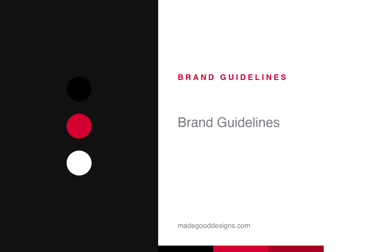
Two constants: a stark black mainline and the PLAY red heart. Abstract homage — not the CDG wordmark or PLAY heart.
Anti-fashion, in French
Comme des Garçons is a Japanese house with a French name and a deliberately austere logo.
The mainline mark is the “COMME des GARÇONS” wordmark — “COMME” and “GARÇONS” in capitals, the connective “des” in lowercase, a small typographic touch that lightens and balances the lockup. (A caveat: the face is often cited as Helvetica Neue 75 Bold, but that’s unverified from font blogs, not the house, so treat it as a lookalike.) The name is French for “like boys” / “like the boys,” chosen by founder Rei Kawakubo even though the brand is Japanese (it’s widely linked to a Françoise Hardy lyric, best treated as anecdote). Alongside the austere wordmark sits the brand’s most popular mark, the PLAY heart — a red heart with two cartoon eyes, designed by Polish illustrator Filip Pagowski and launched with the PLAY line in 2002. Crucial to state: PLAY is a casual sub-line, not the mainline, and the heart is Pagowski’s work, not Kawakubo’s.
Comme des Garçons began when Rei Kawakubo started designing under the name in 1969 in Tokyo (the company was incorporated in 1973; some sources say 1971). Kawakubo — born 1942, a graduate in Fine Arts and Literature from Keio University, with no formal fashion training — is one of fashion’s most important, self-taught designers. Her first Paris show in 1981 was so radical (black, distressed, deconstructed, asymmetric) that the press dubbed it “Hiroshima chic” and “anti-fashion.” The house grew into a whole universe of sub-lines — PLAY, Homme Plus, BLACK, SHIRT — plus CDG Parfums and the influential retailer Dover Street Market (opened in London in September 2004 with Adrian Joffe).
Colour
CDG is black — with one famous red exception. Click a swatch to copy the hex.
The mainline palette is, overwhelmingly, black — the colour of Kawakubo’s anti-fashion revolution, of deconstruction and conceptual rigour. The one universally-recognised exception is the PLAY heart’s red, a bright, friendly pop against white that made the sub-line a commercial phenomenon. The honest caveat: CDG publishes no official brand hex, so treat both the black and the PLAY red (a vivid red around #D50032) as approximate. The contrast is telling: the mainline is austere, intellectual and black; the accessible PLAY line is warm, playful and red — two colour stories for two very different purposes under one house.
The lesson is using colour to separate the conceptual from the commercial. CDG’s serious, avant-garde mainline lives in black, while its friendly, mass-market PLAY line lives in that cheerful red heart — the palette itself signals which world you’re in. For designers, it’s a reminder that a house can hold two very different colour identities on purpose, matched to two audiences, without contradiction. The takeaway: let colour do strategic work (austere black for the art, warm red for the accessible line), keep each consistent, and don’t force one palette to serve every part of a diverse brand. And, as always, treat any hex as an approximation when the house publishes no spec.
Typography
The wordmark is plain, bold and neutral — the concept, not the type, is the point.
The CDG wordmark is deliberately plain and bold — a neutral grotesque (often likened to Helvetica Neue, though unconfirmed), with that single lowercase “des” as its one quiet flourish. The neutrality is philosophical: for a house built on radical ideas — deconstruction, asymmetry, “anti-fashion” — the logo stays intentionally undesigned-looking, so the clothes and concepts carry all the meaning. It’s the opposite of an expressive, decorative mark; a clean, almost anonymous wordmark that refuses to compete with the work. Set against the austere black mainline, the plain type reinforces the intellectual, conceptual register that defines Comme des Garçons.
Aa
A plain, bold grotesque — the concept leads, not the type. (Specimen set in Archivo, a neutral grotesque in the spirit of the CDG wordmark; the actual face is unverified.)
An empire of ideas
Comme des Garçons turned conceptual fashion into a sprawling, coherent universe.
Comme des Garçons is a lesson in building an empire on ideas rather than a single look. From Kawakubo’s radical, self-taught vision came not just a mainline but a whole ecosystem — PLAY, Homme Plus, BLACK, SHIRT, CDG Parfums and Dover Street Market — each with its own role, from the intellectual runway to the accessible red-heart tee to the concept-store retail. The austere black wordmark and the friendly PLAY heart bookend a brand that spans high-concept and mass-market without losing coherence, because the guiding intelligence (Kawakubo’s) is consistent even as the expressions vary wildly.
For designers, CDG offers two lessons. First, a neutral, almost anonymous logo can be the right choice for an idea-led brand: when your work is conceptual and radical, an undesigned-looking wordmark lets the ideas dominate and ages gracefully. Second, a single strong vision can support an enormous range of sub-brands: PLAY, Homme Plus, BLACK and the rest each serve different audiences and price points, but all read as Comme des Garçons because one sensibility governs them. The takeaways: match your logo’s expressiveness to your strategy (quiet for concept-led, distinctive for product-led); let a coherent vision — not a rigid visual template — unify a diverse house; and don’t be afraid to run a friendly, commercial sub-line (the PLAY heart) alongside your most challenging work, as long as each is clearly itself. From a self-taught designer and a French phrase, Comme des Garçons built one of fashion’s most influential, and most sprawling, empires of ideas.
Explore & save
Keep Comme des Garçons’s identity on hand — save it to a board in the Made Good inspiration library.
Comme des Garçons identity set
Pin the black-and-red palette and the type spirit to your own board.