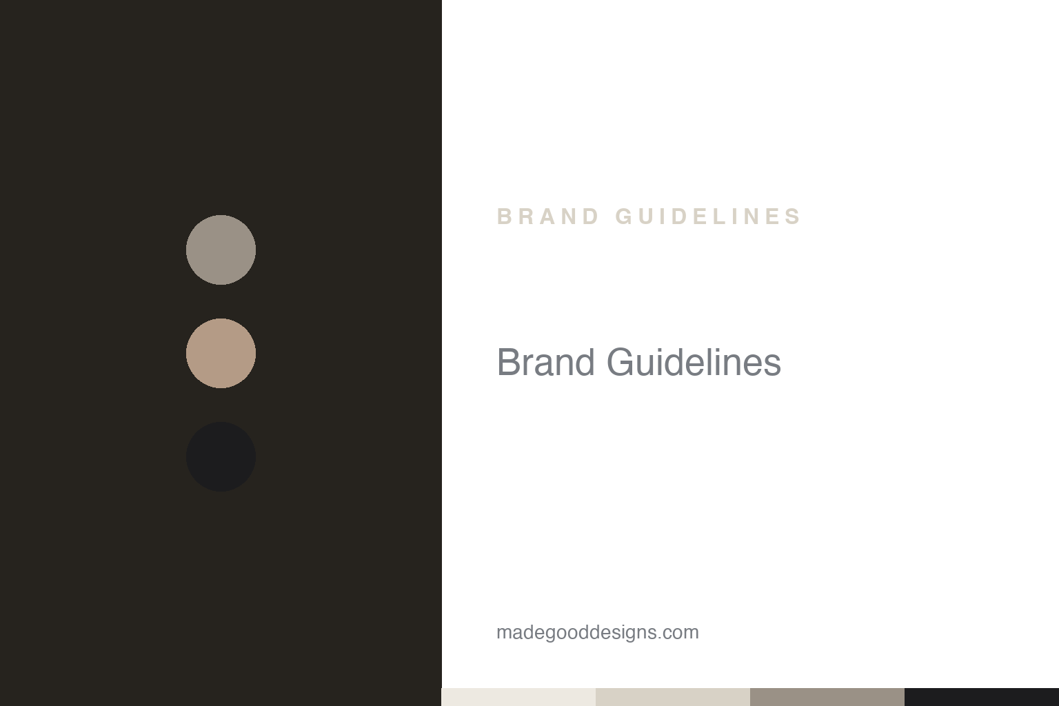
Rick Owens Brand Guidelines
Stark capitals and washed-out neutrals — “glunge” glamour from an independent house.
Aa
Two constants: washed-out muted neutrals and stark, condensed capitals. Abstract homage — not the Rick Owens or DRKSHDW wordmarks.
Glamour and grunge
Rick Owens built a house on “glunge” — and an identity as stripped-back as his silhouettes.
The mainline mark is simply the words “RICK OWENS” set in stark, minimal, uppercase letters, usually monochrome — restrained, luxury-house typography rather than a graphic emblem. The diffusion/denim line, DRKSHDW (“Dark Shadow,” launched around 2005), pairs a cursive “Rick Owens” signature above a heavy uppercase “DRKSHDW.” A caveat: the exact typefaces are unverified — logo sites only guess lookalikes — so it’s safest to describe the effect (stark capitals) than to name a font. The aesthetic those marks front is famously called “glunge” (glamour + grunge): gothic, brutalist, heavily draped, monochrome and dramatic, staged in spectacular runway shows.
Rick Owens founded his label in 1994 in Los Angeles (first stocked by the LA retailer Charles Gallay) and relocated his base to Paris in 2003. A couple of clarifications: Owens studied art at Otis for around two years and learned pattern-cutting at LA Trade-Technical College — he’s not a Parsons graduate, and largely learned on the job; and his birth year is given variously as 1961 or 1962. His Paris headquarters is a former French Socialist Party building on the Place du Palais-Bourbon — a raw-concrete “palace” that doubles as home, atelier and showroom — and he also produces a brutalist furniture line. Crucially, the brand is independent, owned through OWENSCORP, with his wife and muse Michèle Lamy a central business partner and collaborator — not merely a muse.
Colour
Rick Owens lives in washed-out neutrals. Click a swatch to copy the hex.
The palette is famously limited, muted and desaturated: many washed-out blacks alongside a set of signature named neutrals — “Dust,” “Pearl,” “Milk,” plus nude, dark brown and muted grey. The honest caveat: Owens publishes no official brand hex (garment-dye references exist — “Dust” roughly maps to a Pantone TCX code — but those are product colours, not a codified brand system), so treat any value as approximate. And a myth to correct: it’s not all pure black — the signature look is that tonal range of dusty, bone and nude neutrals set with the blacks. The muted palette is the aesthetic: post-apocalyptic, elemental, monastic, quietly luxurious.
The lesson is a restrained palette as a signature. Owens’ washed-out neutrals — Dust, Pearl, Milk — are so consistent and so specific that the palette itself is instantly recognisable as “Rick Owens,” proof that limiting your colours can be a powerful, ownable identity rather than a constraint. For designers, it’s a reminder that a tightly-controlled, desaturated palette communicates a precise mood (here, brutalist, elemental, luxurious) and builds recognisability through discipline. Name your core tones, use them relentlessly, and resist the urge to add colour. As always, where no official spec exists, present these neutrals by name and treat any hex as a close match to the documented mood.
Typography
The wordmark is stark and condensed — austere, architectural, quiet.
Rick Owens’ typography is stark and austere — minimal uppercase letters, no ornament, a mark that behaves more like an architectural label than a fashion logo. That restraint is exactly right for the brand: a brutalist, monochrome, concept-driven house shouldn’t have a decorative logo, and the stripped-back capitals reinforce the elemental, serious mood of the clothes and the concrete Paris palace. The DRKSHDW line adds a little more graphic character (the cursive-signature-over-heavy-caps lockup) to suit its more casual, streetwear-adjacent positioning. Because the faces aren’t officially attributed, the honest description is the effect — stark, condensed capitals — rather than a named font. Austere type for an austere world.
Aa
Stark, condensed capitals — architectural and quiet. (Specimen set in Oswald, a condensed sans standing in for Rick Owens’ stark capitals; the actual face is unverified.)
Independent, and uncompromising
Rick Owens shows how a singular vision — kept independent — becomes an unmistakable brand.
Rick Owens is a study in an uncompromising personal vision, kept independent. Unlike most houses in this series, the brand isn’t owned by a conglomerate — it’s controlled through OWENSCORP, with Owens and Michèle Lamy steering it as a genuinely personal enterprise. That independence shows: the identity is exactly as austere, muted and brutalist as its founder, with no dilution toward mass-market taste. From the stark wordmark to the Dust-and-Milk palette to the concrete Paris headquarters and the furniture line, everything expresses one coherent, elemental worldview — and Owens’ own carefully-cultivated personal image is part of the brand, too.
For designers, Rick Owens offers two lessons. First, the power of a limited, ownable palette and stark identity: by restricting colour to a set of named, desaturated neutrals and keeping the typography austere, Owens made even the absence of colour and ornament into a signature — a reminder that discipline and restraint can be more distinctive than abundance. Second, the value of consistency between founder, product and brand world: the clothes, the palette, the concrete palace, the furniture and Owens’ own persona all say the same thing, which is what makes the brand feel so authentic and complete. The takeaways: define a tight, named palette and a stark visual system and hold them without compromise; let the founder’s genuine worldview shape every touchpoint; and recognise that independence can be what protects a singular vision from being watered down. Rick Owens turned “glunge” and a handful of dusty neutrals into one of fashion’s most uncompromising, unmistakable identities.
Explore & save
Keep Rick Owens’s identity on hand — save it to a board in the Made Good inspiration library.
Rick Owens identity set
Pin the muted-neutral palette and the type spirit to your own board.


