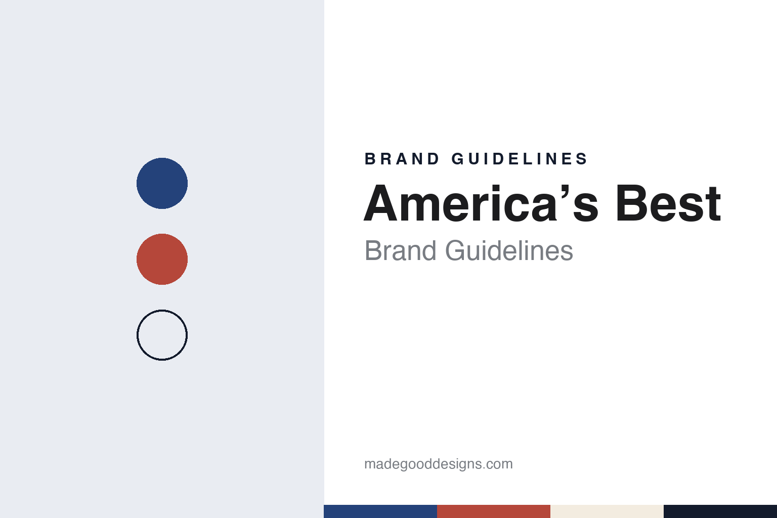
America’s Best Brand Guidelines
A 1978 Chicago chain, an owl and an AB mark.
Aa
Two constants: a deep blue, brick red and warm cream palette and a Sturdy retail sans register. Abstract homage — not an America’s Best or National Vision product or mark; no logo, owl or wordmark is reproduced.
A Magnificent Mile office
A chain born the year price advertising opened up.
America’s Best Contacts & Eyeglasses is an American optical retail chain that sells eye examinations, eyeglasses and contact lenses, and it has belonged to National Vision since 2005. English Wikipedia says the business and its predecessor companies were founded in July 1978 by Bill Grody, soon after federal deregulation allowed eyewear, eye examinations and related services to be advertised on price. That timing shaped the brand: from its start it was built around advertised offers rather than around a local practitioner’s name.
The first location, Wikipedia says, opened in September 1978 on the 15th floor of an office building on North Michigan Avenue, on Chicago’s Magnificent Mile, sharing space with the company’s own in-house advertising agency. Wikipedia says the company financed itself internally until early 1990, by which time it had 34 locations and a full-service lens manufacturing facility.
Ownership then changed several times. In April 1990, Wikipedia says, the founder sold a majority to the Boston investment firm Berkshire Partners in a leveraged buyout, keeping a minority stake with his management team; in December 1993 management bought the majority back, with Berkshire keeping a minority position. In April 1997 the whole company was sold to Chrysalis Management, which owned eyewear stores mainly in the Southwestern United States and set up a holding company, Consolidated Vision Group, for its eyewear businesses. Wikipedia says that by 1997 America’s Best had about 100 stores in 25 states, the District of Columbia and Puerto Rico, and that it was the group’s largest national brand.
The chain reached its present owner in September 2005. Wikipedia says Berkshire Partners returned that month, buying America’s Best together with the rest of Consolidated Vision Group’s eyewear holdings while at the same time buying National Vision, Inc., which became the parent company of all of them, with America’s Best as its largest division. By the end of 2013, Wikipedia says, National Vision had about 750 locations, of which about 425 traded as America’s Best, and early in 2014 the investment firm KKR acquired National Vision. National Vision Holdings is listed on Nasdaq under the symbol EYE, as Vision Monday notes in its reports on the chain.
Colour
An owl, a flag and two letters.
For much of its life the chain’s look was carried by its advertising. Adweek reported on 4 November 2015 that the agency The Richards Group, named agency of record that April, had launched its first campaign for America’s Best by introducing a new character: a bespectacled owl. In the spots “Stop It” and “Keep Up,” the first two of four, the owl tells people they paid too much for their glasses and then has to put up with jokes about the word “who.” The animation was made by The Mill in Chicago, according to the credits Adweek published.
The agency’s principal told Adweek that the owl was meant to break away from the usual category commercials showing customers browsing frames on a backlit wall, and to show the brand’s personality in a way that was “endearing and enduring.” The chain’s senior marketing executive said the owl had been presented in the final stage of its agency search, so the campaign could reach the market without starting over. Ten years later the company still described the bird as its signature owl mascot.
The larger change came in 2025. Vision Monday reported on 20 August 2025 that America’s Best had announced a comprehensive visual brand transformation with the creative company VML, appointed agency of record that March. It included a new logo, a new brand platform and a complete identity overhaul for all media. The chain’s familiar flag logo was replaced by an “AB” acronym brand mark and a new visual design system that, the company said, pays homage to its heritage and to the owl, with a fashionable reinterpretation of American stripes and colours.
The words changed at the same time. The new platform line is “Every Eye Deserves Better,” which National Vision’s chief executive described to Vision Monday as more than a tagline, and the company said the new look was meant to be modern, energetic and joyful while keeping its focus on value. A launch film follows Americans through their everyday lives, the company said its social channels and website would feature photography and video of everyday moments, and the media agency Spark and Rise placed the launch across cable and streaming platforms.
Typography
How optical chains present themselves.
Optical retail chains are first of all shops, and their own material usually starts there. When studying one, look at how the fascia carries the name from across a shopping centre, how the frame wall is lit, grouped and photographed, and how the company’s news pages show openings and refits. Store counts appear again and again in these pages, so read them as dated figures from the company rather than as fixed facts.
Campaign imagery is the second layer. Many chains work with a well-known face, from footballers to television presenters, and describe that person plainly as an ambassador; others build films around customers, families or a single repeated line. For a design study, note who is in the frame, whether the glasses or the person lead the picture, and how one slogan or visual device carries across television, radio, social media and the shop window.
The website is now a third shopfront. Optical chains commonly offer an online try-on, either a camera-based virtual fitting or a service that lets visitors choose frames online and reserve them in a nearby shop, along with appointment booking and frame advice pages. These tools carry the identity into small interface details: buttons, product grids, colour accents and the photography of frames on plain backgrounds.
Behind the shop sign sits a corporate structure that a design guide should state carefully. Some chains are cooperatives of independent opticians, some run franchise networks, and many belong to investment firms or to a larger eyewear group. Corporate pages on owners, takeovers and franchise terms explain why one name can look different from country to country, and why a familiar sign can change hands while the shops stay open. In the guides that follow, owners and dates come from dated sources, and palettes are our own interpretation rather than official brand colours.
Aa
A sturdy retail sans — after the bold lettering of value store signs. (Specimen set in Barlow, a sans STAND-IN; NOT the America’s Best logo or AB mark.)
America’s Best
A store planned as one connected journey.
The newest expression of the identity is a building. Vision Monday reported on 6 November 2026 that America’s Best had opened a flagship store in Alpharetta, Georgia, which the company called the clearest expression yet of its commitment to redefining the optical experience. The store was designed with the retail design firm WD Partners, whose creative executive said its role had been to turn the retailer’s vision into customer flow, merchandising and spaces for discovery, care and celebration.
Instead of a formal check-in counter, the Alpharetta store opens into an open layout where shoppers can explore frames, with a pretest area, a Lens Education Center where customers look at lens options, and a dedicated “Celebration Zone” where staff make final adjustments to new glasses. The president of America’s Best said that retail stores had historically been designed around processes and that this one was designed around people; the company said the store shows how the chain is changing to meet customers where they are, joining online scheduling and research with the visit itself.
The scale behind the sign is large. The chain’s own about page says America’s Best has over 1,000 stores in 31 states plus the District of Columbia and is headquartered in metro Atlanta; English Wikipedia gives more than 1,000 locations as of May 2024. Its parent, which Vision Monday said in August 2025 had more than 1,200 stores in 38 states and Puerto Rico and ranked fourth on its 2025 list of the top 50 U.S. optical retailers, also runs Eyeglass World, Vista Optical shops inside selected Fred Meyer stores and the online retailer DiscountContacts.com.
For a design guide, America’s Best shows how a value chain can turn an advertising character and a national theme into a compact system: an owl kept for a decade, a flag reduced to two letters and some stripes, and a store plan that treats collecting new glasses as a moment of its own. Compare it with its parent National Vision, with the Texas same-day chain Eyemart Express and with Warby Parker. For this guide we use deep blue, brick red and warm cream with a sturdy sans, an unofficial interpretation; no product or logo is reproduced.
Explore & save
Keep America’s Best’s identity on hand — save it to a board in the Made Good inspiration library.
America’s Best identity set
Save the deep blue, brick red and warm cream palette and the Sturdy retail sans register to your own board.