Bank of China Brand Guidelines
A 1912 bank, a coin-shaped mark and a 2006 dual listing.
Aa
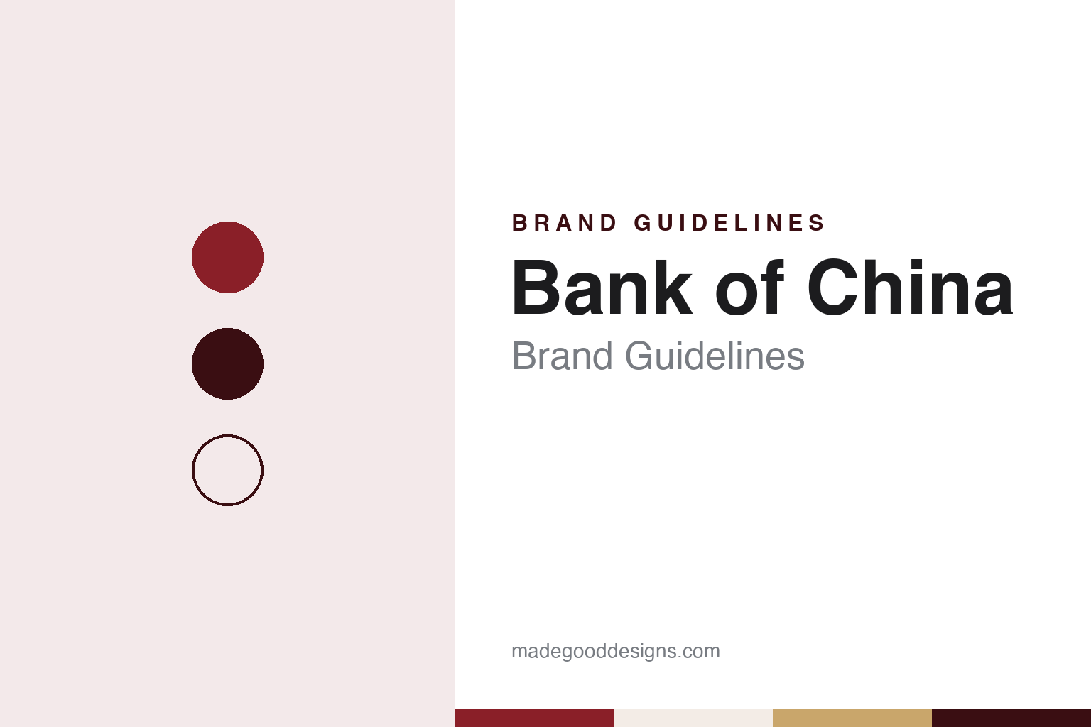
Two constants: a Bank of China red and old-gold palette and a calligraphic serif register. Abstract homage — not a Bank of China asset; no emblem, banknote or sign is reproduced.
From the Da-Qing Bank
A Qing institution renamed for a new republic.
Bank of China (中国银行) says it has the longest continuous operating history of any Chinese bank. Its roots lie in the Da-Qing Bank, set up by the Qing government in Beijing in 1905. When the Republic of China was founded in 1912, the Da-Qing Bank was reorganised as the Bank of China; English Wikipedia credits Chen Jintao, then in charge of financial reform, as its founder. Chinese Wikipedia records a shareholders’ meeting in Shanghai on 28 January 1912 and an opening on 5 February 1912 in the old Da-Qing Bank premises on Hankou Road, Shanghai; the bank itself says it was formally established in February 1912.
In its first decades it issued banknotes on behalf of the government, as one of the “big four” banks of the period with the Bank of Communications, the Central Bank of China and the Farmers Bank of China. It opened a Hong Kong branch in 1917, moved its head office from Beijing to Shanghai in 1928 and opened its first branch outside China, in London, in November 1929, followed by Osaka in 1931 and Singapore and a New York agency in 1936, according to English and Chinese Wikipedia.
The war years reshaped its network. After hostilities with Japan began in 1937, the bank opened branches across South-East and South Asia, including Batavia, Penang, Rangoon, Bombay and Calcutta, to gather remittances, English Wikipedia says. In 1941–42 it closed most of its overseas offices, keeping London, New York, Calcutta and Bombay while opening new ones in Sydney, Liverpool and Havana, and in late July 1942 it lost its right to issue notes when the Central Bank of China was given a monopoly. Its Shanghai head-office building on the Bund, completed in 1937, was used by the Central Reserve Bank of China from 1941 to 1945; the bank reopened branches in Hong Kong, Singapore and elsewhere in 1946.
Colour
1949, 1979 and a dual listing in 2006.
In 1949 most of the bank’s mainland operations came under the People’s Bank of China, and its overseas branches divided: some stayed with the head office in Beijing, others with a head office in Taipei, which in 1971 took the name International Commercial Bank of China, English Wikipedia says. After 1949, the bank says, it served as China’s designated bank for foreign exchange and international trade.
As the People’s Bank spun off its commercial functions, the Bank of China was re-established in 1979 with a focus on international finance, opening a branch in Luxembourg that year, New York in 1981 and Paris in 1985, according to English Wikipedia. It became a wholly state-owned commercial bank in 1994, the bank says. Its Hong Kong operations were regrouped as Bank of China (Hong Kong) in 2001 and listed in October 2002; in Hong Kong it became a note-issuing bank in 1994, and in Macau in 1995, where its notes carry the Portuguese name Banco da China.
The parent company listed in 2006: H shares in Hong Kong on 1 June and A shares in Shanghai on 5 July, according to Chinese Wikipedia. The bank describes itself as the first Chinese bank to complete both an A-share and an H-share offering. English Wikipedia lists Central Huijin, the state investment company, as its largest shareholder, with 64.63 per cent of ordinary shares as of September 2015. In 2007 it renamed an aircraft-leasing business bought from Singapore Airlines as BOC Aviation.
Its international role continues to grow. On 3 February 2026 the UK government announced that the Bank of China’s London Branch had been designated the country’s second renminbi clearing bank, after the first UK–China Financial Working Group met in Beijing. The bank says that at the end of 2025 it operated in 64 countries and regions outside the Chinese mainland, and that it was the official banking partner of the Beijing 2008 Summer Olympics and the Beijing 2022 Winter Olympics.
Typography
Design and documentation.
China’s large banks present themselves to two audiences at once. Most carry a Chinese name and an English one, and many shorten the English to initials, so a single identity has to work in Chinese characters, in Latin letters and in a short acronym on cards, apps and branch fronts. Red and blue dominate the sector’s colours, and marks are often built around Chinese characters or around round forms that recall coins and seals, though the meaning of a particular mark should be checked against the bank’s own account rather than assumed.
Much of the visual record comes from the banks’ own channels. Their websites set out a mission, a motto and a list of values, usually in both languages, and divide services into retail or personal banking, corporate banking, inclusive finance for small businesses and wealth management. Branch photography, with signage over glass frontages and service halls, is a staple of annual reports and investor pages.
The phone has become a second front door. The big banks run mobile-banking apps and, in several cases, separate lifestyle or payments apps, and they report online user numbers alongside branch counts. Many also link their cards to UnionPay, the national card network.
The paper trail is long and dated. Banks listed in Shanghai and Hong Kong publish annual reports, interim results and ESG reports in Chinese and English, and several issue green bonds or publish separate green-finance reports. For design research, those documents give dated, citable evidence of how an identity is applied, from cover design to typography and photography, and they are the most reliable place to check a claim about a bank’s name, history or scale.
Aa
A calligraphic serif for a name written by brush. (Specimen set in Noto Serif, a serif STAND-IN; NOT the Bank of China emblem or calligraphy.)
The Coin and the Character
A round coin, a square hole and the character 中.
Chinese Wikipedia calls the Bank of China emblem the work that first made its designer’s name. It says the Hong Kong designer Kan Tai-keung (靳埭强) was commissioned by the Bank of China group in 1980; the bank’s page there dates the emblem’s adoption to December 1986. The design starts from an ancient Chinese coin, round with a square hole. Vertical strokes above and below the hole turn the whole figure into the character 中, the first character of the bank’s Chinese name, and the round outline and square centre recall the old idea of a round heaven and a square earth. Chinese Wikipedia adds that the rounded corners of the square hole were also read as a computer screen, a nod to the bank’s move to computerised operations, and that Kan received an award from the American magazine Communication Arts for the mark.
The Chinese name has a different author. The four characters 中国银行 used today were written by the scholar and calligrapher Guo Moruo, invited in the 1950s by the bank’s then chairman, Chinese Wikipedia says. The result pairs a geometric, coin-based symbol with brush lettering.
Architecture carries the brand too. The Bank of China Tower in Central, Hong Kong, designed by I. M. Pei and opened in 1990, is known for its triangular frameworks clad in glass curtain walls, according to English Wikipedia, and it serves as the Hong Kong headquarters of Bank of China (Hong Kong).
For a design guide, Bank of China shows how a single geometric symbol, drawn from an everyday object, can carry a bank’s name, country and trade at once. Compare Bank of Communications, its fellow note issuer in the Republic era, and HSBC. For this guide we use a lacquer red, an oxblood and an old coin gold with a serif, an unofficial interpretation; no product or logo is reproduced.
Explore & save
Keep Bank of China’s identity on hand — save it to a board in the Made Good inspiration library.
Bank of China identity set
Keep the Bank of China lacquer red and old-gold palette and the calligraphic serif register on your own board.