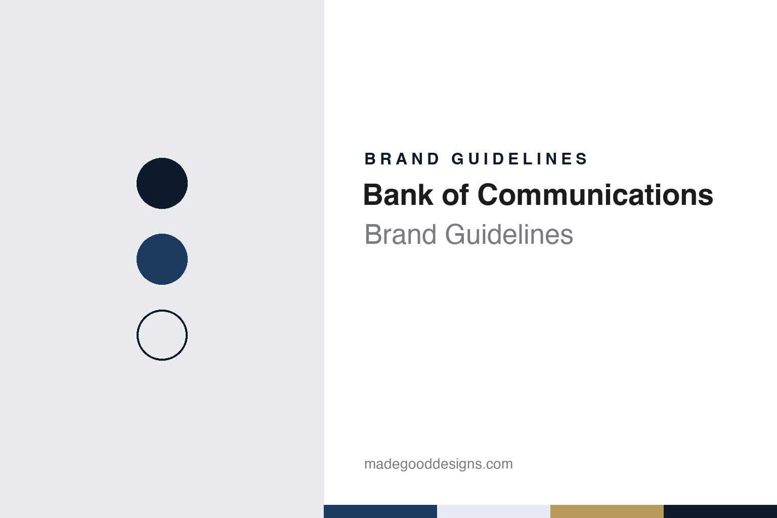
Bank of Communications Brand Guidelines
A 1908 railway bank, reopened in Shanghai in 1987.
Aa
Two constants: a harbour navy and old gold palette and a Classic serif register. Abstract homage — not a Bank of Communications product or mark; no logo, card or banknote is reproduced.
A railway bank
Founded in 1908 to buy back a railway.
Bank of Communications dates its start to 1908. The bank says it was proposed by Chen Bi, then head of the Qing government’s Ministry of Posts and Communications, working with Liang Shiyi, as a way to raise money to redeem the Beijing–Hankou railway from its Belgian loan. English Wikipedia gives the same purpose and credits Liang with proposing the bank in 1907. Its charter, submitted in December 1907, set it up as a commercial bank with four-tenths official and six-tenths merchant shares, a head office in Beijing and first branches in Tianjin, Shanghai, Hankou, Xiamen, Zhenjiang and Guangzhou. The charter said the bank would follow the rules of ordinary commercial banks abroad. It opened for business on 4 March 1908, the second day of the second lunar month, a date known in Chinese tradition as the day the dragon raises its head, the bank says.
The plan worked. English Wikipedia says the bank provided more than half of the financing needed to buy back the railway, and the bank says the redemption money was paid in full before 1909, returning the line to Chinese management.
The name is literal. English Wikipedia notes that “communications” here refers to transport links between places, and the bank’s own history lists the ministry’s four lines of business as shipping, railways, telegraph and post. The Chinese name, Jiaotong Yinhang, carries the same sense of transport and connection.
It became one of a handful of domestic banks that issued banknotes, English Wikipedia says, and opened its first Hong Kong branch on 27 November 1934. In late July 1942 it lost its note-issuing right, at the same time as the Bank of China and the Farmers Bank of China, when the Central Bank of China was given the issuing monopoly. The sources used for this guide do not describe how the bank operated during the war years of 1937–1945 beyond that change.
Colour
Closed, revived and listed.
After 1949 the bank’s mainland operations were merged into the People’s Bank of China and the People’s Construction Bank of China, English Wikipedia says, while its Hong Kong branch kept operating under the same name within the Bank of China group. In 1986 the State Council decided to re-establish it as a commercial bank, and after restructuring it reopened on 1 April 1987 with its head office in Shanghai, where it has remained. The bank describes the reopened institution as China’s first national state-owned joint-stock commercial bank.
The next step brought in a foreign shareholder. The bank says the State Council approved a reform plan in June 2004, including a financial restructuring, and that on 6 August 2004 it signed an agreement in Beijing under which HSBC, through The Hongkong and Shanghai Banking Corporation, took 19.9% and became its second-largest shareholder. English Wikipedia gives the same 19.9% holding as of January 2005. Under the agreement, the bank says, HSBC also gave technical support in risk management, governance, finance and human resources.
Listings followed. Bank of Communications began trading on the Stock Exchange of Hong Kong on 23 June 2005 and on the Shanghai Stock Exchange on 15 May 2007, according to the bank’s own account; English Wikipedia gives the same months. The bank says it was the first state-owned commercial bank to list overseas.
Regulators now class it among the country’s largest lenders. In October 2021 the People’s Bank of China and the banking regulator published a list of 19 domestic systemically important banks, Sina Finance reported, placing Bank of Communications in the third group with China Merchants Bank and Industrial Bank. The Financial Stability Board’s November 2023 list of global systemically important banks included it in the lowest capital bucket, alongside lenders such as Standard Chartered and the Bank of New York Mellon. That bucket carries an extra capital requirement of 1.0%, the board’s list shows; it was the fifth Chinese bank on the list, after the Agricultural Bank of China, Bank of China, China Construction Bank and ICBC.
Typography
Banking in China.
China’s large banks present themselves to two audiences at once. Most carry a Chinese name and an English one, and many shorten the English to initials, so a single identity has to work in Chinese characters, in Latin letters and in a short acronym on cards, apps and branch fronts. Red and blue dominate the sector’s colours, and marks are often built around Chinese characters or around round forms that recall coins and seals, though the meaning of a particular mark should be checked against the bank’s own account rather than assumed.
Much of the visual record comes from the banks’ own channels. Their websites set out a mission, a motto and a list of values, usually in both languages, and divide services into retail or personal banking, corporate banking, inclusive finance for small businesses and wealth management. Branch photography, with signage over glass frontages and service halls, is a staple of annual reports and investor pages.
The phone has become a second front door. The big banks run mobile-banking apps and, in several cases, separate lifestyle or payments apps, and they report online user numbers alongside branch counts. Many also link their cards to UnionPay, the national card network.
The paper trail is long and dated. Banks listed in Shanghai and Hong Kong publish annual reports, interim results and ESG reports in Chinese and English, and several issue green bonds or publish separate green-finance reports. For design research, those documents give dated, citable evidence of how an identity is applied, from cover design to typography and photography, and they are the most reliable place to check a claim about a bank’s name, history or scale.
Aa
A classic serif for a bank that dates itself to 1908. (Specimen set in Source Serif 4, a serif STAND-IN; NOT the Bank of Communications logo.)
BOCOM
An old name with a modern network.
Today the bank’s profile says it serves customers through more than 2,800 outlets in mainland China and 24 overseas branches, subsidiaries and representative offices, a network that runs from Hong Kong, Tokyo and Seoul to London, Frankfurt and Johannesburg. Through subsidiaries it also works in financial leasing, fund management, trust, insurance and offshore securities. Its short forms are BOCOM and BankComm, English Wikipedia says, and its website sits at bankcomm.com.
Its own storytelling leans on age. The bank calls itself one of the oldest banks in China, and its corporate-culture pages profile figures from its founding era, including Chen Bi and Liang Shiyi, beside an account of the 2004–2007 reforms that it calls an important milestone. Those two stories, a Qing-era railway bank and a reform-era listed bank, frame how it presents itself. The palette below is our own interpretation.
For a design guide, Bank of Communications shows how a bank can carry a founding date through a long break and use it in a modern identity. Compare HSBC, which became its second-largest shareholder in 2004, and Bank of China, another bank that issued notes before 1942. For this guide we use a harbour navy and an old gold with a serif, an unofficial interpretation; no product or logo is reproduced.
Explore & save
Keep Bank of Communications’s identity on hand — save it to a board in the Made Good inspiration library.
Bank of Communications identity set
Pin the harbour navy and old gold palette and the Classic serif register to your own board.