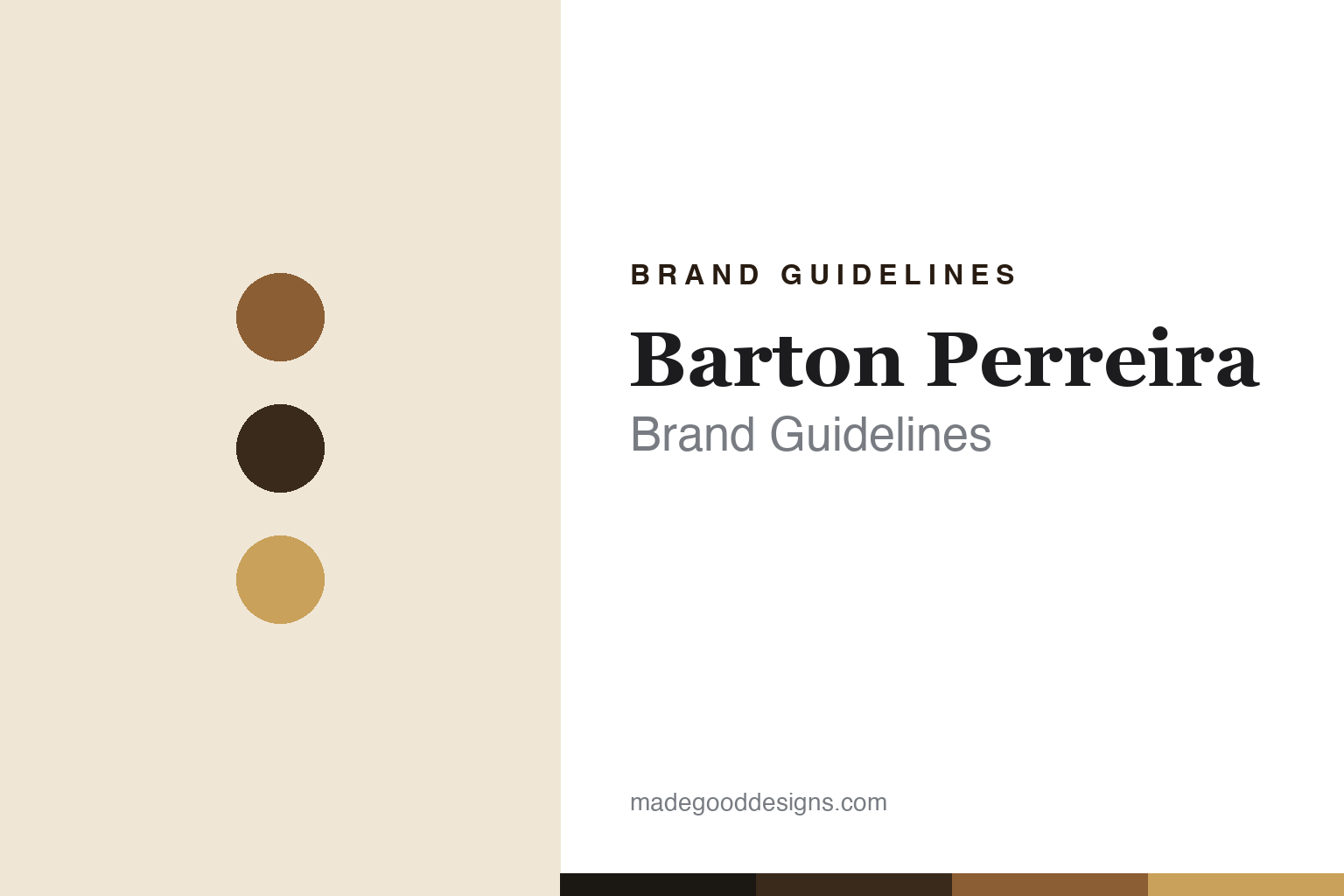
Barton Perreira Brand Guidelines
Quiet Hollywood luxury from Oliver Peoples alumni — handmade in Japan.
Aa
Two constants: a amber-and-brass tortoise palette and a letter-spaced serif. Abstract homage — not the Barton Perreira wordmark or logo.
Hollywood’s quiet glamour
Barton Perreira makes understated luxury eyewear.
Barton Perreira is a lesson in quiet luxury with a pedigree. It was founded in 2007 in Los Angeles by Bill Barton and Patty Perreira, both Oliver Peoples alumni: Patty Perreira is a celebrated, largely self-taught designer who spent close to two decades designing many of Oliver Peoples’ iconic styles, and Bill Barton is an Oliver Peoples business veteran. After Oliver Peoples was acquired by Oakley in 2006, they left to build their own house.
The positioning is understated Hollywood glamour — handcrafted, small-batch luxury with a “Southern California golden-hour” sensibility, favoured by actors and photographed on red carpets without shouting a logo. Frames are handmade in Japan (in Sabae, Japan’s eyewear capital), using high-grade Japanese acetate and titanium, with a single pair taking weeks.
Its most famous frame is the Joe, a polished black rectangular acetate style worn by Daniel Craig’s James Bond in No Time to Die (2021) — sold since as a “Joe 007” special edition — alongside catalogue models such as the Byron, Cassady and Stax. (Honest notes: it was founded in 2007 by Oliver Peoples alumni but is a separate, unaffiliated brand — not an Oliver Peoples sub-label; the Bond film is No Time to Die (2021), not 2020; the biggest correction is ownership — Barton Perreira was fully acquired by Thélios, the eyewear arm of LVMH, in 2023, so while its design is “independent in spirit,” it is no longer an independent company; and no official brand hex is published.)
Colour
Barton Perreira lives in an amber-and-brass tortoise palette. Click a swatch to copy the hex.
Barton Perreira’s identity is warm, refined and cinematic — a deep espresso tortoise, an amber cognac, a golden brass, a warm ivory, and a near-black lens shadow. The palette reads like fine acetate at golden hour: rich tortoises and warm metals, glamorous but restrained. It signals quiet luxury and Hollywood polish rather than loud branding — the look of a frame that whispers status. The honest caveat: with no published brand hex, these tones are an original, unofficial interpretation, not first-party values.
The lesson is an amber-and-brass tortoise palette signals quiet Hollywood luxury. Barton Perreira’s world reads as warm and expensive. For designers, it is a reminder that rich tortoise tones plus a golden-brass warmth convey understated glamour, matching a brand built on discreet, handcrafted luxury. The takeaways: use warm tortoise-and-brass tones for quiet glamour; let the acetate’s own colours lead; and treat any single hex as unofficial when there is no published spec.
Typography
The wordmark spirit is a letter-spaced serif — refined and quiet.
Barton Perreira’s identity carries a refined, quiet, cinematic spirit — a “Barton Perreira” wordmark set as a restrained, letter-spaced serif whose calm forms match understated luxury. A letter-spaced editorial serif captures the mood: it is elegant and unhurried, the register of quiet Hollywood glamour rather than a loud logo. Set against an amber-and-brass palette, the serif feels expensive and discreet — exactly the handmade, red-carpet personality Barton Perreira carries. It is refined rather than flashy, mirroring frames that carry no shouting mark. (Barton Perreira’s real wordmark is a trademark we describe but do not reproduce, and the exact typeface is not something we assert.) Because the specific mark is not ours to use, the honest description is “a letter-spaced serif spirit,” not the Barton Perreira logo. The type behaves like the brand: refined, quiet and cinematic.
Aa
A letter-spaced serif spirit — refined and quiet. (Specimen set in Prata, an elegant editorial serif; NOT the Barton Perreira logo, which is a trademark.)
Pedigree plus discretion as the difference
Barton Perreira stands for quiet luxury.
Barton Perreira is a lesson in turning pedigree into a discreet luxury brand. Its founders learned their craft at Oliver Peoples and carried that quiet-luxury DNA into their own house — no front logos, handmade in Japan, favoured by people who want glamour without a billboard. That combination of genuine design pedigree and disciplined discretion earned real Hollywood credibility (the Bond “Joe” among many red-carpet appearances) and, ultimately, acquisition by LVMH’s Thélios. It shows that a clear, restrained point of view can build a brand worth a conglomerate’s attention.
For designers and brand-builders, Barton Perreira offers a clear takeaway: craft pedigree plus discretion can create durable luxury. The lessons: let real experience (not just a name) inform the product; commit to discretion when the category is full of logos; and build cultural credibility through use, not shouting. It is also a reminder to keep the facts honest: Barton Perreira was founded in 2007 by Oliver Peoples alumni, is handmade in Japan, made the Bond “Joe” for No Time to Die (2021), and has been owned by LVMH’s Thélios since 2023 — with the palette here an unofficial interpretation. Barton Perreira turned pedigree into quiet luxury — proof that discretion can be the difference.
Explore & save
Keep Barton Perreira’s identity on hand — save it to a board in the Made Good inspiration library.
Barton Perreira identity set
Pin the amber-and-brass palette and the letter-spaced-serif spirit to your own board.


