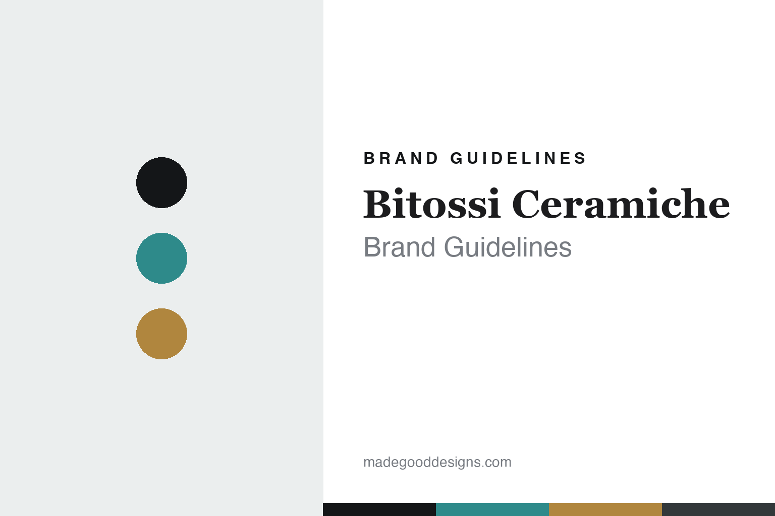
Bitossi Ceramiche Brand Guidelines
The mid-century glaze.
Aa
Two constants: a turquoise-and-ochre palette and a retro serif register. Abstract homage — not a Bitossi pattern or wordmark.
The mid-century glaze
Bitossi turned Tuscan clay into mid-century Italian art pottery.
Bitossi Ceramiche is a lesson in mid-century Italian art pottery as the identity. An Italian house from the ceramics town of Montelupo Fiorentino, it made clay into colour and texture — art pottery you know on sight.
Its identity is the mid-century glaze. Bitossi’s incised, richly glazed pieces — saturated colour, textured surfaces, expressive forms — are the work it is known for. Clay as mid-century art. The glaze, made unmistakable.
(Honest notes: Bitossi Ceramiche is an Italian ceramics house in Montelupo Fiorentino, a historic ceramics town in Tuscany near Florence, founded in 1921 by Guido Bitossi as the “Manifattura Maioliche Artistiche” — the family’s ceramic lineage in the area is claimed to reach back centuries (to around 1536), but that is heritage framing, not the 1921 founding. Its signature is mid-century Italian art pottery, defined above all by its long-serving art director Aldo Londi (1911–2003), whose iconic “Rimini Blu” collection (launched 1959), incised “graffito” glazes, saturated colours and expressive animal and figure forms became the house look, alongside continuous collaborations with designers like Ettore Sottsass and Patricia Urquiola. On production, it is handcrafted in Montelupo, in its own historic manufactory on the original site, with a foundation holding the archive. It is an independent, family-run company across five generations. Two honest notes: it should be distinguished from “Bitossi Home,” a separate tableware brand, and from the broader Bitossi industrial group; and Rimini Blu dates to 1959. Aldo Londi’s designs, the glazes and patterns are IP we describe but don’t reproduce. There’s no official brand hex — these tones are an unofficial interpretation. This is design commentary and does not promote any product.)
Colour
Bitossi lives in a turquoise-and-ochre palette. Click a swatch to copy the hex.
Bitossi’s identity is saturated, textured and Italian — a turquoise, an ink, an ochre, a graphite, and a chalk. The palette leans turquoise and ochre — the register of rich mid-century glazes on incised clay. It signals colour and craft rather than novelty. The honest caveat: with no published brand hex, these tones are an original, unofficial interpretation, not first-party values.
The lesson is a turquoise-and-ochre palette signals mid-century glaze. Bitossi’s world is a saturated, textured, Italian object. For designers, it is a reminder that a glaze and a hand — an art director’s colour and texture — can be the whole identity, and that a rich, mid-century palette signals that era. Because a mid turquoise can fail as small text, keep type dark and let the colour live in the accents, palette and band. The takeaways: own a glaze; texture the surface; keep the colour rich; and treat any single hex as unofficial.
Typography
The register is a retro serif — warm, expressive, characterful.
Bitossi’s identity carries a warm, expressive, characterful spirit — a saturated, mid-century object. A soft, retro serif captures the mood: it is warm and full of character, the register of mid-century Italian design. Set in a turquoise-and-ochre palette, the retro serif feels warm and expressive — exactly the personality Bitossi carries. It is characterful rather than plain, mirroring an incised, glazed piece. (Bitossi’s real patterns, glazes and wordmark are works we describe but do not reproduce, and the exact typeface is not ours to use.) Because it is not ours to use, the honest description is “a retro serif spirit,” shown here in a stand-in. The type behaves like the brand: warm, expressive and characterful.
Aa
A retro serif spirit — warm and expressive. (Specimen set in Fraunces, a retro serif STAND-IN; NOT the Bitossi wordmark.)
Mid-century Italian art pottery as identity
Bitossi Ceramiche stands for the mid-century glaze.
Bitossi Ceramiche is a lesson in making a glaze and a hand the identity. A turquoise-and-ochre palette, a retro serif and an incised, glazed piece make mid-century art pottery the whole brand — saturated, textured, Italian. The glaze is the differentiator. The differentiator is an art director’s vision: Aldo Londi’s colours, textures and forms, made real in a Tuscan manufactory the family has run for generations.
Put to work, the identity is a creative director as design. A house building in this spirit would find a singular art director, let their sensibility define a house look — a glaze, a texture, a palette — and keep making it on the original site, so the style becomes synonymous with the name. The lesson Bitossi teaches is that an art director plus a place can build a brand: a recognisable mid-century look, an own manufactory, and a warm, characterful design language give it an identity that reissues and new collaborations keep alive. The glaze is the memory, and Montelupo is the home.
For designers and brand-builders, Bitossi offers a clear takeaway: let a singular vision define the house. The lessons: own a glaze; empower an art director; stay rooted in a place; and be honest about the story. It is also a reminder to stay accurate: it was founded in 1921 (its ~1536 lineage is heritage framing, not a founding date), Rimini Blu dates to 1959, and it should not be confused with Bitossi Home or the broader Bitossi group — the palette here is an unofficial interpretation. And it is a reminder that made-where honesty can be a genuine boast: Bitossi is handcrafted in Montelupo, Italy, on its original site, and that is worth stating plainly. Bitossi Ceramiche made the mid-century glaze the brand — proof that a glaze can be the difference.
Explore & save
Keep Bitossi Ceramiche’s identity on hand — save it to a board in the Made Good inspiration library.
Bitossi Ceramiche identity set
Pin the turquoise-and-ochre palette and the retro-serif register to your own board.


