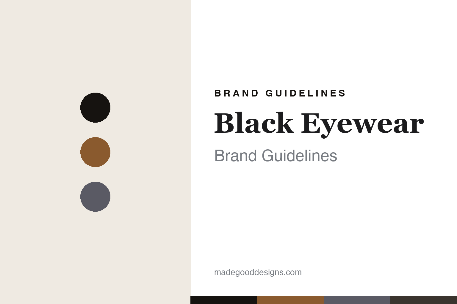
Black Eyewear Brand Guidelines
The jazz-revival frame.
Aa
Two constants: a smoky-cognac palette and a vintage serif register. Abstract homage — not the Black Eyewear frame or wordmark.
The jazz-revival frame
Black Eyewear revives 1950s frames, named for jazz greats.
Black Eyewear is a lesson in a jazz-themed revival as the identity. A British brand from London, it revives the bold eyewear of the 1950s and names each frame for a jazz figure.
Its identity is the jazz-revival frame. Black Eyewear’s acetate frames — bold, simple, iconic 1950s shapes, each dedicated to a jazz musician — are the work it is known for. Eyewear with a soundtrack. Vintage form, jazz spirit.
(Honest notes: Black Eyewear is a British eyewear brand based in London, with its own practice on Goodge Street, founded by career optician Robert Roope — the year is given as 2005 on its own About page and 2006 in press, so we hedge to 2005–06. Its stated mission is to “rescue the bold, simple, iconic eyewear styles of the 50s,” in acetate, and its signature is that each frame is dedicated to a jazz figure — confirmed models include Bird (Charlie Parker), Coltrane, Miles (Miles Davis), Cannonball (Cannonball Adderley) and Chet (Chet Baker), across round, aviator, cat-eye and panto shapes and a “Quartet” collection. On production, an honest gap: the brand makes no “made in” claim anywhere we could find — it is designed in Britain, with manufacturing undisclosed, so we don’t assert Italy, Japan or the UK. It is independent and founder-led. Because the model names are real jazz musicians’ names, whose estates are often licensed, we report the naming as fact but reproduce no portrait, likeness or signature; the Stanley Kubrick “client” story is press lore we only name-drop; and Nik Roope is a separate person, not the founder. There’s no official brand hex, and we reproduce no frame or logo — these tones are an unofficial interpretation. This is design commentary and does not promote any product.)
Colour
Black Eyewear lives in a smoky-cognac palette. Click a swatch to copy the hex.
Black Eyewear’s identity is warm, vintage and smoky — a cognac, an ink, a smoke, an espresso, and a cream. The palette leans smoky cognac — the register of warm acetate and late-night jazz-club tones. It signals heritage and mood rather than novelty. The honest caveat: with no published brand hex, these tones are an original, unofficial interpretation, not first-party values.
The lesson is a smoky-cognac palette signals a jazz revival. Black Eyewear’s world is a warm, vintage, atmospheric object. For designers, it is a reminder that a cultural theme — 1950s jazz — can be the whole identity, and that a warm, smoky palette signals that mood. Because a cognac can fail as small text, keep type dark and let the colour live in the accents, palette and band. The takeaways: revive an era; theme it; keep it warm; and treat any single hex as unofficial.
Typography
The register is a vintage serif — warm, characterful, mid-century.
Black Eyewear’s identity carries a warm, characterful, mid-century spirit — a vintage, jazz-tinged object. A high-contrast display serif captures the mood: it is elegant and period-tinged, the register of 1950s revival. Set in a smoky-cognac palette, the vintage serif feels warm and characterful — exactly the personality Black Eyewear carries. It is mid-century rather than modern, mirroring a revived frame. (Black Eyewear’s real frame and wordmark are works we describe but do not reproduce, and the exact typeface is not ours to use.) Because it is not ours to use, the honest description is “a vintage serif spirit,” shown here in a stand-in. The type behaves like the brand: warm, characterful and mid-century.
Aa
A vintage serif spirit — warm and characterful. (Specimen set in DM Serif Display, a high-contrast display serif STAND-IN; NOT the Black Eyewear wordmark.)
A jazz-themed revival as identity
Black Eyewear stands for the jazz-revival frame.
Black Eyewear is a lesson in building an identity from a cultural theme. A smoky-cognac palette, a vintage serif and a 1950s frame make a jazz revival the whole brand — warm, characterful, mid-century. The theme is the differentiator. The differentiator is reviving a specific era and threading a single idea — jazz — through every model name and every frame shape.
Put to work, the identity is a theme carried all the way through. A designer building in this spirit would pick one cultural world and commit to it completely, so naming, form and tone all reinforce the same story. The lesson Black Eyewear teaches is that a coherent theme plus real design can build a brand: 1950s revival shapes and jazz-dedicated names give it a memorable identity, and a warm, vintage design language keeps that theme consistent.
For designers and brand-builders, Black Eyewear offers a clear takeaway: pick a world and commit to it. The lessons: revive an era; theme it; keep it warm; and be honest about the story. It is also a reminder to hedge what conflicts: the founding year is given as 2005 or 2006, so we say 2005–06 — the palette here is an unofficial interpretation. And it is a reminder that made-where honesty sometimes means admitting a gap: the brand states no manufacturing country, so we don’t invent one. It is a reminder, too, that borrowed names carry other people’s IP: the jazz model names belong to real musicians, so we report the theme but reproduce no likeness. Black Eyewear made the jazz-revival frame the brand — proof that a theme can be the difference.
Explore & save
Keep Black Eyewear’s identity on hand — save it to a board in the Made Good inspiration library.
Black Eyewear identity set
Pin the smoky-cognac palette and the vintage-serif register to your own board.


