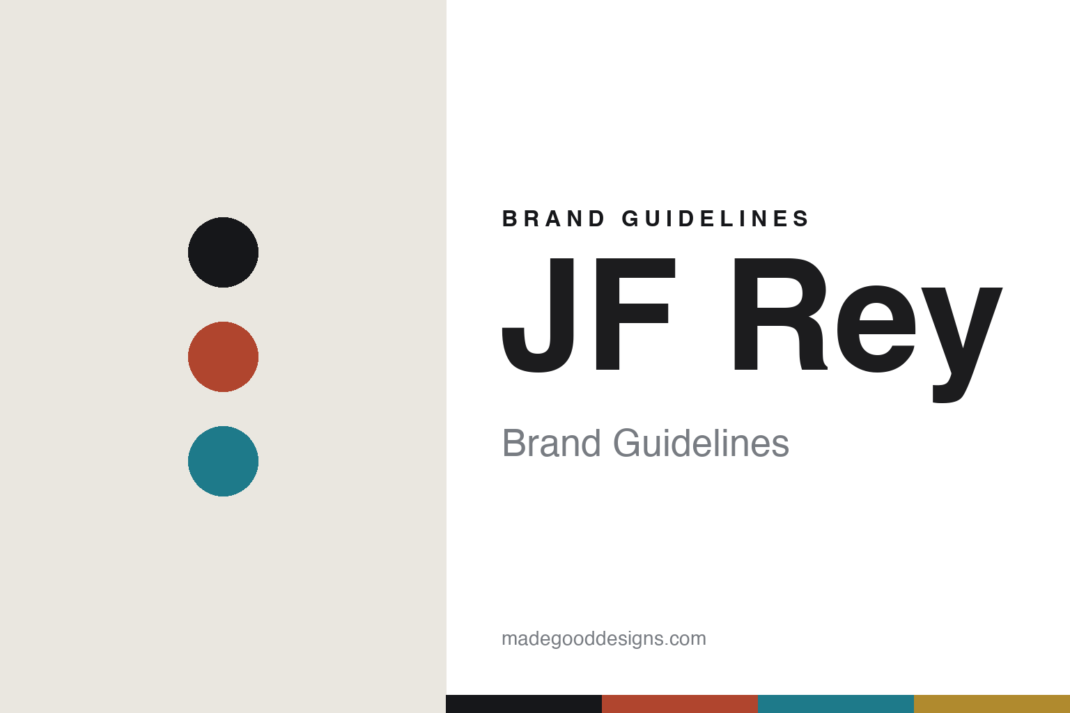
JF Rey Brand Guidelines
The bold-colour frame.
Aa
Two constants: a bold-contrast palette and a bold grotesque register. Abstract homage — not the JF Rey frame or wordmark.
The bold-colour frame
JF Rey makes eyewear loud, colourful and layered.
JF Rey is a lesson in bold, disruptive colour as the identity. A French design house from Marseille, it makes eyewear loud — fearless colour contrasts, layered and textured materials.
Its identity is the bold-colour frame. JF Rey’s expressive acetate, metal, carbon and wood frames — chromatic, graphic, unmistakably free — are the work it is known for. Eyewear as statement. Colour without apology.
(Honest notes: JF Rey is a French eyewear house based in Marseille, under parent company BLI-DBP, from designer Jean-François Rey, a third-generation eyewear maker from the Jura. The J.F. Rey company was created in 1995 — its “40 years in 2025” framing counts the designer’s earlier career from the 1980s, not the 1995 brand, so we don’t conflate the two; a “Joëlle Rey” co-founder appears in one source and is unconfirmed. Its signature is bold, disruptive colour — fearless chromatic contrasts, graphic and architectural lines, and layered, textured materials mixing acetate, metal, carbon and wood — placing it alongside French design pioneers like Alain Mikli and Emmanuelle Khanh, across lines such as Boz (its women’s line), Volte Face and Sky Eyes and current collections like Sledge, Carbonwood and Iconic40. On production, an important nuance: it is designed in France, with French assembly at its Ellaps factory, but the acetate itself is manufactured in Italy — so we don’t make a blanket “Made in France” claim, since material and per-model origins vary. Its independence in 2026 is unconfirmed, so we call it a designer-led house. There’s no official brand hex, and we reproduce no frame, sub-brand lockup or logo — these tones are an unofficial interpretation. This is design commentary and does not promote any product.)
Colour
JF Rey lives in a bold-contrast palette. Click a swatch to copy the hex.
JF Rey’s identity is loud, chromatic and expressive — a signal red, an ink, a bold teal, an ochre, and a bone. The palette leans bold contrast — the register of fearless colour and layered material. It signals expression and confidence rather than novelty. The honest caveat: with no published brand hex, these tones are an original, unofficial interpretation, not first-party values.
The lesson is a bold-contrast palette signals expressive design. JF Rey’s world is a loud, chromatic, confident object. For designers, it is a reminder that colour itself — fearless, contrasting, layered — can be the whole identity, and that a bold-contrast palette signals that expression. Even here, keep type dark and let the loud hues live in the accents, palette and band, so the colour reads without breaking legibility. The takeaways: be fearless with colour; layer the materials; stay graphic; and treat any single hex as unofficial.
Typography
The register is a bold grotesque — strong, graphic, confident.
JF Rey’s identity carries a strong, graphic, confident spirit — a loud, colourful object. A heavy grotesque sans captures the mood: it is bold and current, the register of expressive design. Set in a bold-contrast palette, the grotesque feels strong and graphic — exactly the personality JF Rey carries. It is confident rather than quiet, mirroring a loud frame. (JF Rey’s real frame, sub-brand lockups and wordmark are works we describe but do not reproduce, and the exact typeface is not ours to use.) Because it is not ours to use, the honest description is “a bold grotesque spirit,” shown here in a stand-in. The type behaves like the brand: strong, graphic and confident.
Aa
A bold grotesque spirit — strong and graphic. (Specimen set in Archivo, a heavy grotesque sans STAND-IN; NOT the JF Rey wordmark.)
Bold, disruptive colour as identity
JF Rey stands for the bold-colour frame.
JF Rey is a lesson in making colour the identity. A bold-contrast palette, a heavy grotesque and a chromatic frame make bold, disruptive colour the whole brand — loud, graphic, confident. The colour is the differentiator. The differentiator is refusing restraint — fearless contrasts, layered materials, expressive form — in a category that often plays it safe.
Put to work, the identity is expression as the product. A designer building in this spirit would lead with colour and material, letting a frame be a statement rather than a neutral, so the object stands out on sight. The lesson JF Rey teaches is that a distinctive, fearless design language can build a brand: bold colour and material layering give it an unmistakable identity, and a strong, graphic design language keeps that expression coherent.
For designers and brand-builders, JF Rey offers a clear takeaway: let colour be the position. The lessons: be fearless with colour; layer the materials; stay graphic; and be honest about the story. It is also a reminder to keep the timeline straight: the J.F. Rey company dates to 1995, and the “40 years” framing is the designer’s career — the palette here is an unofficial interpretation. And it is a reminder that made-where honesty means resisting an easy claim: it is designed and assembled in France, but its acetate is Italian-made, so we don’t say a blanket “Made in France.” JF Rey made the bold-colour frame the brand — proof that colour can be the difference.
Explore & save
Keep JF Rey’s identity on hand — save it to a board in the Made Good inspiration library.
JF Rey identity set
Pin the bold-contrast palette and the bold-grotesque register to your own board.


