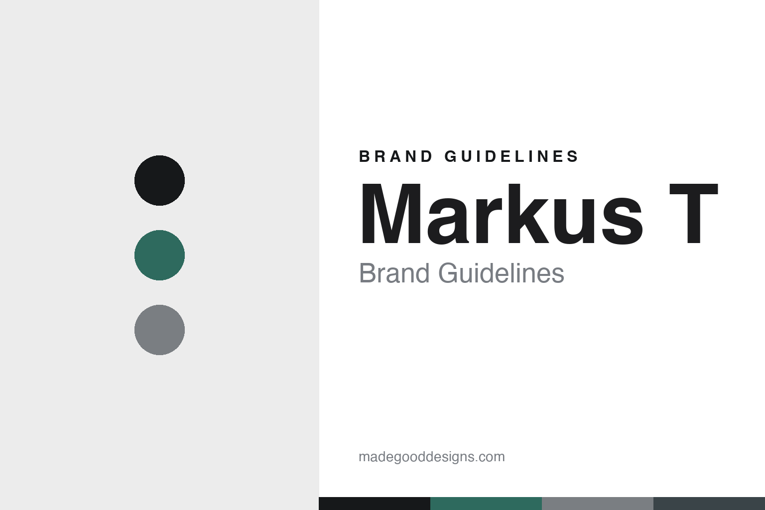
Markus T Brand Guidelines
The lightweight frame.
Aa
Two constants: a signal-and-titanium palette and a technical sans register. Abstract homage — not the Markus T frame or wordmark.
The lightweight frame
Markus T engineers ultra-light frames in its own German factory.
Markus T is a lesson in own-factory engineering as the identity. A German eyewear manufacturer from Gütersloh, it engineers ultra-light, screwless frames and makes them itself, in-house.
Its identity is the lightweight frame. Markus T’s frames — around 3.6 grams, built from a proprietary material and a patented screwless hinge — are the work it is known for, in a minimalist, often asymmetric design with bold colour combinations. Eyewear you barely feel. Engineering, made light.
(Honest notes: Markus T (Markus Temming GmbH) is a German eyewear manufacturer based in Gütersloh, with production in Isselhorst nearby — not Bochum — founded in 1999 (a 1998 date appears in a secondary source) by Markus Temming, an optician by training. Its signature is own-factory lightweight engineering — a proprietary lightweight polyamide it calls “TMi” (recyclable and anti-allergenic; the patent it cites is for a polyamide dye process for TMi, so we hedge the exact patent scope) and a patented screwless hinge that “marks every collection,” with titanium frames using nylon fibres instead of screws — noting it is a screwless hinge, not a hingeless frame. Frames start around 3.6–3.7 grams, in a minimalist, often asymmetric design with bold colour combinations, across collections like DESIGN, MIO and DOT, and it has earned some forty design distinctions including Red Dot and iF awards. On production, it is genuinely 100% made in Germany, in its own in-house manufacture in a redeveloped grain distillery — a real own-factory story. It is an independent, founder-led manufacturer. Its TMi material and screwless hinge are patented IP we describe but don’t reproduce. There’s no official brand hex, and we reproduce no frame, hinge mechanism or logo — these tones are an unofficial interpretation. This is design commentary and does not promote any product.)
Colour
Markus T lives in a signal-and-titanium palette. Click a swatch to copy the hex.
Markus T’s identity is engineered, light and precise — a signal green, an ink, a titanium, a graphite, and a white. The palette leans signal and titanium — the register of engineered lightness and bold colour accents on metal. It signals technology and craft rather than novelty. The honest caveat: with no published brand hex, these tones are an original, unofficial interpretation, not first-party values.
The lesson is a signal-and-titanium palette signals engineered lightness. Markus T’s world is an engineered, light, precise object. For designers, it is a reminder that an engineering feat — a screwless hinge, a 3.6-gram frame — can be the whole identity, and that a signal-and-titanium palette signals that precision. Because a signal green can fail as small text, keep type dark and let the colour live in the accents, palette and band. The takeaways: engineer the lightness; own the factory; add bold colour; and treat any single hex as unofficial.
Typography
The register is a technical sans — precise, engineered, modern.
Markus T’s identity carries a precise, engineered, modern spirit — a light, technical object. A technical grotesque sans captures the mood: it is exact and current, the register of engineered design. Set in a signal-and-titanium palette, the technical sans feels precise and engineered — exactly the personality Markus T carries. It is technical rather than decorative, mirroring a lightweight frame. (Markus T’s real frame, hinge mechanism and wordmark are works we describe but do not reproduce, and the exact typeface is not ours to use.) Because it is not ours to use, the honest description is “a technical sans spirit,” shown here in a stand-in. The type behaves like the brand: precise, engineered and modern.
Aa
A technical sans spirit — precise and engineered. (Specimen set in Space Grotesk, a technical grotesque sans STAND-IN; NOT the Markus T wordmark.)
Own-factory engineering as identity
Markus T stands for the lightweight frame.
Markus T is a lesson in making engineering the identity. A signal-and-titanium palette, a technical sans and an ultra-light frame make own-factory engineering the whole brand — engineered, light, precise. The engineering is the differentiator. The differentiator is a proprietary material and a patented screwless hinge, made into a 3.6-gram frame in its own German factory.
Put to work, the identity is engineering as design. A designer building in this spirit would solve a hard technical problem — weight, a screwless joint — and let that solution define the product, so the object could not easily be copied. The lesson Markus T teaches is that owning the making and the technology can build a brand: its own factory, its TMi material and its patented hinge give it genuine authority, and a precise, technical design language keeps that engineering legible — while bold colour keeps it from feeling clinical.
For designers and brand-builders, Markus T offers a clear takeaway: let a technical solution define the object. The lessons: engineer the lightness; own the factory; add bold colour; and be honest about the story. It is also a reminder to stay accurate: it is based in Gütersloh, not Bochum, and founded in 1999, and its patent covers a dye process for TMi — the palette here is an unofficial interpretation. And it is a reminder that made-where honesty can be a genuine boast: Markus T is 100% made in Germany, in its own factory, and that is worth stating plainly. Markus T made the lightweight frame the brand — proof that engineering can be the difference.
Explore & save
Keep Markus T’s identity on hand — save it to a board in the Made Good inspiration library.
Markus T identity set
Pin the signal-and-titanium palette and the technical-sans register to your own board.


