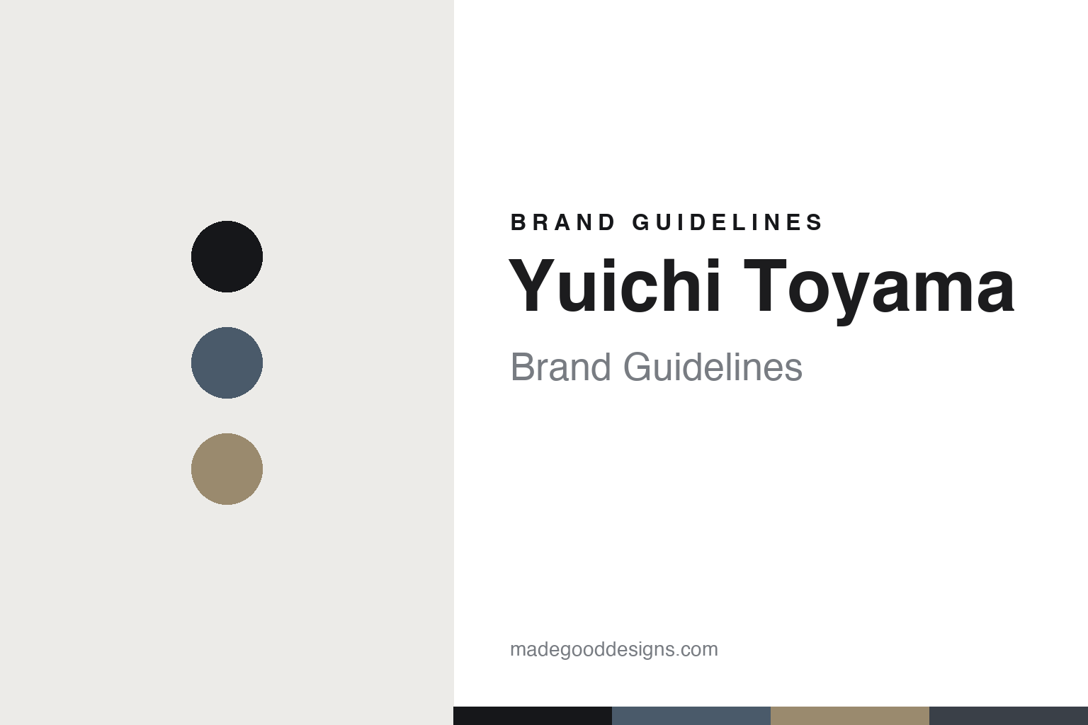
Yuichi Toyama Brand Guidelines
The architectural frame.
Aa
Two constants: a steel-and-acetate palette and a geometric sans register. Abstract homage — not the Yuichi Toyama frame or wordmark.
The architectural frame
Yuichi Toyama builds a frame like a small structure.
Yuichi Toyama is a lesson in architectural minimalism as the identity. A Japanese design eyewear house made in Sabae, it treats a frame like a small structure — pure design and structural aesthetics.
Its identity is the architectural frame. Yuichi Toyama’s metal-and-acetate combination frames — delicate metal-wire and titanium constructions that combine opposites, soft against angular — are the work it is known for. Eyewear as structure. Every line, considered.
(Honest notes: the brand is the eponymous label of designer Yuichi Toyama, run by Atelier Cinq Co., Ltd. in Tokyo. Toyama’s eyewear career began in 1993 in Fukui, but the brand itself started as “USH” in 2009 and was renamed “YUICHI TOYAMA.” in 2017 — so we date it to 2009/2017, not 1993, a common misreport. Its signature is architectural minimalism — metal-and-acetate combination frames, delicate metal-wire and titanium work, designed by a five-step method the studio calls Look, Think, Draw, Make, Break — across models like the TOKYO and KYOTO from its premium “YUICHI TOYAMA : 5” line, made with Sabae master craftspeople. On production, it is genuinely made in Japan, in Sabae, Fukui — the exact factory isn’t named, but Sabae craftsmanship is central. It is an independent, designer-led house. Its wordmark carries a trailing period, and its Armani and TOGA collaborations are third-party IP. There’s no official brand hex, and we reproduce no frame or wordmark — these tones are an unofficial interpretation. This is design commentary and does not promote any product.)
Colour
Yuichi Toyama lives in a steel-and-acetate palette. Click a swatch to copy the hex.
Yuichi Toyama’s identity is structural, quiet and refined — a steel, an ink, a sand, a graphite, and a chalk. The palette leans steel and acetate — the register of metal-wire construction and warm acetate. It signals architecture and craft rather than novelty. The honest caveat: with no published brand hex, these tones are an original, unofficial interpretation, not first-party values.
The lesson is a steel-and-acetate palette signals architectural craft. Yuichi Toyama’s world is a structural, quiet, considered object. For designers, it is a reminder that a construction method — combining metal and acetate, soft and angular — can be the whole identity, and that a steel-and-acetate palette signals that architecture. Because a steel tone can fail as small text, keep type dark and let the colour live in the accents, palette and band. The takeaways: build the structure; combine opposites; keep it quiet; and treat any single hex as unofficial.
Typography
The register is a geometric sans — structural, precise, quiet.
Yuichi Toyama’s identity carries a structural, precise, quiet spirit — an architectural, considered object. A geometric sans captures the mood: it is exact and calm, the register of structural minimalism. Set in a steel-and-acetate palette, the geometric sans feels structural and precise — exactly the personality Yuichi Toyama carries. It is architectural rather than decorative, mirroring a combination frame. (Yuichi Toyama’s real frame and wordmark are works we describe but do not reproduce, and the exact typeface is not ours to use.) Because it is not ours to use, the honest description is “a geometric sans spirit,” shown here in a stand-in. The type behaves like the brand: structural, precise and quiet.
Aa
A geometric sans spirit — structural and precise. (Specimen set in Jost, a geometric sans STAND-IN; NOT the Yuichi Toyama wordmark.)
Architectural minimalism as identity
Yuichi Toyama stands for the architectural frame.
Yuichi Toyama is a lesson in making structure the identity. A steel-and-acetate palette, a geometric sans and a combination frame make architectural minimalism the whole brand — structural, precise, quiet. The construction is the differentiator. The differentiator is treating a frame like a small building — metal and acetate combined, soft and angular balanced, every line resolved.
Put to work, the identity is method as design. A designer building in this spirit would follow a clear process — look, think, draw, make, break — and let structure, not ornament, carry the object, so the frame reads as considered architecture. The lesson Yuichi Toyama teaches is that a design method plus genuine craft can build a brand: a disciplined, five-step approach and Sabae manufacture give it a quiet authority, and a structural, geometric design language keeps that architecture legible.
For designers and brand-builders, Yuichi Toyama offers a clear takeaway: let structure carry the object. The lessons: build the structure; combine opposites; keep it quiet; and be honest about the story. It is also a reminder to stay accurate: the brand began as USH in 2009 and was renamed in 2017 — not 1993, the designer’s career start — and the palette here is an unofficial interpretation. And it is a reminder that made-where honesty can be a genuine boast: Yuichi Toyama is made in Sabae, Japan, and that is worth stating plainly. It is a reminder, too, that a wordmark and collaborations carry IP, so we describe them but reproduce nothing. Yuichi Toyama made the architectural frame the brand — proof that structure can be the difference.
Explore & save
Keep Yuichi Toyama’s identity on hand — save it to a board in the Made Good inspiration library.
Yuichi Toyama identity set
Pin the steel-and-acetate palette and the geometric-sans register to your own board.


