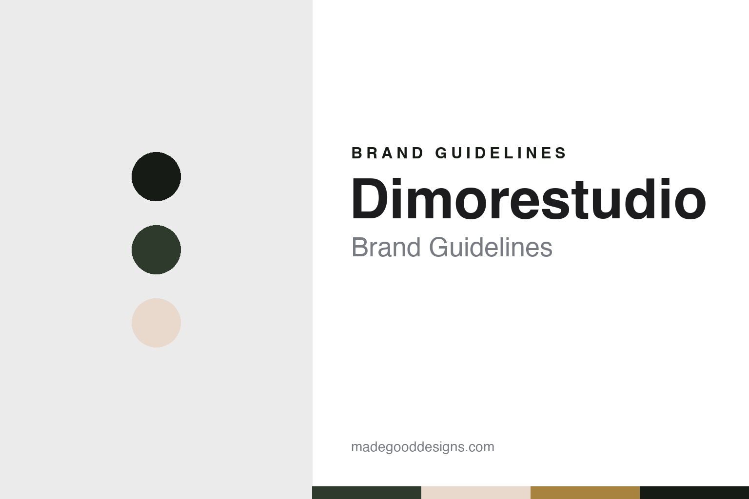
Dimorestudio Brand Guidelines
A Milan studio that dresses rooms with several decades at once.
Aa
Two constants: a Dimorestudio green and brass palette and a Display serif register. Abstract homage — not a Dimorestudio product or mark; no furniture, interior or logo is reproduced.
Two partners in Brera
A graphic designer and an art director.
Dimorestudio is an architecture and interiors practice in Milan, founded in 2003 by Britt Moran and Emiliano Salci. The studio writes its name as one word; Dezeen, which gave the same founding year and city in two articles in 2017, has written it as “Dimore Studio.” The studio’s own account describes Moran as a former graphic designer from North Carolina and Salci as a former art director at the furniture company Cappellini, and says it works on residential, retail and hospitality projects.
The name comes from Italian. Moran is quoted on the studio’s website explaining that “dimore” means dwellings but calls up old villas with aristocratic roots, which gives the name a sense of nostalgia; the studio, he says, takes a historical approach to a project and then adds a contemporary feel.
WWD, the American fashion trade paper, profiled the pair in September 2016. It said Salci had held a creative role at Cappellini before the studio was set up, that Moran mainly handled contracts and administration, and that a 2008 commission from Milan’s Grand Hotel et de Milan, to revamp its interiors and decorate its Caruso restaurant, was the point from which the firm grew. The paper put the staff at 30 at that time. It also reported that the studio’s furniture was sold at Dimore Gallery, which opened in 2013 in the same building as the studio on Via Solferino, in the Brera district, alongside vintage pieces by designers such as Gio Ponti, Franco Albini and Jean Prouvé.
Colour
Rooms that mix the decades.
The press has described the studio’s interiors as a mix of periods. WWD described a style that avoids cold minimalism without becoming flamboyant, and quoted Salci on the pair’s interest in the 1930s and in the decades between Art Deco and the 1960s. Projects that the paper credited to the studio in 2016 included suites inside Palazzo Fendi in Rome, opened that March, and the Hotel Saint-Marc in Paris. Dezeen reported in April 2017 that the studio had completed the second Aesop shop in Milan in 2016, and later described its green subway tiles and lemon-yellow shelving.
Milan design week is a regular stage for the studio. In April 2017, Dezeen reported two exhibitions in Brera: an apartment on Via Solferino furnished with its lighting, furniture and hand-painted tiles, with Art Deco references, mirrored details and rooms in pale blue and pink. The show opened with a wall of patterned tiles that the studio designed to look like faceted origami, and striped and wavy graphics on the floors were meant to suggest movement in the manner of the artist Gianni Piacentino. The second was a show called Veranda at the Circolo dei Reduci e Combattenti on Via Alessandro Volta, with garden furniture in slender enamelled iron and a collection of striped textiles in blue, green and gold. In September 2017, for the London Design Festival, Dezeen reported an installation called (Un)Comfort Zone at the Mazzoleni gallery in London, credited to the spin-off Dimore Gallery, with five furnished rooms set around the gallery’s post-war Italian art. Moran told the magazine that the pair had tried to make it almost like a set design for a film, and Dezeen wrote that the duo offered an alternative to the minimalism that had dominated interior design. WWD had reported a similar indoor-outdoor veranda, a winter garden, at Design Miami/Basel in June 2016.
The furniture carries plain, numbered names. Dezeen listed a mirrored wooden cabinet called Armadio 098 and a wood and steel armchair called Poltrona 102 in London; WWD said the line had started with a table and an armchair, and that a range of interior fabrics was produced in house in Como.
Typography
Design and documentation.
Interior-design practices rarely build their identity the way product brands do. Most trade under the names of their founders, either as a pair of surnames, as Yabu Pushelberg does, or as a single word that joins the studio and its founder, as Studioilse does. The name appears on the website, in press credits and on furniture collections, and it is usually set plainly, with the work itself left to carry the character.
Project photography does much of that work. The practices in this guide present hotels, restaurants, shops and homes through photographs credited to named photographers, with short project titles, a city and a year. Trade magazines such as Dezeen and Wallpaper* usually report a project when it opens, quoting the designers on materials, colours and the building they started from, and those dated reports are the main record of who designed what.
Many practices also design furniture, lighting and objects, often with established manufacturers, and show them at furniture fairs, in exhibitions or in their own studios. Some publish books on their work or write about design more widely. Founders and partners are presented in their professional roles: as designers, creative directors or teachers, and as the people quoted when a project is published.
Offices are described plainly, often as a city and a building, and some practices treat their own studio as a project in its own right. Pages on history and clients tend to be short. This guide sets out what dated sources say about each practice: when and where it was founded, who leads it, and which projects and collections are credited to it, leaving out award lists and private clients.
Aa
A high-contrast display serif — numbered pieces and mixed periods. (Specimen set in Bodoni Moda, a serif STAND-IN; NOT the Dimorestudio logo.)
Dimorestudio
From studio to brand.
In 2019 the founders split their product work into a separate label. The studio’s website calls Dimoremilano a contemporary brand founded that year for furnishings, textiles and lighting. Designboom reported in April 2019 that it was launched at Milan design week with an exhibition called Interstellar, divided by silk curtains into an office, a living room, a dining room and a bedroom, and using aluminium, lacquers, brushed and polished steel, bronze and laminates. Pieces kept the numbered naming, such as the star-shaped Lampada 127 light over a round dining table with mirrored mosaics, the Letto 134 bed and the Divano 139 sofa, and the fabrics had names such as Boulevard and Kiss Me Tiger. Designboom called the engraved bronze doors in the show a signature of the studio. The fabric collection, with geometric forms, printed jacquards and plain colours, was shown in a second building in small rooms hung with photographs of Milan by Andrea Ferrari.
The practice now presents itself in two parts: Dimorestudio for architecture and interiors, and Dimoremilano for the objects it makes. Its website is dimorestudio.eu. Its words are short and descriptive, with rooms, materials and period references doing most of the work, and its furniture is named by type and number rather than by invented names.
For a design guide, Dimorestudio shows how an interiors practice can turn a consistent way of mixing decades into a product brand without changing its voice. Compare India Mahdavi, a Paris studio that also designs and sells its own furniture, and Roman and Williams, a New York practice with its own shop. For this guide we use a bottle green and an old brass with a serif, an unofficial interpretation; no product or logo is reproduced.
Explore & save
Keep Dimorestudio’s identity on hand — save it to a board in the Made Good inspiration library.
Dimorestudio identity set
Pin the Dimorestudio green and brass palette and the Display serif register to your own board.
Source & notes
Frequently Asked Questions
What font can I use to match the Dimorestudio look?
This guide describes Dimorestudio’s type as “A high-contrast display serif — numbered pieces and mixed periods”. Its type specimen is set in Bodoni Moda from Google Fonts as a stand-in; Bodoni Moda is not Dimorestudio’s own lettering.
What colours are in the Dimorestudio palette?
This guide’s Dimorestudio palette is Bottle green #2E3B2C, Ink #161C15, Powder rose #E9D9CC, Old brass #A8823F and Paper #F8F4EE. The tones are the guide’s own unofficial interpretation, not official Dimorestudio hex codes.
When was Dimorestudio founded?
Dimorestudio was founded in 2003, in Milan.
Who founded Dimorestudio?
Dimorestudio was founded by Britt Moran and Emiliano Salci in 2003.