Esselunga Brand Guidelines
The Milan supermarket named after a stretched letter.
Aa
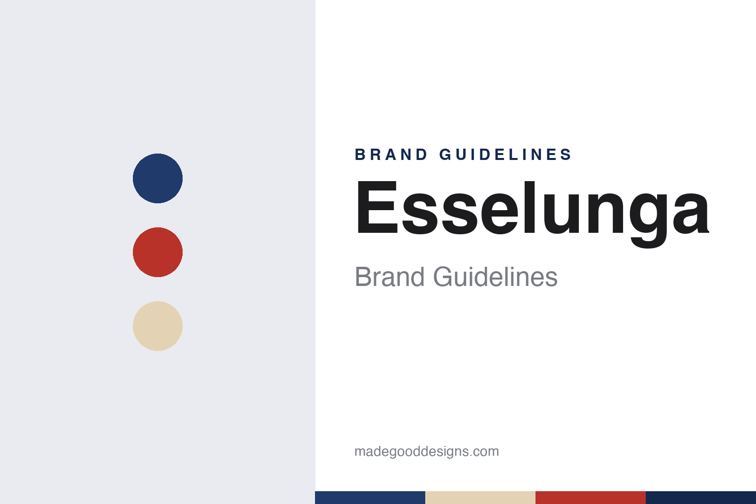
Two constants: an Esselunga blue, red and birch palette and a Swiss sans register. Abstract homage — not an Esselunga product or mark; no sign, logo or package is reproduced.
Supermarkets Italiani
An American venture in Milan, 1957.
Esselunga began as Supermarkets Italiani S.p.A., set up in Milan on 13 April 1957. Italian Wikipedia says the company was founded by Nelson Rockefeller’s International Basic Economy Corporation, which held 51 per cent, with Italian partners including the textile industrialists Bernardo and Guido Caprotti, Mario and Vittorio Crespi and Marco Brunelli; English Wikipedia also names Claudio Caprotti among the founders.
The first store opened on 27 November 1957 in a former workshop on viale Regina Giovanna in Milan. The company’s own timeline describes it as 500 square metres with 1,600 articles, a modern supermarket of American inspiration. Italian Wikipedia says the Italian partners wanted the stores to look and run like American ones, down to the name: they chose the plain word “Supermarket” over Italian alternatives. Florence followed on 9 February 1961, with a store on via Milanesi. In 1961, Italian Wikipedia says, the Caprotti brothers bought the American stake, and Bernardo Caprotti became chief executive in 1965.
Today the operating company is Esselunga S.p.A., controlled by Supermarkets Italiani; English Wikipedia says the Caprotti family owns it entirely through that holding. Its base is at Limito di Pioltello, east of Milan, where the company says it began making ravioli, sliced bread and ice cream, and roasting coffee, in 1959. Italian Wikipedia lists stores in Lombardy, Veneto, Piedmont, Emilia-Romagna, Tuscany, Liguria, Lazio and Trentino-Alto Adige; the first in that last region opened at the WaltherPark centre in Bolzano on 16 October 2025, it says.
Colour
Max Huber’s letter.
The name came from a sign. The Swiss graphic designer Max Huber drew the “Supermarket” logotype in 1957, according to the Archivio Grafica Italiana, an online archive of Italian graphic design; its initial S had an upper stroke stretched out over the rest of the word. Customers began calling the stores Esselunga — “long S” — and that became the official name. The archive says the letter was first drawn as an outline and soon used as a solid shape, that from 1960 it appeared alongside a new “Esselunga” logotype, redesigned in the early 1970s, and that the initial S is still in use.
Accounts of the timing differ. The company’s timeline says Huber’s long S became the mark of the Esselunga supermarkets in 1964. Italian Wikipedia links the nickname to a 1969–1971 advertising campaign built on the line “le mille lire lunghe” — the “long thousand lire” — at “the supermarket with the long S.” The company says its work with the advertising agency Armando Testa began in 1978, when the agency turned the nickname into a logo; Italian Wikipedia says Armando Testa gave the logo its current version in 1987.
Advertising has carried much of the identity since. The company says its first poster campaigns, from 1967, promoted the advantages of shopping at a supermarket rather than individual products, and that some were drawn by the cartoonist Benito Jacovitti. With Armando Testa came “Esselunga prezzi corti” — long S, short prices — in 1979. Italian Wikipedia says the 1996 series “Da noi la qualità è qualcosa di speciale,” in which fresh foods took on personalities, ran to more than 70 subjects and that its posters are held in the Louvre’s poster collection. In 2001 it was followed by “Famosi per la qualità,” in which foods became famous characters from history, art, film and fairy tales, the company says, with puns such as John Lemon.
Typography
Fascias, own labels and owners.
Italian retail chains present themselves first through the fascia, the name over the door, and one group often runs several. Esselunga trades as Esselunga, as laEsse for smaller neighbourhood stores and as Bar Atlantic for its coffee bars; Conad’s network includes Conad City, Spazio Conad and Margherita Conad, names that signal the size of a store as much as its owner.
Own-label ranges carry much of that identity. Grocers put their own name on packaging and then build sub-brands for price, origin or occasion, and they publish flyers, in print and in apps, alongside advertising campaigns that can run for years. Several of the brands in this guide have worked with outside graphic designers and advertising agencies, and some of that work, such as Max Huber’s long S for Esselunga, is now kept in design archives.
Ownership structures differ, and each guide states them plainly. Some chains are family-controlled companies with a holding company above them; some are cooperatives, in which independent shopkeepers own the stores and share purchasing, logistics and a common mark; others are brands inside a larger fashion or retail group, or the Italian arm of a foreign group, and some have been listed on the stock exchange. Each guide names the owner as a dated source gives it, and says plainly when a business changed hands.
The guides draw on what the companies publish about themselves (their timelines, founders’ pages, store formats and investor pages) and check it against independent dated sources: Italian and English Wikipedia, the business and trade press, and official records such as decisions of Italy’s competition authority. Where a company’s own account and an independent source differ, both are given.
Aa
A Swiss sans — a nod to Max Huber’s long S. (Specimen set in Archivo, a sans STAND-IN; NOT the Esselunga logo.)
Esselunga
Stores, bars and own labels.
Own labels go back a long way. Italian Wikipedia says the American managers of the early years started private-label products such as packaged sliced bread, and that Esselunga frozen foods, launched with Armando Testa in 1979, were followed by lines such as Naturama, Bio and Top. In 2019 the company added Smart, a low-price range marked in yellow, Italian Wikipedia says, and that December the smaller laEsse fascia for neighbourhood stores. The pastry brand Elisenda, made with the chefs of the Da Vittorio restaurant, dates from 2018, the company says.
Architecture is part of the story. Italian Wikipedia names architects including Mario Botta, Luigi Caccia Dominioni, Ignazio Gardella, Vico Magistretti, Renzo Piano and Gio Ponti among the designers of its stores. The Bar Atlantic coffee bars began in 2003 at Pantigliate, in a design by Magistretti with blue tiles and walls lined in Finnish birch, the company says. On 12 November 2026 Milano Città Stato reported that Esselunga had opened its first two Bar Atlantic sites in buildings separate from its supermarkets, on via Pezzotti on 30 October and on viale Papiniano on 11 November, bringing the brand to 135 bars in eight regions. In Florence, the trade site GDONews reported on 29 October 2026 that the Galluzzo store, opened in November 2014 with a partly underground structure, exposed brick facades and a green roof, had grown from about 2,500 to 3,581 square metres without any new building volume, adding a wine shop and a parafarmacia counter.
For a design guide, Esselunga shows how one stretched letter can become a company’s name. Compare Conad, the cooperative grocery group from Bologna, and Carrefour, another supermarket name built around a single letter. For this guide we use a deep blue, a poster red and a birch tone with a sans, an unofficial interpretation; no product or logo is reproduced.
Explore & save
Keep Esselunga’s identity on hand — save it to a board in the Made Good inspiration library.
Esselunga identity set
Pin the Esselunga blue, red and birch palette and the Swiss sans register to your own board.