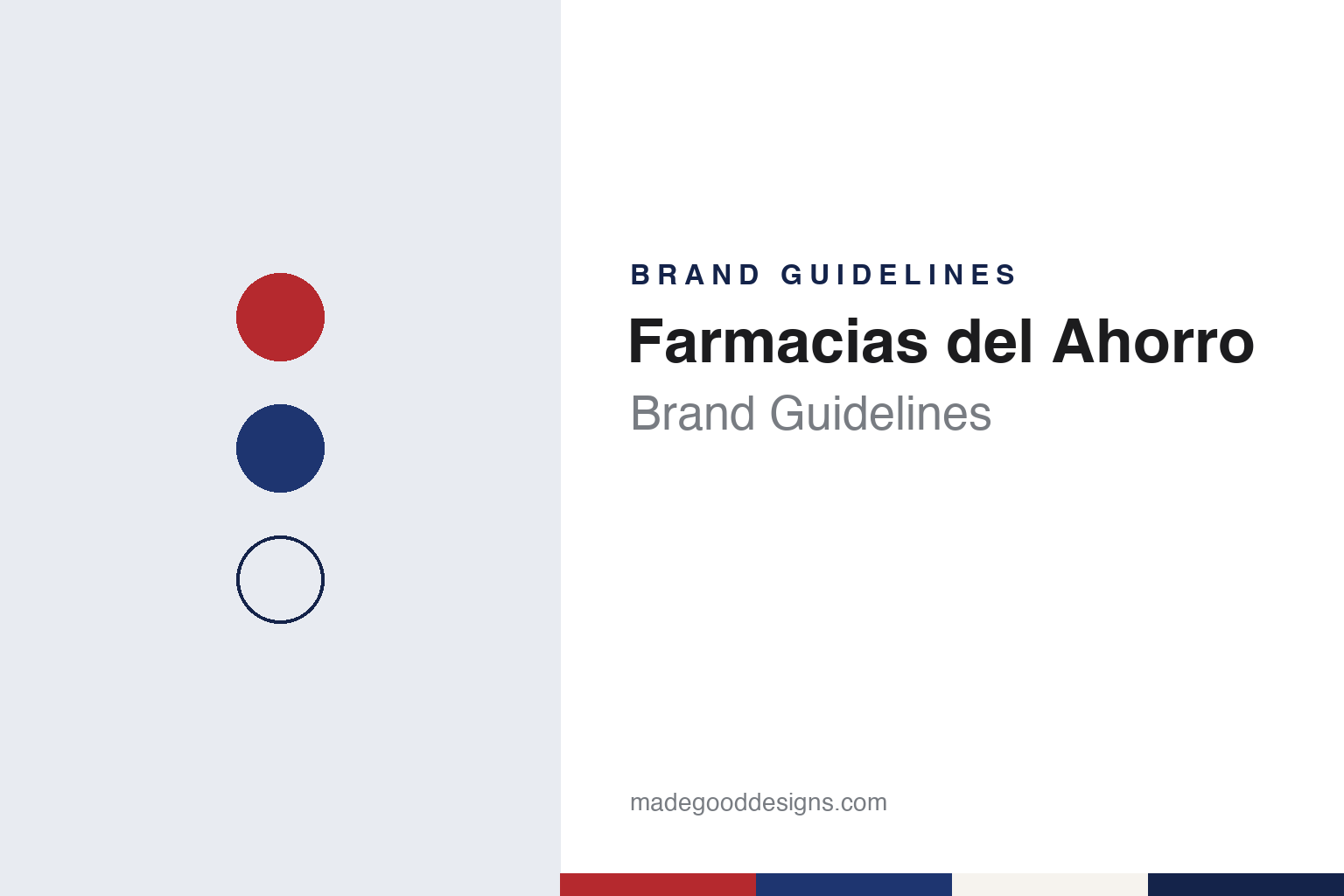
Farmacias del Ahorro Brand Guidelines
A 1991 Chiapas chain, a capital A and a loyalty wallet.
Aa
Two constants: a red, deep blue and warm white palette and a bold retail sans register. Abstract homage — not a Farmacias del Ahorro asset; no logo, sign or pack is reproduced.
Farmacia Regia
A Chiapas pharmacy family renames its shops.
Farmacias del Ahorro began in Tuxtla Gutiérrez, the capital of the southern Mexican state of Chiapas. Its roots go back to 1976, when Maximiliano Leonardo Asturias, who had worked as a representative for several pharmaceutical laboratories, opened a pharmacy business called Farmacia Regia. El Siglo de Torreón reported in May 2026 that the company was founded under that name in Tuxtla Gutiérrez, and El CEO, drawing on an interview the founder gave to the consultancy BacherZoppi, wrote in March 2023 that the family’s Farmacia Regia shops traded from 1976 until 1990.
In 1991 his son Antonio Leonardo Castañón proposed modernising the small chain and giving it a new name. According to the same El CEO report, the founder drew up a list of possible names before settling on “Farmacias del Ahorro”, roughly “savings pharmacies”, and gave it to a first shop of about 75 square metres; Antonio Leonardo Castañón started as chief executive that year, the interview says. Tus Buenas Noticias dated the public opening to 14 September 1991 in Tuxtla Gutiérrez and wrote in February 2026 that father and son founded the first four branches. Another son, Maximiliano Leonardo Castañón, joined as director of purchasing and marketing, El CEO reported.
The chain grew from that base. In its early years, home deliveries went out by bicycle through the streets of Chiapas, the company’s director general, Rafael Selvas, told El CEO in November 2026, as the business marked its 35th year. El Siglo de Torreón described a model built on selling in volume rather than on high margins, and wrote that in 1991 the business took on the format and image it still uses.
Colour
A capital A, a franchise arm and a loyalty wallet.
The name came with a mark. El CEO reported in 2023 that the logo was devised by Antonio Leonardo Castañón, who suggested building it around a distinctive letter “A”, and that the family set out to create a modern, well-presented pharmacy. Tus Buenas Noticias described the logo in February 2026 as a capital “A” on a red ground with blue lettering, also designed by him. In advertising, El Siglo de Torreón pointed in May 2026 to a jingle built on the line “¡Te queremos bien!”, which the paper said many readers would find hard to read without singing.
The chain runs both company-owned shops and franchises. Figures from the retail association ANTAD, quoted by El CEO in 2023, gave 849 own pharmacies and 192 franchises as of 2021, served by four distribution centres, including a large one in Lerma, in the State of Mexico, which also supported a home-delivery service. By May 2026, El Siglo de Torreón put the network at more than 2,000 branches across Mexico. Online, Comscore data cited by El CEO in August 2026 gave the chain an average of about 2 million unique monthly visitors to its website, where customers can browse and order, and about 1.9 million followers across its social media accounts.
Services sit alongside the shop counter. Antonio Leonardo Castañón told the podcast Orgullosamente Tercos, as El Siglo de Torreón reported, that the loyalty programme and free consultations are among the pillars of the business; the paper put the number of active loyalty wallets, the Monedero del Ahorro, at around 22 million. In November 2026, Selvas told El CEO that the chain runs an online marketplace focused on health products and offers medical consultations inside its stores. In 2023 the company bought an electronic-payment institution licence that was not yet operating, and with it built Cuenta Monedero, a debit account with a Visa card for deposits, transfers and remittances, launched in May 2026 and offered in all branches, according to the same interview.
Typography
Design and documentation.
Mexican supermarket, pharmacy, discount and footwear chains tend to show their identity less through one logo than through a family of names. A grocer may run a hypermarket, a supermarket, a warehouse store and a neighbourhood shop side by side, and the format names do the sorting: a prefix or suffix such as Híper, Súper, Mercado or Express, or a diminutive for the smallest stores, tells shoppers what size of shop to expect before they walk in.
Promotions and own programmes carry weight too. Seasonal campaigns with their own names, loyalty cards and printed or online flyers appear on the companies’ own pages as part of how the stores present themselves, and some promotion names have outlived the chains that created them, moving with the stores when they changed hands. Mascots, catalogues and house ranges play a similar role for pharmacy and footwear sellers, and a guide can describe them only as the companies publish them.
Ownership is usually stated plainly. Several of these groups began as family shops in a single city and still describe their founders, holding companies and stock-exchange listings on corporate pages; takeovers between rivals recur, and a store can carry several names over its life. Regulators have a part in that story: competition reviews can decide which stores a buyer may keep.
For a designer, the useful lesson is the system rather than any single mark: how a palette, a sans and a set of format names can scale from a large hypermarket to a corner store without losing the parent name. In this guide the palette and type are an unofficial interpretation; no logo, fascia or product is reproduced.
Aa
A bold retail sans for a name built around one capital letter. (Specimen set in Archivo, a sans STAND-IN; NOT the Farmacias del Ahorro logo.)
Farmacias del Ahorro
A family chain from Chiapas, still run by its founders’ family.
Ownership has stayed with the founding family. El CEO and Tus Buenas Noticias both name Maximiliano Leonardo Asturias and his son Antonio Leonardo Castañón as the founders, and El Siglo de Torreón described the business in May 2026 as a family company divided among several shareholders, with Antonio Leonardo Castañón, one of the main shareholders, as chairman and his brother in charge of purchasing and marketing. El CEO reported in November 2026 that Antonio Leonardo Castañón chairs the board of directors, while day-to-day management sits with Rafael Selvas, who had spent almost 28 years at the company and four as director general.
The founding year is the one the company celebrates. El CEO gave 1991 as the year of foundation in an August 2026 report, and El Siglo de Torreón noted that the chain would reach 35 years on 14 September 2026, counted from the Tuxtla Gutiérrez opening. The Farmacia Regia years before that are the family’s earlier business under a different name.
For a design guide, Farmacias del Ahorro shows how a single letter can carry a retail name: a capital A, a red-and-blue scheme and a sung line in its advertising do the work that a mascot does for other chains. Compare Farmacias Similares, the Mexico City chain fronted by its Dr. Simi character since the late 1990s, and Farmacias Guadalajara, another family-owned Mexican pharmacy chain, which El CEO reported belongs to the Arroyo family. For this guide we use a counter red, a deep blue and warm white with a sans, an unofficial interpretation; no product or logo is reproduced.
Explore & save
Keep Farmacias del Ahorro’s identity on hand — save it to a board in the Made Good inspiration library.
Farmacias del Ahorro identity set
Pin the red, deep blue and warm white palette and the bold retail sans register to your own board.
Source & notes
Frequently Asked Questions
What font can I use to match the Farmacias del Ahorro look?
This guide describes Farmacias del Ahorro’s type as “A bold retail sans for a name built around one capital letter”. Its type specimen is set in Archivo from Google Fonts as a stand-in; Archivo is not Farmacias del Ahorro’s own lettering.
What colours are in the Farmacias del Ahorro palette?
This guide’s Farmacias del Ahorro palette is Counter red #B5292E, Deep blue #1E3570, Ink blue #14234A, Warm white #F6F3EE and Soft grey #D9D6D0. The tones are the guide’s own unofficial interpretation, not official Farmacias del Ahorro hex codes.
When was Farmacias del Ahorro founded?
Farmacias del Ahorro was founded in 1991 (Farmacia Regia from 1976), in Tuxtla Gutiérrez, Chiapas, Mexico.
Who founded Farmacias del Ahorro?
Farmacias del Ahorro was founded by Maximiliano Leonardo Asturias and Antonio Leonardo Castañón in 1991 (Farmacia Regia from 1976).
Who owns Farmacias del Ahorro?
Farmacias del Ahorro today: Family-owned chain, more than 2,000 branches (May 2026).


