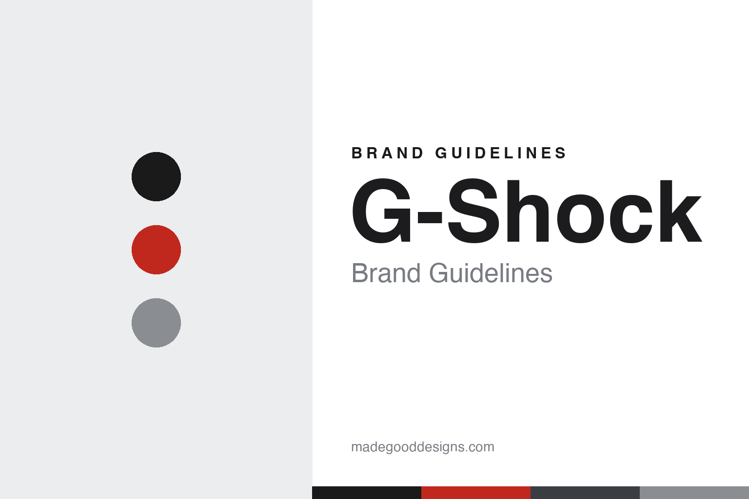
G-Shock Brand Guidelines
A watch built to survive a fall, born from a bouncing ball and a ‘Triple 10’ brief — the toughest name in watches.
Aa
Two constants: a black-and-red palette and a technical sans. Abstract homage — not the G-Shock wordmark or watch.
The Triple 10
G-Shock was built to a single, extreme brief: toughness.
G-Shock’s identity is toughness, and it comes from one extreme development brief: the “Triple 10.” The target was 10-metre drop resistance, 10-bar (10 ATM) water resistance and a 10-year battery life — a spec so demanding it seemed impossible for a 1980s watch. The name says it all: “G-Shock” means “Gravitational Shock,” and the whole design exists to survive impact. The breakthrough was structural: the movement is suspended in a cushioned, floating (“hollow”) structure — cradled in urethane foam inside layers of rubber and a protective case — so a blow to the outside never reaches the delicate internals. That single idea, protecting the module by floating it, is the engineering heart of the brand. (Honest caveats: the G-Shock wordmark is custom lettering, so don’t name a font; and no official brand hex is published — the identity is black with a red accent, with “SHOCK RESIST” a functional case marking.)
The origin story is one of design’s best. G-Shock was developed by Casio engineer Kikuo Ibe — the “father of G-Shock” — motivated after a watch his father gave him shattered when dropped. He built and destroyed roughly 200 prototypes (famously throwing them from a bathroom window) trying to make a truly shock-proof watch, and kept failing. The insight came in a park: watching a rubber ball bounce, Ibe realised that the ball’s centre is barely affected by the impact — so if he suspended the watch’s movement at the centre of a cushioned structure, it too could survive the blow. That bouncing-ball idea led to the first G-Shock, the DW-5000C, launched in 1983.
The DW-5000C established the square (the 5000/5600 series) as G-Shock’s primary icon — the enduring reference shape carried forward by the DW-5600 — while the round DW-6900 “three-eye” (1995) became the second icon. Beyond engineering, G-Shock became a cultural force: adopted by military and emergency services in the late 1980s, then embraced by hip-hop and skate/streetwear culture through the 1990s and 2000s (the first collaboration was with Stüssy in 1997), leading to countless collabs. G-Shock is a product line of Casio Computer Co., Ltd. (Japanese, publicly traded) — proof that a single, uncompromising idea (survive the fall) can build a global brand.
Colour
G-Shock lives in black and red. Click a swatch to copy the hex.
G-Shock’s palette is black with a red accent — the tough, technical, all-business look of a watch built for abuse, with red (the parent Casio’s colour) adding energy and alert. Black reads as rugged, serious and stealthy; the red pops against it, and touches of “resist” yellow/orange appear on tool-watch variants. It’s a hard, functional, high-contrast scheme that matches the product’s purpose perfectly. The honest caveat: Casio publishes no official G-Shock brand hex — the identity is “black plus a red signature accent” — so treat any values here as approximations rather than a confirmed spec.
The lesson is a palette that signals function. G-Shock’s black-and-red reads as tough and technical, telling you exactly what the watch is for before you read a word. For designers, it’s a reminder that a hard, high-contrast palette can communicate ruggedness and purpose, especially for a tool product. The takeaways: match the palette to the product’s function (black-and-red for toughness); use a single bright accent for energy against a neutral base; and treat specific hexes as approximate when none is officially published.
Typography
The wordmark is a bold, technical sans — engineered and tough.
G-Shock’s bold, technical wordmark is engineered-looking on purpose. Strong, slightly angular, industrial letterforms — often flanked by “PROTECTION” and “SHOCK RESIST” markings on the case — read as tough, precise and built-to-survive, exactly matching a watch designed for impact. The type has the character of a piece of equipment rather than a fashion accessory, which is the point: G-Shock is a tool you can trust. That industrial, no-nonsense quality has stayed consistent across four decades and countless models. (Because the wordmark is a custom logotype — no named font is published — the honest description is “a bold, technical sans,” not a specific typeface.) The type behaves like the brand: engineered, tough and utterly functional.
Aa
A bold, technical sans — engineered and tough. (Specimen set in Chakra Petch, a technical sans in the spirit of the G-Shock logotype; the real wordmark is custom.)
One idea: survive the fall
G-Shock built a brand on a single uncompromising promise.
G-Shock is a lesson in building a brand on one uncompromising idea. Everything about it flows from a single promise — survive the fall — pursued to an extreme through the Triple 10 brief, Kikuo Ibe’s 200 prototypes and the bouncing-ball breakthrough. That relentless focus produced a genuinely tougher watch, and the brand’s identity (the rugged black-and-red look, the industrial wordmark, the “shock resist” markings) simply dramatises that one promise. It’s also a masterclass in how a purely functional product can become a cultural icon: because G-Shock was authentically tough, it was adopted by soldiers, skaters and rappers alike, and that credibility turned a tool into a style statement.
For designers and brand-builders, G-Shock offers a clear takeaway: a single, uncompromising promise, relentlessly pursued, can build a brand and a culture. The lessons: commit totally to one core idea (toughness) and engineer it for real, not just in marketing; let the identity dramatise that idea (industrial look, black-and-red, functional markings); and understand that genuine substance is what earns cultural credibility (military-to-hip-hop crossover). It’s also a reminder to keep the facts precise — the Triple 10 brief was 10m drop, 10-bar water and 10-year battery; Kikuo Ibe built ~200 prototypes and cracked it via the bouncing-ball insight; the first G-Shock was the 1983 DW-5000C, with the square as its icon and the DW-6900 “three-eye” (1995) the second; and G-Shock is a Casio line. G-Shock turned “survive the fall” into a global brand — proof that one uncompromising promise can be everything.
Explore & save
Keep G-Shock’s identity on hand — save it to a board in the Made Good inspiration library.
G-Shock identity set
Pin the black-and-red palette and the technical-sans spirit to your own board.