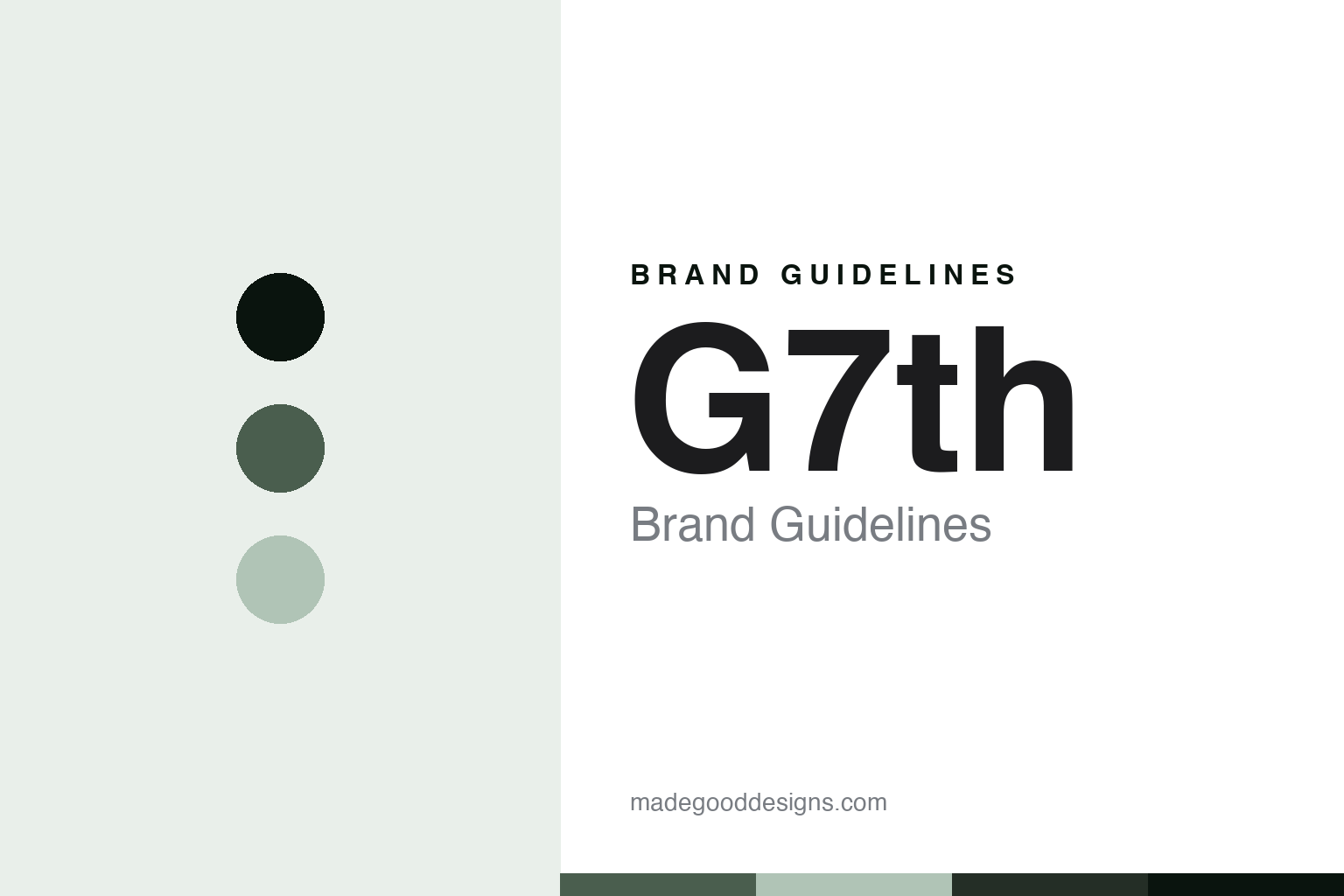
G7th Brand Guidelines
The capo company.
Aa
Two constants: a brushed-sage palette and a design-sans register. Abstract homage — not a G7th capo or mark.
The capo company
G7th is the British capo maker founded by Nick Campling, whose Performance capo launched in 2004, a family-owned design company that designs its capos in the UK.
G7th closes the round with the smallest part that changes a whole song — the capo. From the UK, G7th designs guitar capos: the clamp a player fits to a fretboard to raise the pitch. Its answer to how a maker becomes a name is design engineering: rethink the humble capo as a precision mechanism, so it clamps evenly and holds tune. A British capo, engineered as a design.
Its identity is the capo company. G7th’s Performance capo, its patented mechanisms and its design-engineering approach are the work it is known for. A capo, redesigned. The small part a player chooses.
(Honest notes, so the story stays precise. G7th — G7th Ltd — was founded by Nick Campling, whose Performance capo launched in 2004 (he ran an earlier design consultancy; the legal entity dates to 2000); it is based in Peterborough, in Cambridgeshire, not Bristol. On what it makes, it is guitar capos across ranges such as Performance, Newport, Nashville, Heritage and UltraLight, with patented mechanisms — its “Unique Tension Control” squeeze-on clamp and its “ART” (Adaptive Radius Technology) string pad that adapts to the fretboard radius. On where it is made — the honest heart of this entry — G7th makes no “Made in Britain” claim; its own tagline is “We design – you play,” and it is a small design-led company, so we present it as designed in the UK with its country of manufacture not publicly disclosed, and we do not imply British manufacture. On ownership, it is family-owned and led: control sits with the Campling family (via a holding company), with the founder as chairman and his son among the directors. Its awards we attribute generically as the company reports them, naming none it does not; its endorsing artists we present as reported. Its name, marks and trademarked technology names are IP, described but never reproduced, and there is no official brand hex; these tones are an unofficial interpretation. This is design commentary and does not promote any product.)
Colour
G7th lives in a brushed-sage palette. Click a swatch to copy the hex.
G7th’s identity is designed, British and considered — a brushed sage, an ink, a steel sage, a deep sage, and a paper. The palette leans brushed sage and steel: the register of a brushed-metal capo and a design studio. It signals design engineering over commodity. The honest caveat: with no published brand hex, these values are an original, unofficial interpretation, not first-party colours.
The lesson is a brushed-sage palette signals a design-engineered, British-designed identity. G7th’s world is a designed, metal, British object. For designers, it is a reminder that a brushed sage and a soft steel can carry a company built on design — the muted green-grey of anodised metal and the sheen of a machined finish. Because these tones can fail as small text, keep type dark and let the colour live in the accents, palette and band. The takeaways: rethink the commodity part; patent the mechanism; be honest that you only design at home; and treat any single hex as unofficial.
Typography
The register is a design sans — clean, considered, modern.
G7th’s identity carries a clean, considered, modern spirit — a design-engineering company, not a commodity brand. A design sans captures the mood: even, precise and contemporary, the register of a studio that redesigns a small part. Set in a brushed-sage palette, the design sans feels clean and considered — exactly the personality G7th carries. It is a design and a patent rather than a factory, mirroring a redesigned capo. (G7th’s real logo, its “The Capo Company” tagline and its trademarked technology names are things we describe but do not reproduce, and the exact typeface is not ours to use.) Because it is not ours to use, the honest description is “a design-sans spirit,” shown here in a stand-in. The type behaves like the company: clean, considered and modern.
Aa
A design-sans spirit — clean and considered. (Specimen set in Libre Franklin, a design-sans STAND-IN; NOT the G7th logo or tagline.)
The parts players choose
G7th stands for the humble capo, redesigned.
G7th closes the round by redesigning the smallest part in it: the capo, engineered as a design. A brushed-sage palette, a design sans and a redesigned capo make one thing — the capo company — the whole identity: designed, British and considered. The patented mechanism is the differentiator, and the design-engineering approach is the meaning. The point is a company that took the humblest guitar accessory — a clamp — and rethought it as a precision mechanism that clamps evenly and holds tune.
Put to work, the identity is design engineering, honestly told, as design. A company in this spirit would rethink the commodity part, patent the mechanism, and be honest about the making — a redesigned capo, patented tension and radius technology, designed in the UK, manufacture undisclosed. A brand learning from it would see that redesigning a commodity is a durable identity — that a capo engineered to clamp evenly holds a place a generic clamp cannot — and that being precise, Performance capo launched 2004 by Nick Campling, family-owned, designed in the UK with its manufacture not disclosed, keeps the story honest. G7th holds the round’s designed-elsewhere pole: where Bare Knuckle and Melos make by hand at home and Röslau and Arcus manufacture in Germany, G7th is candid that it is a design company that does not claim to manufacture in Britain — and the honest editorial move is to say “designed in the UK, made where undisclosed,” never letting a British brand imply a British factory. The discipline is in the corrections: Peterborough not Bristol, no “Made in Britain” claim, and no named award the company does not cite. The lesson G7th teaches is that design engineering can hold an identity: the redesigned mechanism gives it substance, and the honesty about the making keeps it credible. The design is the personality, and the redesigned capo is the proof.
For designers and brand-builders, G7th closes the parts players choose, from Britain: redesign the commodity, and be honest about the making. The lessons: rethink the humble part; patent the mechanism; say plainly you only design at home if that’s the case; don’t let a national brand imply a national factory; and never reproduce a logo or tagline. It is also a reminder to stay precise: G7th is the British capo maker founded by Nick Campling, whose Performance capo launched in 2004, a family-owned design company that designs its capos in the UK — with the palette here an unofficial interpretation. G7th made design engineering the identity — proof that a redesigned capo, honestly told, can be the difference.
Explore & save
Keep G7th’s identity on hand — save it to a board in the Made Good inspiration library.
G7th identity set
Pin the brushed-sage palette and the design-sans register to your own board.


