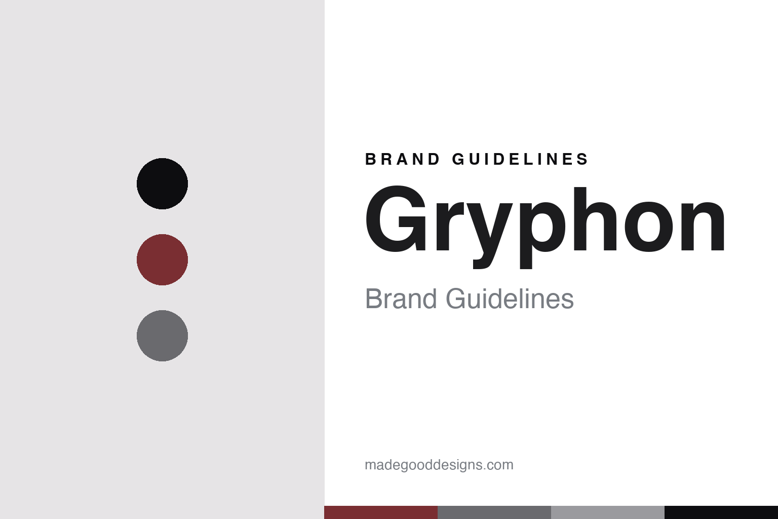
Gryphon Brand Guidelines
The black monolith.
Aa
Two constants: an oxblood-and-jet palette and a sculptural sans register. Abstract homage — not a Gryphon device or wordmark.
The black monolith
Gryphon builds imposing, all-black Class-A electronics in Ry, Denmark.
Gryphon is a lesson in an aesthetic as the identity. A Danish ultra-high-end maker in Ry, it builds massive, sculptural, all-black amplifiers, preamplifiers, DACs and speakers — imposing black monoliths of pure Class-A power. Electronics, made a dramatic object.
Its identity is the black monolith. Gryphon’s heavy, all-black, sculptural devices are the work it is known for. A drama, made a signature. A maker whose look is unmistakable.
(Honest notes, so the story stays precise. Gryphon was founded in 1985 by Flemming E. Rasmussen, who was both its founder and the industrial designer of its products — its dramatic black aesthetic is his design language. He retired in 2018, so we credit the look to him but attribute today’s operations to the management team that has run it since, and we keep him distinct from the film director of the same name. On ownership: in 2025 the Chinese group Goer Dynamics took a minority stake, so it is Danish-based and independently managed but not wholly independent, and we say so. Everything is made in-house in Ry, Denmark. Its devices and name are its IP, described but never reproduced, and there is no official brand hex — these tones are an unofficial interpretation. This is design commentary and does not promote any product.)
Colour
Gryphon lives in an oxblood-and-jet palette. Click a swatch to copy the hex.
Gryphon’s identity is dramatic, dark and imposing — an oxblood, a jet, a graphite, a steel, and a chalk. The palette leans oxblood and jet: the register of deep black with a single dark, dramatic accent. It signals presence and power over lightness. The honest caveat: with no published brand hex, these values are an original, unofficial interpretation, not first-party colours.
The lesson is an oxblood-and-jet palette signals a dramatic, imposing identity. Gryphon’s world is a dark, sculptural, powerful object. For designers, it is a reminder that a near-black palette with one deep accent can carry a brand built on presence — the jet of its casework and a single dramatic note. Because these tones can fail as small text, keep type dark and let the colour live in the accents, palette and band. The takeaways: own an aesthetic; make it imposing; keep it in-house; and treat any single hex as unofficial.
Typography
The register is a sculptural sans — bold, dramatic, imposing.
Gryphon’s identity carries a bold, dramatic, imposing spirit — a sculptural object, not a shy one. A sculptural sans captures the mood: strong, contemporary and commanding, the register of massive black monoliths. Set in an oxblood-and-jet palette, the sculptural sans feels bold and dramatic — exactly the personality Gryphon carries. It is imposing rather than delicate, mirroring a heavy, black device. (Gryphon’s real devices and wordmark are things we describe but do not reproduce, and the exact typeface is not ours to use.) Because it is not ours to use, the honest description is “a sculptural-sans spirit,” shown here in a stand-in. The type behaves like the maker: bold, dramatic and imposing.
Aa
A sculptural-sans spirit — bold and dramatic. (Specimen set in Syne, a sculptural-sans STAND-IN; NOT the Gryphon wordmark or any device design.)
An aesthetic as identity
Gryphon stands for the black monolith.
Gryphon is a lesson in making an aesthetic the identity. An oxblood-and-jet palette, a sculptural sans and imposing black devices make a dramatic look the whole maker — dark, sculptural and powerful. The aesthetic is the differentiator. The differentiator is a genuine, singular design language — massive, all-black, sculptural casework, so distinctive that a device is recognised as Gryphon on sight.
Put to work, the identity is a look as the brand. A maker building in this spirit would commit to one bold aesthetic across its whole range, keep the making in-house, and be candid about its ownership and its founder’s legacy, so the customer buys into a strong point of view rather than a spec. It would let the drama of the object carry the brand, so that presence becomes the signature. It would treat the sheer physical presence of a device as part of the design rather than a by-product of the engineering, so that the object announces the brand across a room before any badge is read. The lesson Gryphon teaches is that a singular, committed aesthetic can build a brand: the design gives it recognition, and the Danish making gives it substance. The aesthetic is the personality, and the making is the proof.
For designers and brand-builders, Gryphon offers a clear takeaway: own a bold aesthetic and commit to it. The lessons: own a look; make it imposing; keep it in-house; and be honest about the story. It is also a reminder to stay accurate: Gryphon is a Danish ultra-high-end maker founded in 1985, its black aesthetic the design language of founder Flemming Rasmussen (retired 2018), now Danish-based and independently managed with a Chinese minority investor since 2025, and built in-house in Ry — with the palette here an unofficial interpretation. Gryphon made the black monolith the maker — proof that an aesthetic can be the difference.
Explore & save
Keep Gryphon’s identity on hand — save it to a board in the Made Good inspiration library.
Gryphon identity set
Pin the oxblood-and-jet palette and the sculptural-sans register to your own board.