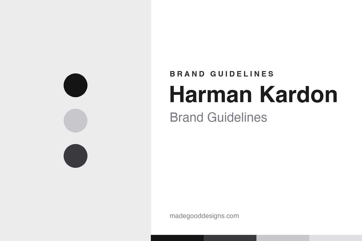
Harman Kardon Brand Guidelines
The inventor of the hi-fi receiver — transparent orb speakers, a signature slash, and a black minimal look.
Aa
Two constants: a minimal black/silver palette and a clean lowercase sans with a slash. Abstract homage — not the harman/kardon wordmark.
The inventor of the receiver
Harman Kardon created the hi-fi receiver.
Harman Kardon is a lesson in an inventor’s legacy carried into design-led audio. It was founded in 1953 by Dr. Sidney Harman and Bernard Kardon (each investing $5,000). Their first product, the Festival D1000 (1954), is credited as the world’s first integrated hi-fi receiver — combining tuner, preamplifier and amplifier into one chassis, making high fidelity accessible to ordinary listeners. (A date nuance: the company was founded in 1953, and the D1000 shipped in 1954.) (Honest caveats: no official brand hex was found, so the colours below are observed, and the wordmark typeface is undocumented.)
Harman Kardon is one brand within Harman International, a vast audio empire Sidney Harman built that also owns JBL, AKG, Infinity, Mark Levinson, Revel and Lexicon. In 2016–2017, Samsung acquired Harman International for about $8 billion (Samsung’s largest acquisition, driven mainly by automotive/connected-car technology — which brought all these audio brands under Samsung).
What sets Harman Kardon apart visually is its design: distinctively transparent and orb/sphere-shaped speakers. The translucent SoundSticks (2000) — designed by Jony Ive’s team at Apple, not Harman Kardon’s own designers — is in MoMA’s permanent collection, and the sphere/orb language continues in the Aura and Onyx speakers. The identity matches: a premium, minimalist, monochrome look, and a signature lowercase “harman/kardon” wordmark with a forward slash between the names. Engineering heritage, expressed as sculptural design.
Colour
Harman Kardon lives in black and silver. Click a swatch to copy the hex.
Harman Kardon’s palette is premium and minimal: predominantly black, with white, silver and the physical transparency of its speakers. The black reads as sophisticated, high-end and understated — the colour of serious audio and luxury electronics — while the silver and clear/translucent materials give the products a sculptural, jewel-like quality. It’s a restrained, monochrome scheme that lets the distinctive shapes (the orbs, the transparent SoundSticks) be the visual statement rather than any loud colour. The elegance signals quality and design credibility. The honest caveat: Harman Kardon publishes no official brand hex — the black, silver and graphite tones here are observed approximations, not first-party values.
The lesson is let form, not colour, be the statement. Harman Kardon’s minimal black-and-silver puts the focus on its sculptural, transparent speaker forms. For designers, it’s a reminder that a restrained palette can showcase distinctive product design. The takeaways: use a minimal, premium palette so the product form leads (black and silver); let materials (transparency, chrome) do part of the branding; and treat specific hexes as approximate when no official spec is published.
Typography
The wordmark is a lowercase sans with a slash — minimal and signature.
Harman Kardon’s lowercase sans wordmark — “harman/kardon,” with the distinctive forward slash between the two names — is minimal and signature. The clean, even letterforms read as premium, modern and understated, matching a design-led audio brand, and the all-lowercase treatment feels contemporary and quietly confident rather than formal. The slash is the ownable detail: a simple typographic mark that turns two surnames into a single recognisable identity. Set in monochrome, the wordmark stays out of the way so the sculptural speakers can shine. It’s refined and distinctive without being loud. (Because the exact face is undocumented, the honest description is “a lowercase sans,” not a named font.) The type behaves like the brand: minimal, premium and signature.
Aa
A lowercase sans with a slash — minimal and signature. (Specimen set in Jost, a geometric sans in the spirit of the harman/kardon wordmark; the real face is undocumented.)
Heritage meets design
Harman Kardon pairs invention with beauty.
Harman Kardon is a lesson in pairing genuine engineering heritage with distinctive design. On one side is real substance: it literally invented the hi-fi receiver and sits within an audio empire (JBL, AKG and more) built on decades of acoustic expertise. On the other is striking form: transparent, orb-shaped speakers that look like sculpture and land in museum collections. That combination — heritage credibility plus design desirability — is what lets Harman Kardon stand apart in a crowded audio market, and its minimal black-and-silver identity (with the signature slash) keeps the focus squarely on the products. It’s proof that the strongest audio brands marry real acoustic substance with objects people want to display.
For designers and brand-builders, Harman Kardon offers a clear takeaway: combine genuine heritage/substance with distinctive, desirable design, and let a minimal identity keep the focus on the product. The lessons: real engineering credibility earns trust (inventing the receiver, the Harman empire); striking, sculptural design earns desire (the transparent SoundSticks, the orbs); and a restrained identity with one signature detail (the slash) ties it together. It’s also a reminder to keep the facts precise — Harman Kardon was founded in 1953 by Sidney Harman and Bernard Kardon, made the first hi-fi receiver (the D1000, 1954), belongs to Harman International (JBL/AKG, Samsung-owned since 2016–17), and is known for transparent/orb speakers and the lowercase “harman/kardon” slash wordmark. Harman Kardon pairs heritage with design — proof that substance plus desirable form is the strongest audio-brand formula.
Explore & save
Keep Harman Kardon’s identity on hand — save it to a board in the Made Good inspiration library.
Harman Kardon identity set
Pin the black-and-silver palette and the lowercase-sans spirit to your own board.