Jules Pascin drew all the time. Café tables, street orators, travellers, friends and studio models fill his sketchbooks, prints and canvases, usually caught with a quick, broken line and then brushed with colour so thin that the ground shows through. The result looks unfinished on purpose: a portrait that is half drawing and half painting, held together by a few confident strokes. That balance between line and soft colour is the part a designer can study and borrow.
This guide looks at how his pictures are built, which works you can date from museum records, how he made them, and how to use his ideas in illustration, branding and editorial work. One public-domain painting from the Art Institute of Chicago appears below; for more public-domain prints and paintings, browse the MGD museum inspiration collection.
Who was Jules Pascin?
Britannica gives his birth as 31 March 1885 in Vidin, Bulgaria, and the Jewish Virtual Library agrees on the town and year. He was born Julius Pincas. According to Britannica and the Crystal Bridges Museum of American Art, he adopted the name Pascin around 1905; Crystal Bridges describes it as an anagram of Pincas.
Crystal Bridges records that he moved to Munich in 1903 and sent drawings to the satirical weekly Simplicissimus in 1904, which led to a regular contract; Britannica also dates his work for the satirical journals to 1904. The Centre Pompidou dates his arrival in Paris to December 1905, and the Jewish Virtual Library also places it in 1905, describing how artists gathered at the Café du Dôme in Montparnasse welcomed him.
In Paris he met the painter Hermine David, the subject of the portrait above. When the First World War began he went to the United States. Crystal Bridges and the Annex Galleries describe several years based in New York, with long trips through the American South and to Cuba. RoGallery and Annex Galleries record that Hermine David joined him in New York, and RoGallery dates their marriage there to 1918. The Jewish Virtual Library dates his American citizenship to 1920.
He returned to Paris in the early 1920s and spent most of his remaining years there, with further travel. Britannica and Crystal Bridges both record his death in Paris in June 1930; Britannica gives 1 June and Crystal Bridges 2 June.
Jules Pascin’s key works and dates
Every date below comes from the museum that holds the work, as listed in its collection records.
1905, Family Dressing. Pen and black ink, watercolour and gouache on paper, at the Metropolitan Museum of Art. It shows the illustrator’s habit of drawing first and colouring second.
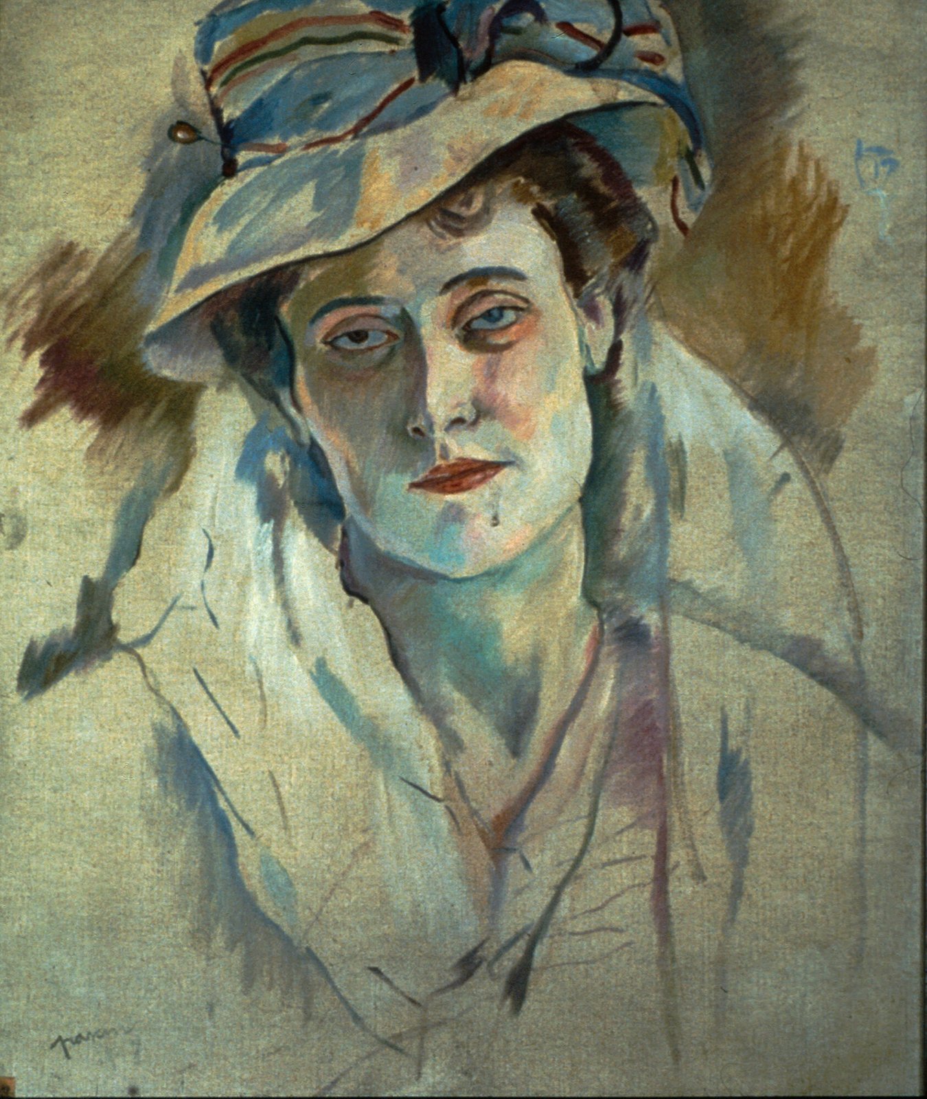
1907, Hermine David. Oil on canvas, 66 by 55.2 centimetres, at the Art Institute of Chicago, which flags it as public domain.
About 1909, The Foolish Virgins. Oil and graphite on canvas, at the Met. The medium itself tells the story: pencil drawing stays visible under the paint.
1913, Claudine Resting. Oil on canvas, at the Art Institute of Chicago.
1916, Three Women in a Café. Pen and black ink on red-brown paper, at the Met, from his American years.
1924, Pierre Mac Orlan. An oil portrait of the French writer, at the Met.
1925, Street Scene with Orator. A colour etching printed in brown, black and red, at the Art Institute of Chicago.
1929, Cendrillon. Colour etchings for Charles Perrault’s Cinderella. The Philadelphia Museum of Art dates the book to 1929, and the Art Institute of Chicago holds plates such as Cinderella’s Coach, printed in yellow, blue, orange, grey and black.
Apart from the 1907 portrait, these works are not flagged public domain by the museums, so they are described here in text only.
What to look at: the line comes first
Pascin trained his hand on magazine illustration, and it shows. In Hermine David, the paint is applied in short, separate strokes, but the structure is drawn: a dark contour runs around the brim of the hat, down the cheek and along the shoulder, and the blouse is suggested by a few thin brush lines that do not close. The lower third of the canvas is almost bare. He stops when the figure reads, not when the surface is full.
That is a useful habit for illustrators. A line that breaks and restarts feels alive; a line that is closed and even feels traced. Look at how Pascin lets contours fade where light falls on the face and presses them hard in the shadows under the hat.
His signature also works as a graphic element. In the Chicago portrait it sits small and handwritten at the lower left, in the same loose line as the drawing, so it reads as part of the picture rather than a label on top of it.
Palette: muted greens, pearly greys and one warm accent
The Chicago portrait shows how soft, low-contrast colour can still hold a strong image. Measured from the museum’s scan of this painting, the dominant colours are a sage grey (#8A8D72), a light olive (#9FA580), a grey-green (#626D62), a khaki mid-tone (#777560), a deep olive shadow (#49483A) and a pale celadon highlight (#BAC099). The blues of the hat band and the red of the lips are tiny in area, yet they are where the eye goes.
Two lessons follow. First, a palette can be almost monochrome and still feel warm if one small accent breaks it. Second, colours close in value let the drawn line do the work of separating forms. To build a similar scheme from your own reference images, try the image colour picker; for more historic palettes, see vintage colour palettes.
Technique: thin paint, transfer drawing and colour etching
Thinned oil. Crystal Bridges notes that his later pictures were painted with oils diluted with turpentine on very thin canvas, for faster execution. Thin layers like these let the canvas and the underdrawing stay part of the image.
Carbon transfer. Several drawings at the Art Institute of Chicago, such as Woman Writing at a Table (after 1923) and a portrait of Professor Adolf Elwyn (1927/28), are catalogued as carbon transferred with a stylus. An essay in Artforum describes his habit of drawing by carbon-paper transfer, relying on a feel for rhythm and weight. The method gives a soft, slightly grainy line, a quality designers now imitate with textured digital brushes.
Prints. The museum records list drypoints, etchings, soft-ground etchings, aquatints and lithographs. His drypoints keep the scratchy, hesitant line of a sketch, while the late colour etchings for Cendrillon layer several flat inks to build a soft, storybook colour. For the processes behind them, see our guides to etching and the printmaking collection.
Pascin in the School of Paris
Pascin belongs to the international group of artists who worked in Montparnasse in the early twentieth century, often called the School of Paris. Two of the artists in that circle, with very different approaches to line and portraiture, have their own guides here: Amedeo Modigliani’s elongated portraits and Tsuguharu Foujita’s fine line and pale grounds.
The Pascin Expertise association records posthumous exhibitions in 1931 at the Downtown Gallery in New York and at Bernheim-Jeune in Paris, and the Met, the Art Institute of Chicago, the Centre Pompidou and Crystal Bridges all hold his work today.
How designers can borrow Jules Pascin’s ideas
Draw, then tint. Build an illustration on a loose line and add colour as a thin, transparent layer that does not fill every shape. It keeps the image light and quick.
Leave the edges open. Let the lower part of a portrait or the corners of a scene fade into the ground. In editorial layouts, those open areas make natural space for headlines.
Use a muted base with one accent. Choose four or five close greys or greens and add a single red or blue in a small area to guide the eye.
Treat the signature as type. A hand-drawn name in the same line as the drawing can serve as a mark or a logo for an illustration series.
Value texture. Transfer drawing, drypoint and thin paint all leave visible traces of the process. Grain and broken lines make digital work feel handmade.
Frequently asked questions
What is Jules Pascin known for?
For quick, expressive drawings and thinly painted figure pictures and portraits, made mostly in Paris, and for his early illustrations for the Munich magazine Simplicissimus.
Where was Jules Pascin from?
He was born in Vidin, Bulgaria, in 1885, worked in Munich and Paris, spent the First World War years in the United States and became an American citizen in 1920, according to the Jewish Virtual Library.
Where can I see Jules Pascin’s work?
The Art Institute of Chicago, the Metropolitan Museum of Art, the Cleveland Museum of Art, the Centre Pompidou in Paris and Crystal Bridges Museum of American Art all hold works by him.
Can I use Jules Pascin’s paintings in my designs?
The Art Institute of Chicago flags his 1907 portrait of Hermine David as public domain in its open-access collection. Most of his other works are not flagged public domain by the museums, so check the holding museum’s terms before reproducing them.