Lalique Brand Guidelines
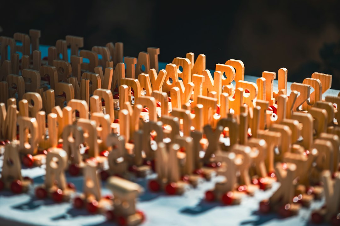
Frosted sculptural crystal — from René Lalique, jeweler turned glassmaker.
Aa
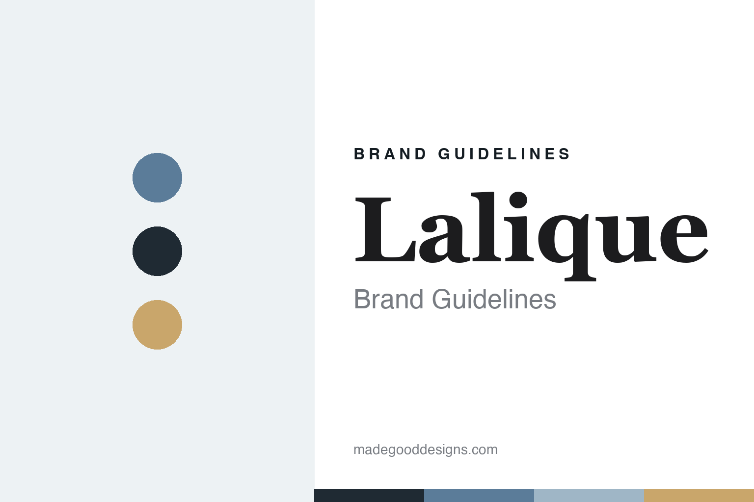
Two constants: a frost-and-opaline palette and a classical serif. Abstract homage — not the Lalique wordmark or logo.
Jeweler turned glassmaker
Lalique began with jewels, then defined art glass.
Lalique is a lesson in a great artist changing medium. Its founder, René Lalique (1860–1945), first made his name as a master jeweler — the defining figure of Art Nouveau jewellery, using unconventional materials (horn, ivory, enamel, semi-precious stones) and naturalistic, female-form motifs, with the actress Sarah Bernhardt among his patrons. He supplied designs to leading Paris jewellers early in his career and triumphed at the 1900 Exposition Universelle.
Only later did he turn to glass — a shift that accelerated after he met the perfumer François Coty around 1907 — and reinvented himself as a pioneering Art Deco glassmaker. His hallmark is frosted (satin-finished) crystal with sculptural relief: the contrast between satin-frosted and polished-clear surfaces, “sculpting with light.” He pioneered mass-produced luxury perfume bottles for Coty and others, and made around 29 glass car mascots (the iconic “Victoire,” about 1928). His main factory at Wingen-sur-Moder, Alsace, was built in 1921 and still makes Lalique crystal today.
Lalique is now owned by Lalique Group SA, led by Silvio Denz, who acquired the house in 2008 (the group was taken private off the SIX Swiss Exchange in 2024). (Honest notes: René Lalique was a jeweller first, glassmaker second — not the reverse; his jewellery era is Art Nouveau and his glass era increasingly Art Deco — don’t collapse the two; and there is no official “Lalique blue” — blue and opaline are descriptive, and no official brand hex is published.)
Colour
Lalique lives in a frost-and-opaline palette. Click a swatch to copy the hex.
Lalique’s identity is frosted, sculptural and soft — a frost white, a clear-crystal grey, an opaline blue, a deep slate blue-black, and a warm amber opal. The palette reads like the glass itself: satin-frosted highlights against polished shadow, with an opaline blue and vintage-glass amber. It signals art, sculpture and light rather than cut-crystal opulence. The honest caveat: there is no official “Lalique blue” and no published brand hex, so these tones are an original, unofficial interpretation, not first-party values.
The lesson is a frost-and-opaline palette signals sculptural art glass. Lalique’s world reads as soft and luminous. For designers, it is a reminder that frosted whites and greys, lifted by an opaline blue and amber, convey glass treated as sculpture, matching a house built on the frosted-clear contrast. The takeaways: work in frosted, low-contrast tones with a soft blue and warm amber accent; let light and relief lead; and treat any single hex as unofficial — and avoid asserting a “Lalique blue.”
Typography
The wordmark spirit is a classical serif — elegant and artful.
Lalique’s identity carries an elegant, artful, refined spirit — a “LALIQUE” wordmark set in clean, spaced capitals whose calm forms match a house of sculptural crystal. A classical serif captures the mood: it is graceful and understated, the register of art glass and perfume flacons rather than loud luxury. Set against a frost-and-opaline palette, the classical serif feels elegant and quiet — exactly the frosted-crystal, Art-Deco personality Lalique carries. It is artful rather than ornate, mirroring glass sculpted with light. (Lalique’s real wordmark — and the historic “R. LALIQUE” maker’s mark — are trademarks we describe but do not reproduce, and the exact typeface is not something we assert.) Because the specific mark is not ours to use, the honest description is “a classical serif spirit,” not the Lalique logo. The type behaves like the brand: elegant, artful and refined.
Aa
A classical serif spirit — elegant and artful. (Specimen set in Marcellus, a classical serif; NOT the Lalique logo, which is a trademark.)
Sculpting light as the difference
Lalique stands for glass treated as art.
Lalique is a lesson in carrying an artist’s vision into industry. René Lalique brought the eye of a great Art Nouveau jeweller to glass and made a new thing of it: frosted, sculptural crystal where the play of satin and polished surfaces — not cut facets — is the whole effect. He then applied that vision to everyday luxuries the world had never seen designed so beautifully: the mass-produced perfume bottle, the car mascot, the decorative object. The differentiator was an artistic signature strong enough to define a house for a century.
For designers and brand-builders, Lalique offers a clear takeaway: a singular artistic signature can outlive its founder. The lessons: build the identity on an unmistakable effect (frosted-clear contrast) rather than a category convention; apply the vision to fresh objects (bottles, mascots) to widen the story; and keep the identity elegant and quiet so the glass speaks. It is also a reminder to keep the facts honest: René Lalique was a jeweller first, his glass era is Art Deco, and the house is now owned by Silvio Denz’s Lalique Group — with the palette here an unofficial interpretation and no official “Lalique blue.” Lalique sculpted light — proof that an artist’s signature can be the difference.
Explore & save
Keep Lalique’s identity on hand — save it to a board in the Made Good inspiration library.
Lalique identity set
Pin the frost-and-opaline palette and the classical-serif spirit to your own board.