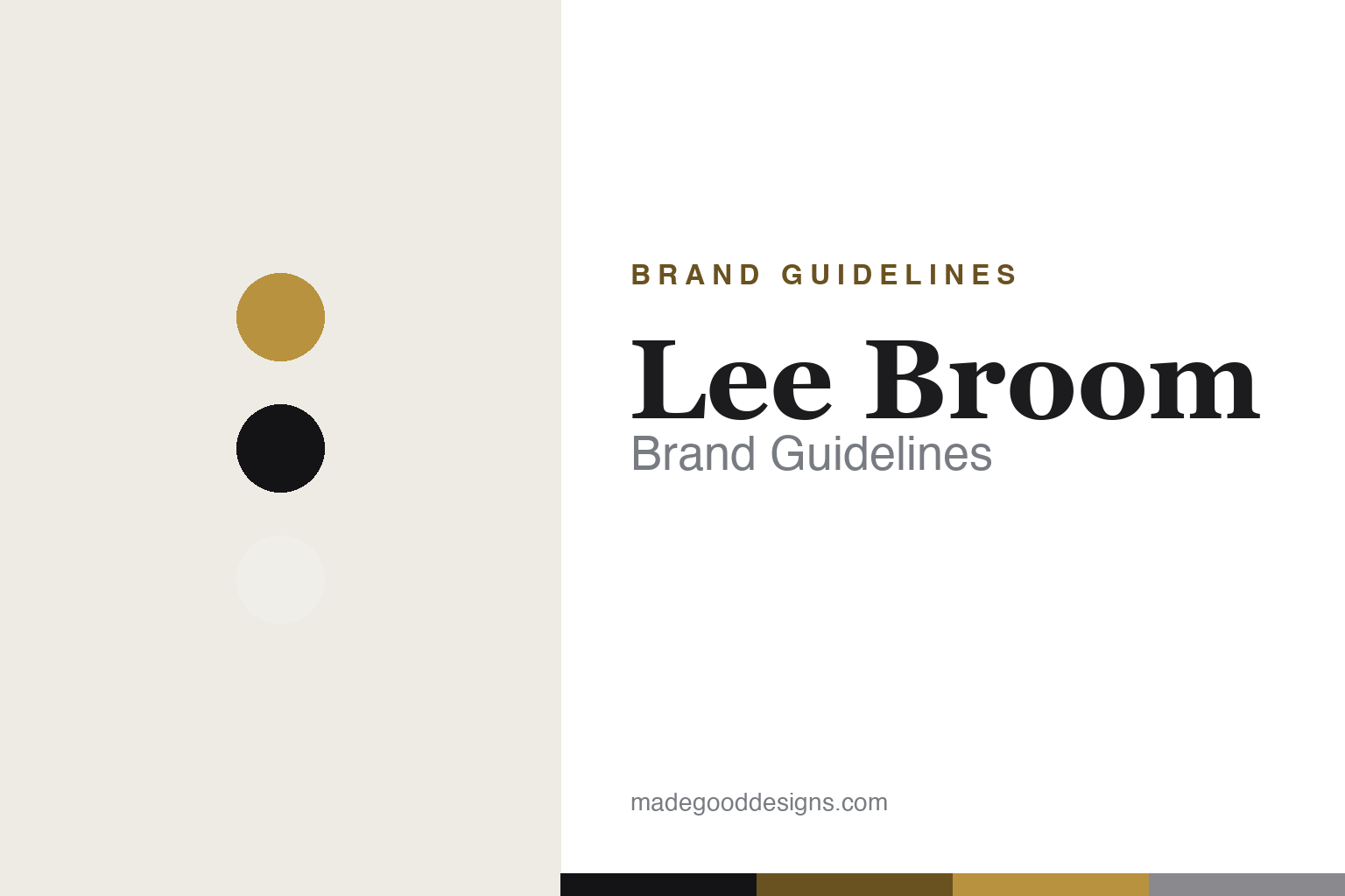
Lee Broom Brand Guidelines
Theatrical luxury — crystal, brass and drama, from a designer who began in the theatre.
Aa
Two constants: a glamorous brass-and-black palette and a high-contrast Didone serif. Abstract homage — not the Lee Broom wordmark.
Theatrical luxury
Lee Broom stages design.
Lee Broom is a lesson in drama as a design language. The British designer’s eponymous London studio was founded in 2007, but the story starts earlier — and the theatre matters. Broom began with a theatre-school background (the root of his sense of drama and narrative), then, at 17, won a fashion design competition that led to him working for Vivienne Westwood, before taking a fashion degree at Central Saint Martins. Theatre and fashion, not just product design, are in the DNA. (Two honest notes: no official brand hex is published, and the wordmark typeface is undocumented.)
His breakthrough was the Crystal Bulb (2012) — a standard lightbulb reimagined as cut lead crystal, patterned after traditional cut-crystal decanters and whisky glasses. It made his signature clear: luxury, wit and a love of glamorous materials (crystal, brass, marble). Other pieces followed — Decanterlight, Fulcrum, Optical, Eclipse, Hanging Hoop, Orion — building a distinctly theatrical, monochrome-and-brass luxury aesthetic.
What truly sets Lee Broom apart is showmanship. He presents each year at the Milan, New York and London design weeks with “conceptual, dynamic installations which are surreal, experiential and always unexpected” — from a mobile showroom touring on a vehicle to rotating, performance-style presentations. The theatre-school roots make the drama authentic, not gimmicky. Widely awarded — British Designer of the Year (2011) and the Queen’s Award for Enterprise (2015) — and stocked in hundreds of stores worldwide, the studio stays independent and founder-led. Theatrical luxury.
Colour
Lee Broom lives in a glamorous brass-and-black palette. Click a swatch to copy the hex.
Lee Broom’s identity is glamorous, theatrical and luxurious — brass and gold, deep black, and crystal white, with rich materials (marble, cut crystal). The palette reads as dramatic and refined: a monochrome stage lit by brass and crystal, exactly the moody, luxurious world of his product launches. It signals showmanship, luxury and British design confidence. It’s a brass-and-black palette that signals glamour, drama and luxury. The honest caveat: Lee Broom publishes no official brand hex, so the brass, black and crystal-white here are an original, unofficial interpretation of his aesthetic, not first-party values.
The lesson is a brass-and-black palette signals glamour and drama. Lee Broom’s monochrome-and-brass world reads as theatrical and luxurious. For designers, it’s a reminder that a tightly controlled, glamorous palette — black, brass, crystal — can create a sense of occasion and luxury more powerfully than colour. The takeaways: use restrained, luxurious tones for drama; let materials (crystal, brass, marble) carry glamour; and treat specific hexes as unofficial when there’s no published spec.
Typography
The wordmark is a high-contrast Didone — glamorous and theatrical.
Lee Broom’s identity carries a glamorous, theatrical, luxurious spirit — a “Lee Broom” wordmark whose high-contrast serif letterforms read as refined and dramatic. A Didone serif captures the mood: all fine hairlines and confident thick strokes, it’s the typographic voice of luxury and fashion, fitting for a designer who came through theatre and Vivienne Westwood. Set against a glamorous brass-and-black palette, the elegant serif adds drama and occasion — exactly the theatrical, luxury personality Lee Broom stages at every design week. It’s glamorous and high-contrast rather than plain or industrial, mirroring crystal-and-brass objects made to dazzle. Because the exact wordmark face isn’t publicly documented, the honest description is “a Didone serif spirit,” not a named font. The type behaves like the brand: glamorous, theatrical and luxurious.
Aa
A Didone serif spirit — glamorous and theatrical. (Specimen set in Bodoni Moda, a high-contrast Didone in the spirit of the Lee Broom identity; the real face is undocumented.)
Showmanship as the difference
Lee Broom turned launches into theatre.
Lee Broom is a lesson in treating the presentation as part of the product. Plenty of designers make beautiful objects; Lee Broom’s differentiator is theatre — turning each collection’s launch into a surreal, experiential event that people travel to see, from a showroom mounted on a moving vehicle to rotating, performance-style installations at the Milan, New York and London design weeks. That showmanship isn’t marketing bolted on; it grows straight from his theatre-school and fashion roots, and it makes the brand a spectacle as much as a catalogue. Combined with a tightly controlled aesthetic — crystal, brass, monochrome glamour, crystallised in the Crystal Bulb — it gives a relatively small independent studio outsized cultural presence and a string of honours (British Designer of the Year, the Queen’s Award). The lesson is that how you reveal your work can be as defining as the work itself, especially when the theatre is authentic to who you are. Anyone can launch a product; Lee Broom stages a show. Make the reveal theatrical, and the experience becomes the brand. Design the drama, too.
For designers and brand-builders, Lee Broom offers a clear takeaway: presentation can be a core part of the design. The lessons: make the launch an experience worth travelling for (the touring showroom, the rotating installations); keep a tightly controlled, recognisable aesthetic (crystal, brass, monochrome); and keep the facts precise — Lee Broom came through theatre school and worked for Vivienne Westwood before founding his London studio in 2007, and the Crystal Bulb (2012) is his breakthrough. It’s also a reminder to keep it honest: exact launch years for later pieces are best hedged, and no official brand hex or typeface is published, so the palette and type here are an interpretation. Lee Broom turned launches into theatre — proof that showmanship can be the difference.
Explore & save
Keep Lee Broom’s identity on hand — save it to a board in the Made Good inspiration library.
Lee Broom identity set
Pin the glamorous palette and the Didone-serif spirit to your own board.