London Eye Brand Guidelines
Marks Barfield’s millennium wheel on the South Bank.
Aa
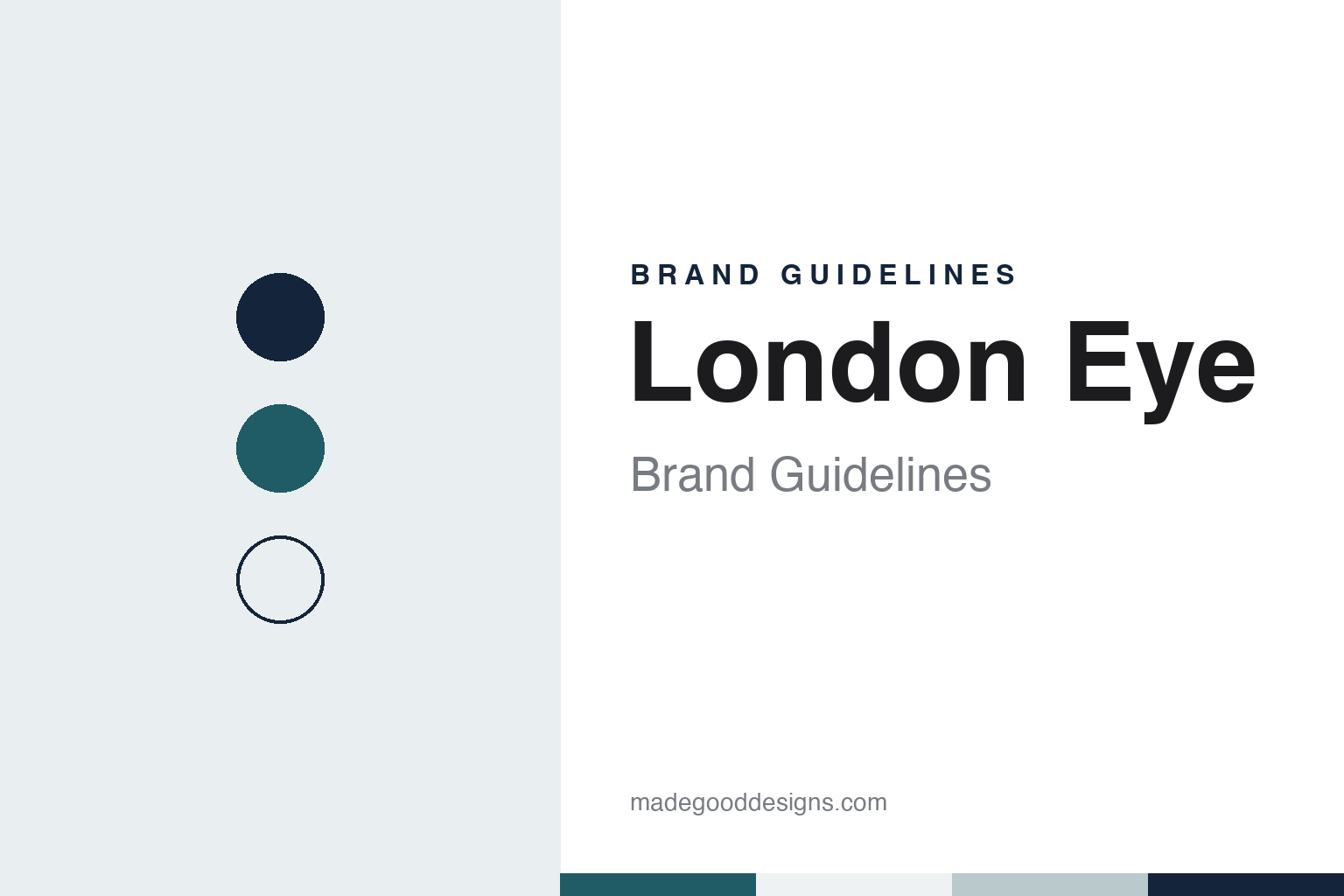
Two constants: a river teal, navy and steel white palette and a rounded geometric sans register. Abstract homage — not a London Eye product or mark; no logo, ticket or photograph is reproduced.
The Millennium Wheel
A competition entry that kept going after the competition ended.
The London Eye began as an entry to a competition. In 1993 the architects David Marks and Julia Barfield entered a contest for a landmark to mark the new millennium; the attraction’s own history names the sponsors as The Sunday Times and the Architecture Foundation, while the BBC, in a 2025 anniversary report, says The Times. The competition ended without a winner, and the couple carried on with their design for an observation wheel on the South Bank of the Thames, beside County Hall and the western end of Jubilee Gardens.
The BBC reported in March 2025 that Barfield chose the South Bank site and that the pair set up The Millennium Wheel Company, using computer-generated images, then a new technique, to show the wheel against views of London. A journalist at the Evening Standard found their planning application and the paper launched a “Back the Wheel” campaign; English Wikipedia dates the campaign to the summer of 1994 and says British Airways agreed seed funding that December. Planning permission was granted in 1996, and finance came from the German bank Westdeutsche Landesbank and the Japanese trading company Sumitomo Corporation, Wikipedia says.
Engineering was by Arup, with the structural engineer Jane Wernick; Mace managed construction and Hollandia supplied the main steelwork, according to English Wikipedia. The BBC describes a fabrication spread across Europe: the spindle from the Czech Republic, cables and curved glass from Italy, capsules from France and the main structure from the Netherlands. The capsules were made by Poma. Barfield told the BBC that the first contractor wanted cheaper capsules that would have reduced the design to a “pastiche Ferris wheel,” so the architects stopped the project for 24 hours until a new firm was found. The wheel was assembled flat over the river from sections brought up the Thames, then raised upright over about a week.
The wheel was ceremonially opened on 31 December 1999. The Guardian reported a “soft opening” for competition winners, media and pre-booked passengers on 1 February 2000, under the name British Airways London Eye, and the wheel took its first paying public on 9 March 2000, the BBC says. The Guardian gave it as 135 metres (443 feet) high with 32 capsules, each for 25 people, turning at 1.6 miles an hour.
Colour
A wheel held from one side, and lit at night.
The design is a cantilevered wheel. Instead of standing between two legs, the rim is held from one side by an A-frame, and tensioned steel cables give it the look of a giant spoked bicycle wheel, English Wikipedia says. The wheel is 120 metres across and the structure 135 metres tall. The 32 sealed, oval glass capsules sit on the outside of the rim, and the attraction’s own history says there is one capsule for each of the 32 London boroughs.
Barfield told the BBC that the first scheme had 60 capsules, a symbol of minutes and seconds, but that the number was cut because it would have cost more and passengers would have looked into the next capsule instead of at the city. She described the finished wheel as “a symbol of time turning, for the millennium,” a circle with no beginning and no end.
It was meant to be temporary. The Guardian noted in February 2000 that it had planning permission for five years. English Wikipedia says the operators applied to Lambeth Council for permanent status in December 2001 and that it was granted in July 2002. A dispute with the Southbank Centre, which owns part of the land under the supports, ended in February 2006 with a new 25-year lease.
Light is a large part of the identity. English Wikipedia says the wheel was relit with LED lighting from Color Kinetics in December 2006, allowing digital control in place of coloured gels over fluorescent tubes. That turned the night-time wheel into a surface for sponsors and causes. Time Out reported in November 2019 that since 2015 the wheel had glowed red at night for Coca-Cola, and that the new sponsor, lastminute.com, would light it in its hot-pink brand colour from February 2020. The BBC noted in 2025 that the wheel regularly lights up for charities and campaigns, and that it forms the backdrop to the Mayor of London’s New Year fireworks; Wikipedia says more than 2,000 fireworks are launched from the wheel itself.
Typography
Observation decks, towers and wheels.
Observation decks, towers and observation wheels sell a view, but they present themselves through a building. Most carry the name the operator publishes, often a building name or an address, and their visual identity tends to borrow from the structure itself: its silhouette, its stone or steel, and the architects named in the operator’s own history pages and in the press. A deck at the top of an office tower usually shares that tower’s name; a purpose-built tower or wheel often turns its own outline into the mark.
The visitor route is where most of the design work shows. Tickets, timed-entry screens, queue signs and wayfinding lead people from a street entrance, often separate from the office lobby, through security and exhibits to the lift lobbies and up to the terraces. Many operators have rebuilt these routes in recent decades, adding museums on lower floors, new entrances and glass parapets, and they describe those renovations, with dates and design firms, on their corporate pages.
Light is the second layer. Floodlighting and LED schemes let a tower change colour for holidays and events, and several operators publish lighting calendars or run partner programmes for them. At night the lit crown often stands in for the logo, and it appears on postcards, souvenirs and social media far more often than any wordmark.
Behind the attraction there is usually a property company, a public body or an entertainment group, and these guides name them plainly, with dates for openings, renamings and changes of ownership. Souvenir graphics, from tote bags to scale models, tend to reuse the same few elements: the outline, the name and a palette drawn from the materials of the building.
Aa
A rounded geometric sans for a wheel. (Specimen set in Outfit, a sans STAND-IN; NOT the London Eye logo.)
London Eye
One circle, several owners and many names.
The ownership has changed more than once. English Wikipedia, citing The Guardian (2006), says the original owners were Marks Barfield, the Tussauds Group and British Airways. Tussauds announced it was buying British Airways’ share in 2005 and Marks Barfield’s in 2006, giving it sole ownership; Tussauds was later merged with Merlin Entertainments. The attraction’s website today says it is operated by Merlin Entertainments South Bank and Dungeons Ltd, and still credits Marks Barfield Architects with conceiving and designing it.
The name has followed the sponsors. It was the British Airways London Eye from opening until 2008, and in August 2009 it took the operator’s own name, the Merlin Entertainments London Eye, Wikipedia says, citing Marketing Week. The BBC reported in January 2011 that EDF Energy had signed a three-year sponsorship with Merlin, making it the EDF Energy London Eye; it became the Coca-Cola London Eye in 2015 and, from February 2020, the lastminute.com London Eye, Time Out reported. The attraction’s history page lists the British Airways and Coca-Cola names among its past titles.
Merlin has also added layers around the ride. A 4D cinema opened in County Hall in 2009, with a short film of London seen through the eyes of a seagull; a refit of the capsules began the same year, with each capsule floated down the river to Tilbury; and in June 2013 one capsule was named the Coronation Capsule, Wikipedia says. The BBC reported in January 2011 that more than 38 million visitors had ridden the wheel since 2000, and in March 2025 that the figure had reached 85 million.
For a design guide, the London Eye shows how a single structure can carry changing sponsor names and night colours while its circle stays constant. Compare The View from The Shard, a later London viewpoint downstream at London Bridge, and the Eiffel Tower, the Paris landmark that, Wikipedia says, the architects chose a wheel partly to avoid being compared with. For this guide we use a river teal, a steel white and a deep navy with a geometric sans, an unofficial interpretation; no product or logo is reproduced.
Explore & save
Keep London Eye’s identity on hand — save it to a board in the Made Good inspiration library.
London Eye identity set
Pin the river teal, navy and steel white palette and the rounded geometric sans register to your own board.
Source & notes
Frequently Asked Questions
What font can I use to match the London Eye look?
This guide describes London Eye’s type as “A rounded geometric sans for a wheel”. Its type specimen is set in Outfit from Google Fonts as a stand-in; Outfit is not London Eye’s own lettering.
What colours are in the London Eye palette?
This guide’s London Eye palette is River teal #1F5C66, Deep navy #14243A, Steel white #EEF2F2, Cable grey #B9C9CC and Paper #F7F7F5. The tones are the guide’s own unofficial interpretation, not official London Eye hex codes.
When did London Eye open?
London Eye opened on 9 March 2000 (public), in London, England.