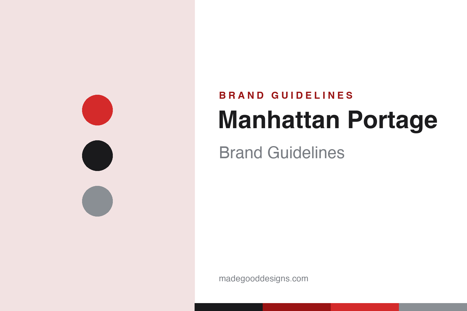
Manhattan Portage Brand Guidelines
New York Tough — the red skyline label, born on the gritty streets of 1983 New York City.
Aa
Two constants: a signature-red-and-black palette and a tall, NYC-signage display. Abstract homage — not the Manhattan Portage label.
Born on the streets of NYC
Manhattan Portage carried the city.
Manhattan Portage is a lesson in a place as the whole brand. It was founded in 1983 in New York City by John Peters, born on “the challenging and gritty streets” of NYC — originally making tough bags for bike messengers and East Village DJs. An early innovation was practical: swapping heavy metal buckles for lighter, durable hardware. (The name nods to “portage,” the act of carrying or hauling loads. Two honest notes: no official brand hex is published, and the wordmark typeface is undocumented.)
The identity is one of the most recognisable in bags: the iconic red rectangular label bearing the Manhattan/NYC skyline silhouette and “Manhattan Portage NYC.” The red label is the signature mark — “a cultural symbol on New York streets and globally.” (An honest note: there’s also a premium Black Label line, so red is the mainline signature, not the only label.) The bags are built from military-grade Cordura with YKK components, led by the classic NY Messenger Bag and backpacks.
From bike-courier roots, Manhattan Portage grew into a streetwear icon, with a deep collaboration practice (partners have included UNDERCOVER, Stüssy, PUMA, Alpha Industries and Pokémon) and a strong following, notably in Japan. Its brand voice is pure New York: “New York Tough” and “a bag for everyone,” stamped “Est. 1983.” Two honest, important facts: founder John Peters later moved on and launched a separate brand, “John Peters New York” (don’t conflate the two), and while the brand is NYC through and through in design and identity, its current production is in Taiwan (design stays in New York), so it’s not accurate to call the mainline “Made in USA” today. Born on the streets of NYC.
Colour
Manhattan Portage lives in signature red and black. Click a swatch to copy the hex.
Manhattan Portage’s identity is anchored by its signature red and black — the bright, pillar-box red of the iconic label against black bags and hardware, with steel greys. The red is the whole visual signature: it makes the skyline label instantly recognisable on a strap or flap, and it carries the bold, urban, no-nonsense energy of New York. Black grounds it as tough, practical messenger gear. It’s a punchy, high-recognition palette that ties directly to the brand’s NYC identity. The honest caveat: Manhattan Portage publishes no official brand hex, so the signature red, black and steel here are an original, unofficial interpretation, not first-party values.
The lesson is a single signature colour can carry an identity. Manhattan Portage’s red label is instantly recognisable. For designers, it’s a reminder that one bold, consistent signature colour (on a distinctive label) can become a brand’s whole visual anchor. The takeaways: own one bold signature colour (the red); tie it to a distinctive mark (the skyline label); and treat specific hexes as unofficial when there’s no published spec.
Typography
The wordmark is a tall NYC-signage display — bold and urban.
Manhattan Portage’s identity carries a bold, urban, New York spirit — the “Manhattan Portage New York” wordmark on its red skyline label, whose tall, condensed, signage-like letterforms read as gritty, confident and city-tough. A NYC-signage display captures it well: it feels like subway type and street signage, matching a brand born from bike messengers and steeped in New York identity. Set against the signature red-and-black palette, the type feels bold and urban — exactly the “New York Tough” personality Manhattan Portage cultivates. It’s tall and condensed rather than delicate, mirroring the tough messenger bags. Because the exact wordmark face isn’t publicly documented, the honest description is “a tall NYC-signage display spirit,” not a named font. The type behaves like the brand: bold, urban and tough.
Aa
A tall NYC-signage display spirit — bold and urban. (Specimen set in Staatliches, a tall signage-style display in the spirit of the Manhattan Portage identity; the real face is undocumented.)
Place as the brand
Manhattan Portage bottled NYC.
Manhattan Portage is a lesson in owning a place as a brand. Manhattan Portage didn’t just make bags in New York — it made New York the brand. The name, the skyline label, the red, the “New York Tough” voice, the bike-messenger origin: everything ties the product to the identity, energy and grit of NYC, so buying the bag means buying a piece of that place. That geographic identity is the whole differentiator, and it’s remarkably durable and portable — it’s exactly why the brand became a streetwear icon far from home, especially in Japan, where the authentic New York association carries real cultural weight. The lesson is that a strong, authentic connection to a place — expressed consistently through a name, a mark and a voice — can become a brand’s most valuable and exportable asset. (And an honest brand keeps the facts straight: NYC design and identity, even as production moved to Taiwan.) Bottle a place people love, and the label carries it everywhere. Own the city, own the bag.
For designers and brand-builders, Manhattan Portage offers a clear takeaway: an authentic connection to a place can be a brand’s most exportable asset. The lessons: tie the identity to a place people love (NYC — the name, the skyline label, “New York Tough”); anchor it to one recognisable mark and colour (the red skyline label); and let authentic collaborations extend it (streetwear partners, big in Japan). It’s also a reminder to keep the facts precise — Manhattan Portage was founded in 1983 in NYC by John Peters, is known for its red skyline label and messenger bags, and is designed in New York though now produced in Taiwan. Manhattan Portage bottled NYC — proof that a place can be the brand.
Explore & save
Keep Manhattan Portage’s identity on hand — save it to a board in the Made Good inspiration library.
Manhattan Portage identity set
Pin the red-and-black palette and the signage-display spirit to your own board.


