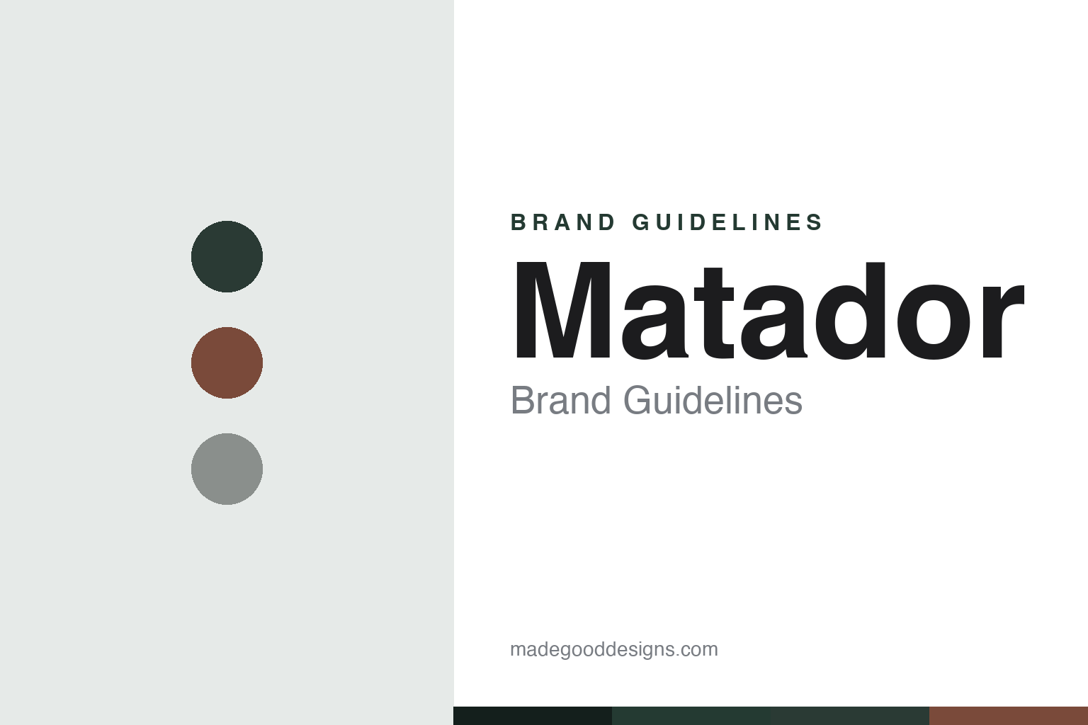
Matador Brand Guidelines
Explore without limits — ultralight, packable travel gear engineered to stuff into almost nothing.
Aa
Two constants: a technical juniper-and-garnet palette and a geometric, technical sans. Abstract homage — not the Matador wordmark.
Explore without limits
Matador made gear disappear.
Matador is a lesson in engineering-led ultralight design. It was founded in 2014 in Boulder, Colorado by two product designers, Chris and Jaime (an honest note: the brand publishes their first names, not surnames, so it’s best to say “founder-designers Chris and Jaime”). Their pedigree is the story: they’d previously designed products at GoPro, Google and Nest, got frustrated by travel-gear failures, and started prototyping in a spare room with a Craigslist sewing machine, an iron and a 3D printer — growing the company, by their own account, with no outside investment or crowdfunding. (Two more notes: no official brand hex is published, and the wordmark typeface is undocumented.)
Matador’s niche is ultralight, packable, water-resistant travel and outdoor gear — packable daypacks and duffels that stuff into tiny sacks, dry bags, travel towels, and clever toiletry systems. Its breakout was the Pocket Blanket, a picnic/beach blanket that packs into a palm-sized pouch (an honest note: it’s the product that put Matador on the map, though the founders’ own earliest prototypes were a packable backpack and a soap case, so it’s the breakout rather than literally the first product).
Signature lines include the FlatPak toiletry system and a family of packable backpacks (an honest note: some earlier model names like Freerain and Beast may have been renamed or discontinued, so they’re best referenced as notable lines rather than current SKUs). The engineering is real and citable: featherweight builds in Cordura ripstop nylon, welded seams, rolltop closures and sealing zippers, increasingly in Bluesign-approved recycled nylon with PFAS-free coatings. Matador’s language is “Built by Travelers, For The Travelers,” with the pillar “Explore Without Limits.” (An honest note: despite the name, there’s no bull/matador figure in the logo — it’s a wordmark; the name is an evocative pun.) Explore without limits.
Colour
Matador lives in a technical juniper-and-garnet palette. Click a swatch to copy the hex.
Matador’s identity leans on a technical, outdoor palette — deep blacks and charcoals as the base, with muted outdoor accents like a juniper green, a garnet red and slate blues (real Matador colourway names). The tones read as capable, understated and gear-first — the look of serious, packable technical equipment rather than fashion — with muted accents adding just enough character. It’s a functional palette that matches a brand built on ultralight engineering and travel. The honest caveat: Matador publishes no official brand hex, so the juniper, garnet and slate here are an original, unofficial interpretation of its colourway names, not first-party values.
The lesson is a technical, mostly-dark palette signals ultralight capability. Matador’s juniper-and-garnet world reads as serious, packable gear. For designers, it’s a reminder that a dark, gear-first palette with muted accents can convey engineering and function. The takeaways: use technical dark tones with muted outdoor accents; keep it gear-first; and treat specific hexes as unofficial when the palette is colourway-based.
Typography
The wordmark is a geometric technical sans — engineered and modern.
Matador’s identity carries an engineered, modern, technical spirit — a “MATADOR” wordmark whose clean, geometric letterforms read as precise, capable and design-led. The technical type matches a brand built by product designers on ultralight engineering, and it keeps the personality modern and functional rather than rugged or decorative. Set against a technical juniper-and-garnet palette, the type feels engineered and modern — exactly the “explore without limits,” packable-gear personality Matador cultivates. It’s geometric and precise rather than ornate, mirroring the cleverly-engineered gear. Because the exact wordmark face isn’t publicly documented, the honest description is “a geometric technical sans spirit,” not a named font. The type behaves like the brand: engineered, modern and technical.
Aa
A geometric technical sans spirit — engineered and modern. (Specimen set in Kanit, a geometric technical sans in the spirit of the Matador identity; the real face is undocumented.)
Engineering as the difference
Matador designed for less.
Matador is a lesson in design-and-engineering pedigree as a differentiator. Matador competes not on heritage or marketing but on engineering — how small, how light, how waterproof, how cleverly a piece of gear can pack down. That focus flows directly from its founders’ background designing hardware at GoPro, Google and Nest: they treat travel gear as a product-design problem, obsessing over grams, welded seams and pack-size, and it shows in concrete, verifiable specs. Growing without outside investment or crowdfunding reinforces the point — the product had to be good enough to sell itself. The whole brand is that engineering promise (“Explore Without Limits”), expressed through a disciplined, technical aesthetic and genuinely innovative products like the palm-sized Pocket Blanket. The lesson is that deep product-design and engineering expertise, applied to a specific problem (packability), can differentiate a brand in a crowded market — substance as the story. When the engineering is genuinely better, you don’t need to shout. Solve it lighter, smaller, smarter.
For designers and brand-builders, Matador offers a clear takeaway: genuine engineering and design pedigree can be the differentiator. The lessons: bring real product-design rigour to the problem (ultralight, packable, waterproof); let concrete specs tell the story (grams, welded seams, pack-size); and back it with substance (self-funded growth, innovative products). It’s also a reminder to keep the facts precise — Matador was founded in 2014 in Boulder by designers Chris and Jaime (ex-GoPro/Google/Nest), is known for packable ultralight gear and the Pocket Blanket, and grew without outside investment. Matador designed for less — proof that engineering can be the difference.
Explore & save
Keep Matador’s identity on hand — save it to a board in the Made Good inspiration library.
Matador identity set
Pin the technical palette and the technical-sans spirit to your own board.


