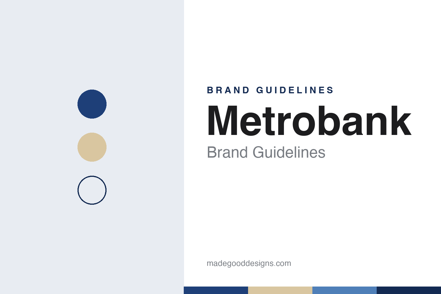
Metrobank Brand Guidelines
The Binondo bank of 1962 that built its brand on one promise: good hands.
Aa
Two constants: a harbour blue and warm sand palette and a rounded geometric sans register. Abstract homage — not a Metrobank product or mark; no logo, card or building is reproduced.
Binondo, 1962
A bank that started in Manila’s old trading district.
Metrobank is the trading name of the Metropolitan Bank & Trust Company, a Philippine universal bank now based in Makati. The company says it was first incorporated on 6 April 1962. It opened its first office on 5 September 1962 in the Wellington Building in Binondo, Manila’s old trading district, The Philippine Star reported in 2012. English Wikipedia describes the founders as a group of businessmen, and its article on George S.K. Ty names him as the founder, together with Emilio Abello, Pio Pedrosa and Placido Mapa Sr.
The bank grew outward from Binondo. English Wikipedia records a first branch in Divisoria in August 1963, a first provincial branch in Davao four years later and a first international branch in Taipei in the early 1970s; its article on the founder dates the Taipei branch to 1970. In 1977 the bank moved its head office into Metrobank Plaza, a 20-storey building in Makati, the Star reported. In August 1981 the central bank authorised it to operate as a universal bank, English Wikipedia says, and the company says its shares have been listed on the Philippine Stock Exchange since 1981.
From the 1980s Metrobank became the centre of a group. English Wikipedia lists a majority stake in Philippine Savings Bank, the founding of Toyota Motor Philippines with Toyota and Mitsui in 1988, a place among the founding members of the BancNet ATM network in 1990, and the acquisition of Solidbank in May 2000, with Metrobank as the surviving entity. In 2017, the same article says, the bank agreed with ANZ to take full ownership of Metrobank Card Corporation, the credit-card venture the two had formed in 2003.
Colour
One promise, repeated everywhere.
Ownership today is split between the stock market and the founding family’s holding company. As of June 2026, the company says, 47.8% of its shares were publicly owned, 39.8% belonged to GT Capital Holdings and 12.3% to the Ty family and related parties. English Wikipedia describes Metrobank as the commercial and retail banking arm of GT Capital, which its article on the founder says he set up in 2007.
The brand’s promise is a single phrase: “You’re in Good Hands.” The company’s overview calls it the promise that “embodies who we are and what we do,” and sums up its mission as “Meaningful Banking from Good Hands.” The same idea runs through its about pages, where sections carry short headings such as “Proven and trusted” and “Bank in confidence,” and the company describes itself as having helped Filipinos “for over six decades.”
Its campaigns lean on people rather than products. In October 2024 The Manila Times reported that Metrobank’s “Grow With Metrobank” campaign had won a gold Stevie at the 2024 International Business Awards, in the video category for banking. The campaign paired a customer story video with culture videos about the bank’s staff, and the paper noted that it was the only gold winner in its category; a judge praised the videos as relatable and easy to understand.
The bank has also used its buildings as emblems. For its 50th anniversary in 2012 the Philippine postal service, PHLPost, issued four commemorative stamps showing four Metrobank landmarks: the Binondo branch of 1962, Metrobank Plaza of 1977, GT International Tower of 2004 and Metrobank Plaza in Shanghai, the Star reported. English Wikipedia says the bank announced in 2023 that Metrobank Plaza would make way for a new tower.
Typography
Design and documentation.
Southeast Asian banks speak to a wide range of customers at once: city professionals and market traders, exporters and farmers, families in the capital and small businesses in provincial towns. Their identities are built to read clearly on a branch sign, a card and a phone screen. Strong symbols and wordmarks are common, often set in deep blues, greens, purples or golds, and many marks carry a symbol with local meaning: Bangkok Bank, for example, has used the royal lotus as its emblem since 1972, according to Thai Wikipedia.
Names often work in more than one language. Many banks pair a name in the local language with an English name or a short set of initials, and some add a Chinese name for business in China; Kasikornbank introduced a logo in Thai, Chinese and English in 2007, English Wikipedia says. Photography of branches, city skylines and everyday customers carries much of the visual message on websites and in campaigns.
Digital channels sit at the centre of the brand. Bank websites give prominent space to everyday banking, loans and mobile apps, such as Bangkok Bank’s Bualuang mBanking and Kasikornbank’s K PLUS, and to QR payments for shops and market stalls. Many banks also present programmes for small businesses, farmers and communities with less access to banking, and an increasing number present themselves as regional banks, linking customers across borders through subsidiaries in neighbouring countries.
Reporting is the other half of the identity. Listed banks publish annual and sustainability reports, and these documents often carry the most considered typography and photography a bank produces. This guide looks at each brand’s history and what can be checked about how it presents itself, and treats the colours and type shown here as an unofficial interpretation rather than official brand assets.
Aa
A rounded geometric sans — steady, friendly, institutional. (Specimen set in Manrope, a sans STAND-IN; NOT the Metrobank logo.)
Metrobank
Awards for teachers, painters and architects.
Much of Metrobank’s public profile reaches people through the Metrobank Foundation. Its Outstanding Filipinos award honours teachers, soldiers and police officers. When the search for the 2027 awards opened in late October 2026, SunStar reported that the programme was entering its 42nd year and had honoured 735 people over four decades.
For designers, the foundation’s other programme matters more. The Metrobank Art & Design Excellence awards, known as MADE, recognise young painters, sculptors, interior designers and architects. In April 2016 GMA News reported the launch of that year’s architecture and interior-design searches with the United Architects of the Philippines, the Philippine Institute of Interior Designers and Bluprint magazine, under the theme “Blueprints MADE for 2050.” Entrants were asked to pick a site anywhere in the Philippines and propose buildings and interiors for the country of 2050. The foundation then described the awards as in their 32nd year, and grand-prize winners received a glass trophy designed by a past MADE awardee.
Metrobank sits among the large Philippine banks. English Wikipedia names SM-led BDO Unibank and the Ayala group’s Bank of the Philippine Islands as its main retail competitors, and describes Metrobank as the third largest bank in the country by total assets as of 2022.
For a design guide, Metrobank shows how a bank can hang its identity on one reassuring phrase and on the buildings, stamps and awards that carry its name. Compare BDO Unibank, the SM group’s bank, and BPI, the Ayala group’s bank. For this guide we use a harbour blue and a warm sand with a sans, an unofficial interpretation; no product or logo is reproduced.
Explore & save
Keep Metrobank’s identity on hand — save it to a board in the Made Good inspiration library.
Metrobank identity set
Pin the Metrobank harbour blue and warm sand palette and the rounded geometric sans register to your own board.