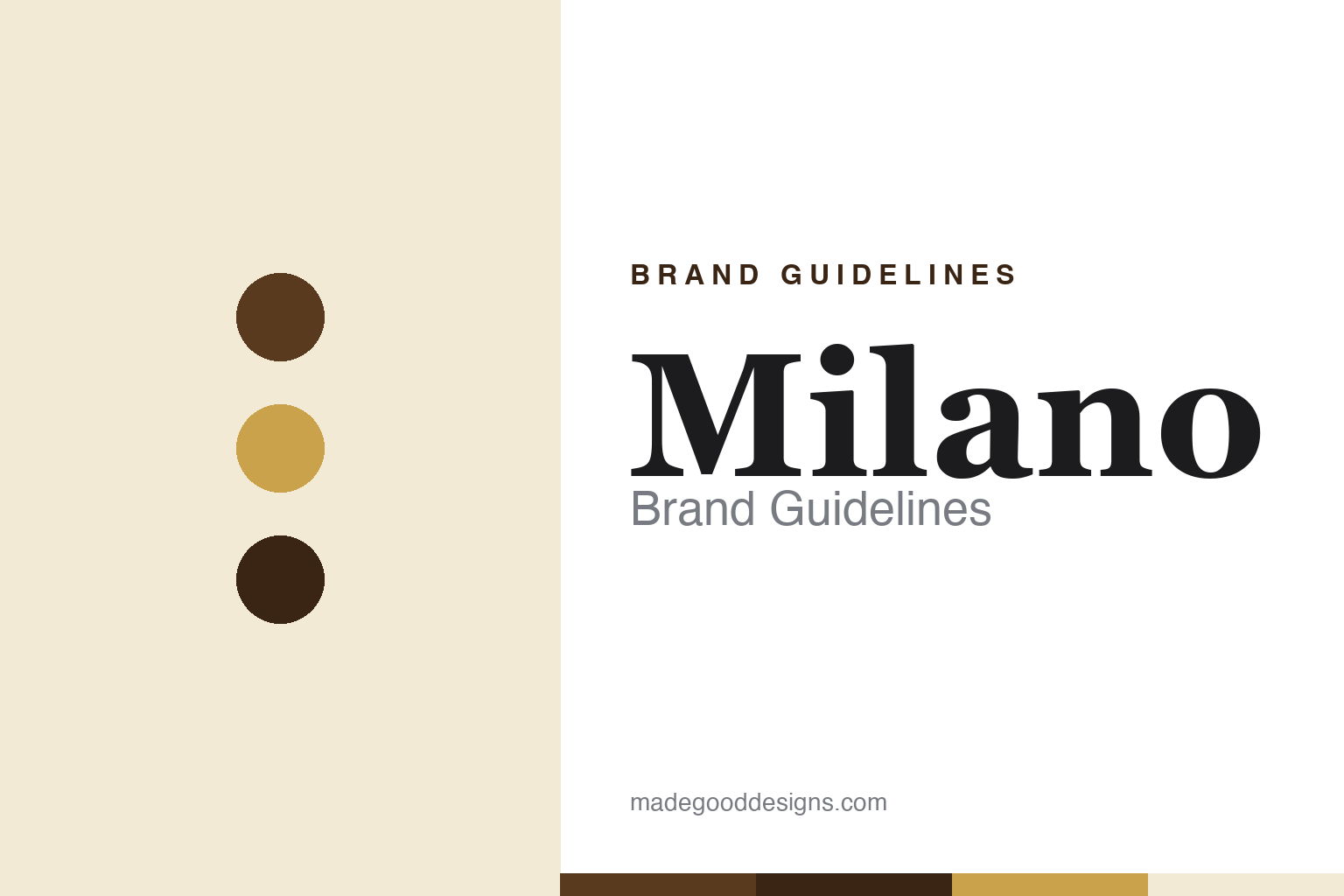
Milano Brand Guidelines
An elegant chocolate sandwich cookie born from a shipping problem — Pepperidge Farm’s sophisticated classic.
Aa
Two constants: a chocolate-and-gold palette and an elegant serif. Abstract homage — not the Milano wordmark or the mill logo.
A melted-chocolate fix
Milano was born from a shipping problem.
Milano is a lesson in turning a problem into an icon. It’s a Pepperidge Farm “Distinctive” cookie: two thin, crisp cookies sandwiching a layer of dark chocolate. Its origin is a genuine engineering story. Pepperidge Farm introduced an open-faced “Naples” cookie — a single wafer topped with chocolate — in 1956; but as distribution expanded, the exposed chocolate melted and stuck together in warm shipping. The fix was elegant: cap it with a second cookie to seal the chocolate inside, and rename it “Milano” in 1957. A logistics headache became one of America’s most beloved cookies. (Honest caveats: no official brand hex or wordmark typeface is published, so the colours and type here are approximate.)
The European-city naming is real and charming. Pepperidge Farm’s Distinctive Cookies debuted in the mid-1950s with names like Bordeaux, Brussels, Venice, Dresden and Geneva; “Naples” became “Milano,” and the line has always used sophisticated Old-World city names to signal an elegant, adult, indulgent cookie (Naples = Napoli, Milano = Milan). The brand leans hard into that premium positioning — the distinctive bag with its internal pleated paper tray, the “perfect balance of crisp cookies and rich chocolate” language, the whole grown-up-treat image. Milano isn’t a kids’ cookie; it’s a small luxury.
The company behind it is a heritage brand. Pepperidge Farm was founded in 1937 by Margaret Rudkin (who began baking for her allergy-prone son), and Campbell Soup — now The Campbell’s Company — acquired it in 1961 (for about $28 million in stock); it remains a subsidiary. Pepperidge Farm’s logo is a grist mill (inspired by the Wayside Inn Grist Mill in Sudbury, Massachusetts, often loosely called a “windmill”), and its heritage advertising — the folksy “Pepperidge Farm remembers” campaign with Yankee spokesman Titus Moody — cemented an old-fashioned, wholesome image. A shipping fix, dressed as European elegance.
Colour
Milano lives in chocolate and gold. Click a swatch to copy the hex.
Milano’s palette is elegant and indulgent — rich chocolate and espresso browns (the dark-chocolate filling), warm gold and tan accents, and a soft cream/ivory bag. The browns read as luxurious and grown-up (this is a chocolate cookie for adults), the gold adds a premium, refined touch, and the cream keeps it sophisticated rather than loud. It’s a restrained, upscale scheme that matches the brand’s positioning as a small everyday luxury — the opposite of a bright, kid-focused cookie. The honest caveat: Pepperidge Farm publishes no official public Milano brand hex — the chocolate, gold and cream here are observed approximations, not a confirmed spec.
The lesson is a palette that signals premium. Milano’s chocolate-brown-and-gold scheme reads as elegant and indulgent — an adult treat, not a children’s snack. For designers, it’s a reminder that rich, restrained colours can position a product as a small luxury. The takeaways: use deep, rich tones drawn from the product to signal indulgence (chocolate browns); add gold and cream for a premium, refined feel; and treat specific values as approximate when no official spec is published.
Typography
The wordmark is an elegant serif — refined and sophisticated.
Milano’s elegant serif wordmark is refined and sophisticated — graceful, high-contrast letterforms that read as upscale and adult, matching a premium chocolate cookie with an Old-World, European-city name. The serif styling signals class, heritage and indulgence rather than fun or minimalism, and it pairs naturally with the chocolate-and-gold palette and the pleated-tray packaging. It’s the typographic equivalent of the brand’s small-luxury positioning: quiet, tasteful and grown-up. (Because the exact face is undocumented, the honest description is “an elegant serif,” not a named font.) The type behaves like the brand: refined, sophisticated and indulgent.
Aa
An elegant serif — refined and sophisticated. (Specimen set in Playfair Display, a high-contrast serif in the spirit of the Milano wordmark; the real face is undocumented.)
Elegance as positioning
Milano turned a fix into a small luxury.
Milano is a lesson in positioning a cookie as a small luxury. Everything about it — the sophisticated European-city name, the elegant serif wordmark, the chocolate-and-gold palette, the pleated paper tray, the heritage “Pepperidge Farm remembers” image — is engineered to make a simple sandwich cookie feel like a grown-up indulgence. That consistent premium positioning lets Milano command a higher price and a distinct place in the aisle, appealing to adults who want a refined treat rather than a kids’ snack. It all traces back to a practical fix (sealing the melting chocolate), proving that smart design can turn a problem into a premium identity.
For designers and brand-builders, Milano offers a clear takeaway: consistent, elegant cues can position an everyday product as a luxury. The lessons: use sophisticated naming and type to signal premium (the city names, the elegant serif); choose a rich, restrained palette to read as indulgent (chocolate and gold); and let packaging reinforce the positioning (the pleated tray, the heritage image). It’s also a reminder to keep the facts precise — Milano evolved from the open-faced “Naples” cookie (1956) into the sealed “Milano” (1957) to solve melting chocolate; Pepperidge Farm was founded in 1937 by Margaret Rudkin and acquired by Campbell in 1961; its logo is a grist mill; and the cookies are American, with the European city names purely marketing. Milano turned a fix into elegance — proof that positioning can make a cookie a small luxury.
Explore & save
Keep Milano’s identity on hand — save it to a board in the Made Good inspiration library.
Milano identity set
Pin the chocolate-and-gold palette and the elegant-serif spirit to your own board.


