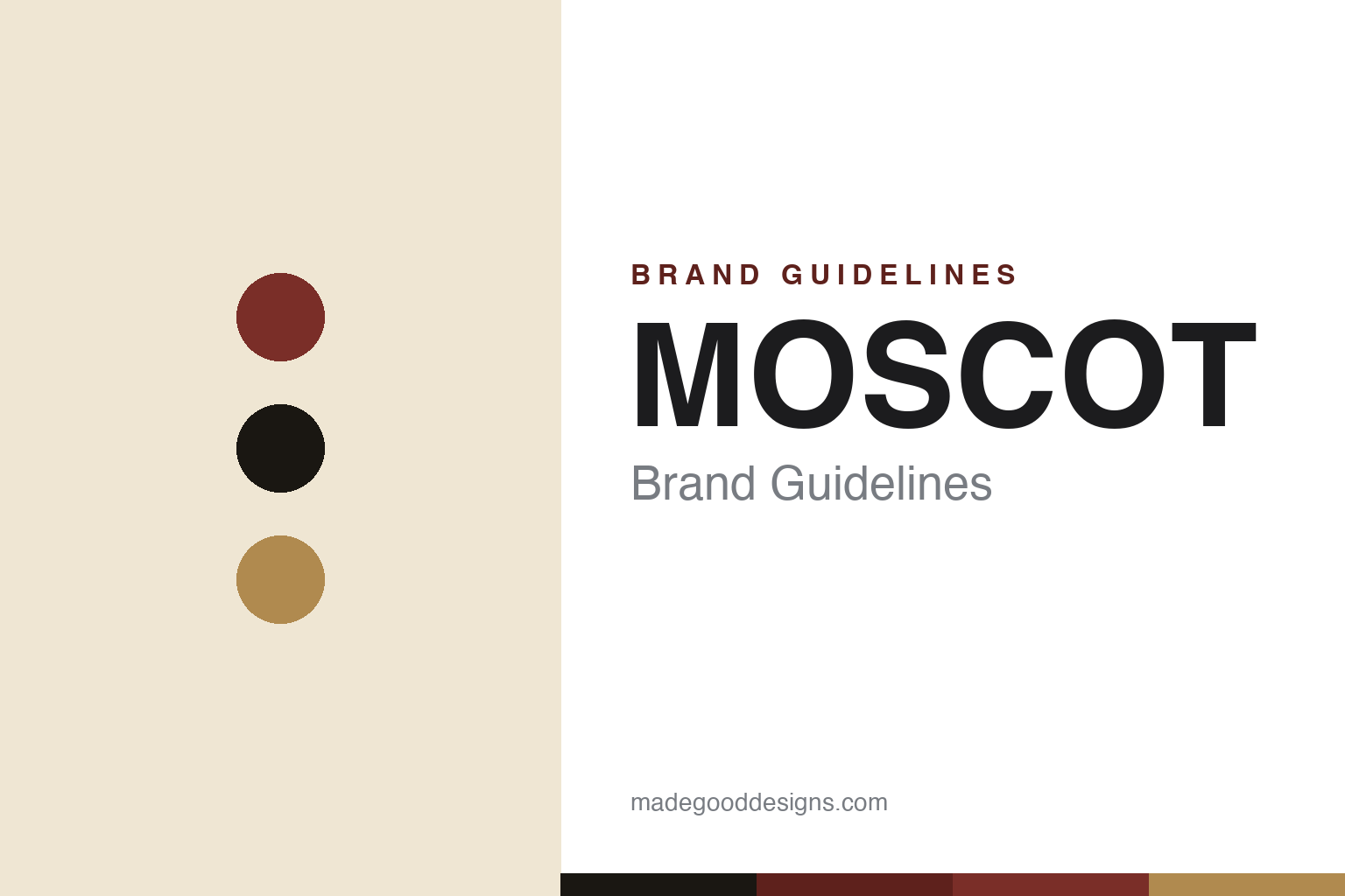
MOSCOT Brand Guidelines
A fifth-generation Lower East Side eyewear family, on the same streets since 1915.
Aa
Two constants: an oxblood-and-brass heritage palette and a condensed signage spirit. Abstract homage — not the MOSCOT wordmark or logo.
On the Lower East Side since 1915
MOSCOT is a five-generation New York eyewear family.
MOSCOT is a lesson in heritage as identity. The family story begins when Hyman Moscot arrived at Ellis Island in 1899 and began selling ready-made eyeglasses from a pushcart on Orchard Street, on New York’s Lower East Side. The company marks 1915 as its established date — the year Hyman opened his first shop — which is why the brand brands itself “Since 1915.” (The two dates are often conflated: 1899 is the immigration and pushcart start; 1915 is the founding of the business.)
It has stayed in the family for five generations — from Hyman to Sol, to Joel, to Dr. Harvey Moscot (the fourth-generation optometrist who leads the company), to Zack Moscot, the fifth generation and the brand’s first Chief Design Officer. For decades the store stood at 118 Orchard Street at the corner of Delancey; the flagship remains on Orchard Street today.
Its signature frames are heritage in themselves: the round, keyhole-bridged, diamond-riveted LEMTOSH (introduced in the 1940s) and the P3-shaped MILTZEN (introduced in the 1930s), both drawing their names from old Yiddish and family nicknames. The brand voice leans into that Lower East Side, Yiddish-inflected heritage. (Honest notes: MOSCOT is “established 1915,” not “founded 1899”; the family name was originally spelled Mushcot and later simplified to Moscot — but the popular “changed at Ellis Island” story is a myth, since officials worked from ship manifests and did not rename immigrants; frame-name person-stories are family lore and vary by source; historical figures often listed evoke the style rather than being documented MOSCOT customers; and no official brand hex is published.)
Colour
MOSCOT lives in an oxblood-and-brass heritage palette. Click a swatch to copy the hex.
MOSCOT’s identity is warm, old-New-York and heritage — an ink black, a warm tortoise amber, an oxblood “Rivington red,” and a brass rivet-gold on aged optical cream. The palette reads like a restored Lower East Side shopfront: vintage signage, wood, tortoise acetate and the glint of a diamond rivet. It signals family history and downtown NYC rather than gloss or trend. The honest caveat: with no published brand hex, these tones are an original, unofficial interpretation, not first-party values.
The lesson is an oxblood-and-brass palette signals heritage and place. MOSCOT’s world reads as warm, storied and specific to a neighbourhood. For designers, it is a reminder that vintage signage tones — oxblood, brass, aged cream — anchor a brand in time and place, matching a house that has stood on the same streets since 1915. The takeaways: use aged, warm heritage tones to signal longevity and place; let a signature detail (the diamond rivet) inform the metallics; and treat any single hex as unofficial when there is no published spec.
Typography
The wordmark spirit is a condensed signage face — bold and heritage.
MOSCOT’s identity carries a bold, condensed, old-signage spirit — a “MOSCOT” wordmark set in confident condensed capitals, often locked up with “NYC Since 1915,” whose forms echo painted shopfront and subway lettering. A condensed signage face captures the mood: it is bold and heritage, the register of a century-old New York storefront rather than a soft modern logo. Set against an oxblood-and-brass palette, the condensed caps feel grounded and storied — exactly the Lower East Side personality MOSCOT carries. It is sturdy rather than delicate, mirroring a shop that has outlasted a century of the city. (MOSCOT’s real wordmark is a trademark we describe but do not reproduce.) Because the exact mark is not ours to use, the honest description is “a condensed signage spirit,” not the MOSCOT logo. The type behaves like the brand: bold, condensed and heritage.
Aa
A condensed signage spirit — bold and heritage. (Specimen set in Oswald, a condensed sans; NOT the MOSCOT logo, which is a trademark.)
Staying put as the difference
MOSCOT stands for continuity.
MOSCOT is a lesson in the value of not leaving. In an industry of conglomerates and licensing, MOSCOT’s asset is that it is still family-owned and independent, still on the Lower East Side, still making the same heritage shapes it has made for generations. That continuity — five generations, one neighbourhood, since 1915 — is a story no marketing budget can buy, and it turns each pair of LEMTOSH glasses into a piece of persistent New York history. The Yiddish-inflected voice and the restored-shopfront stores make the heritage tangible rather than nostalgic decoration.
For designers and brand-builders, MOSCOT offers a clear takeaway: authentic continuity is a moat. The lessons: let real history — a founding year, a family, a street — carry the brand; give the heritage a distinctive voice (here, Yiddish and downtown NYC) so it feels lived-in rather than staged; and keep signature products (the LEMTOSH, the MILTZEN) consistent across decades. It is also a reminder to keep the facts honest: MOSCOT is established 1915 (1899 was the pushcart start), is independent and family-run across five generations, and names its frames from old family and Yiddish lore — while the “Ellis Island changed the name” tale and many celebrity-wearer claims are best treated as legend and style lineage. MOSCOT stayed put — proof that continuity can be the difference.
Explore & save
Keep MOSCOT’s identity on hand — save it to a board in the Made Good inspiration library.
MOSCOT identity set
Pin the oxblood-and-brass palette and the condensed-signage spirit to your own board.