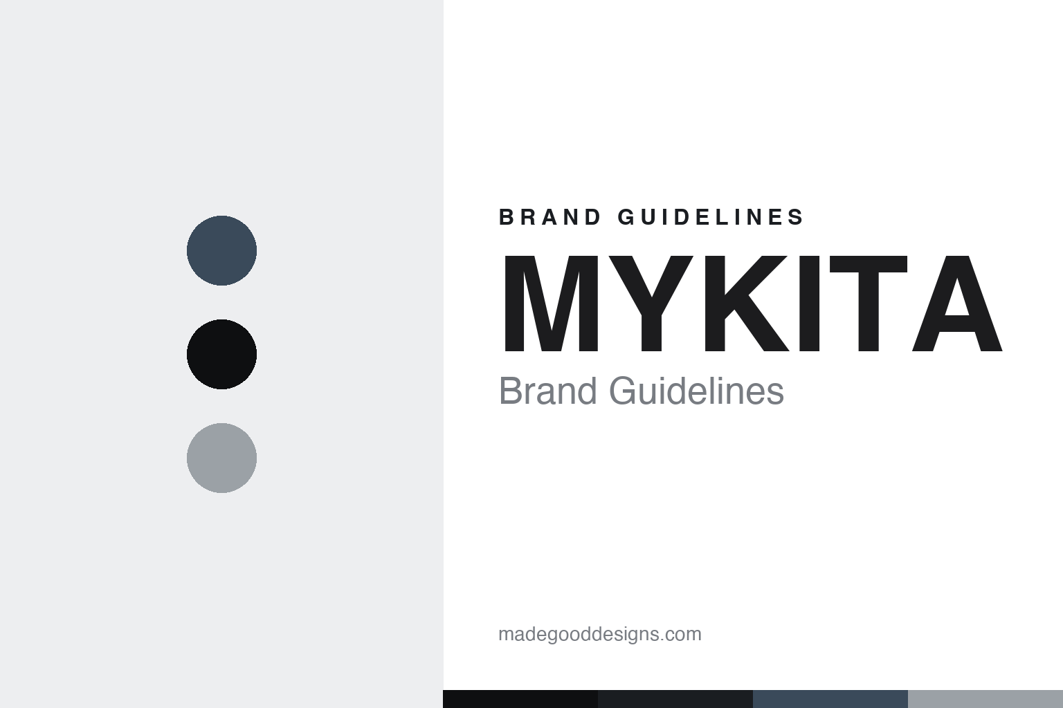
MYKITA Brand Guidelines
Berlin eyewear engineered around a screwless hinge — handmade in a former daycare.
Aa
Two constants: a stainless-and-steel-blue palette and an industrial sans. Abstract homage — not the MYKITA wordmark or logo.
My daycare, my manufactory
MYKITA turned an engineering idea into a Berlin brand.
MYKITA is a lesson in engineering as identity. It was founded in 2003 in Berlin by four people — Harald Gottschling, Daniel Haffmans, Philipp Haffmans and Moritz Krüger. The name is a small, deliberate joke: the founders set up in a former Kita (a German day-nursery, short for Kindertagesstätte), so “MY KITA” nods to a place of learning and starting from basics.
Its signature is a piece of engineering: a screwless spiral hinge built with no screws, welds or glue — the temples clip into an interlocking, patented hinge. That idea, first shown in models like the DRIES, won an iF product design award in 2010 and became the house’s calling card. In 2010 MYKITA also introduced MYLON, a proprietary material — a laser-sintered (3D-printed) polyamide — used for the ultralight MYLON collection, which picked up its own material and design awards.
MYKITA makes its frames in-house in Berlin at a manufactory it calls MYKITA HAUS, and works across collections such as LESSRIM, NO1, LITE, ACETATE and MYLON. It is design-led and much-collaborated: the long-running Maison Margiela eyewear partnership is its flagship collab, alongside work with Bernhard Willhelm, Damir Doma, Moncler and others. (Honest notes: MYKITA had four founders — the three besides Krüger left around 2015, leaving him as CEO and creative director; the name is “MY” + “Kita” (daycare), not an acronym or a Japanese reference; the hinge is explicitly screwless, and MYLON is a 3D-printed polyamide, not acetate; frames are handmade in Berlin; LVMH’s eyewear arm Thélios took a minority stake in 2024, though Krüger remains creative lead; and no official brand hex is published.)
Colour
MYKITA lives in a stainless-and-steel-blue industrial palette. Click a swatch to copy the hex.
MYKITA’s identity is industrial, precise and Berlin — an ink black, a brushed steel grey, a cold aluminium highlight, and a single muted steel-blue accent, on off-white. The palette reads like the product and the manufactory: thin stainless sheet metal, engineered edges, and workshop light. It signals design and engineering rather than colour or ornament, letting the acetates carry any brightness. The honest caveat: with no published brand hex, these tones are an original, unofficial interpretation, not first-party values.
The lesson is a stainless-and-steel-blue palette signals industrial precision. MYKITA’s world reads as engineered and modern. For designers, it is a reminder that a near-monochrome metallic palette — ink, steel grey, aluminium, one cool blue — conveys craft and engineering, matching a brand whose product is literally cut from sheet steel. The takeaways: use metallic neutrals to signal engineering; hold colour back so the material speaks; and treat any single hex as unofficial when there is no published spec.
Typography
The wordmark spirit is an industrial sans — bold and precise.
MYKITA’s identity carries a bold, precise, industrial spirit — a “MYKITA” wordmark set in confident uppercase sans, whose engineered forms match a house built on a patented hinge. An industrial grotesque sans captures the mood: it is clean and mechanical, the register of Berlin design and precision engineering rather than ornament. Set against a stainless palette, the bold sans feels modern and exact — exactly the screwless, sheet-metal personality MYKITA carries. It is functional rather than decorative, mirroring frames stripped to essentials. (MYKITA’s real wordmark is a trademark we describe but do not reproduce, and the exact typeface is not something we assert.) Because the specific mark is not ours to use, the honest description is “an industrial sans spirit,” not the MYKITA logo. The type behaves like the brand: bold, precise and industrial.
Aa
An industrial sans spirit — bold and precise. (Specimen set in Archivo, a grotesque sans; NOT the MYKITA logo, which is a trademark.)
A patented detail as the difference
MYKITA stands for engineered design.
MYKITA is a lesson in owning an engineering idea. Rather than compete on branding, it built recognition on a patented screwless hinge and a proprietary 3D-printed material — assets that are hard to copy and genuinely useful, not just decorative. That made a small Berlin startup into an internationally awarded, design-led house whose frames are recognisable by their construction and made in its own manufactory. Backed by a flagship Maison Margiela collaboration and a made-in-Berlin story, MYKITA occupies a position rooted in craft and invention.
For designers and brand-builders, MYKITA offers a clear takeaway: a genuine, protected innovation can be the brand. The lessons: turn real engineering (a hinge, a new material) into identity; keep the visual system industrial and restrained so the product reads as considered; and make things where you can control the craft. It is also a reminder to keep the facts honest: MYKITA was founded in 2003 by four people in Berlin, its hinge is screwless and MYLON is a 3D-printed polyamide, it is handmade in Berlin, and LVMH’s Thélios holds a minority stake as of 2024 — with the palette here an unofficial interpretation. MYKITA engineered its way to distinction — proof that a patented detail can be the difference.
Explore & save
Keep MYKITA’s identity on hand — save it to a board in the Made Good inspiration library.
MYKITA identity set
Pin the stainless-and-steel-blue palette and the industrial-sans spirit to your own board.


