LINDBERG Brand Guidelines
Danish eyewear reduced to essentials — no screws, no rivets, no welds.
Aa
Two constants: a titanium-and-champagne palette and a clean geometric sans. Abstract homage — not the LINDBERG wordmark or logo.
Less, in titanium
LINDBERG reduced the frame to essentials.
LINDBERG is a lesson in subtraction as design. The optical business began in 1969, when optician Poul-Jørn Lindberg (with his wife Hanne) opened a shop in Aarhus, Denmark. The breakthrough came when Lindberg, frustrated by heavy frames, worked with architect Hans Dissing of Dissing+Weitling to design a radically minimal frame: the Air Titanium, prototyped in 1983 and launched commercially in 1986. It was rimless, ultralight, and built with no screws, no rivets, and no welding or soldering — held together instead by a patented spiral hinge, a single coiled titanium form.
The design won Denmark’s top honour, the Danish ID Prize, in 1989, the first of what the company now counts as more than a hundred international design awards (including iF and Red Dot). The philosophy is pure Scandinavian minimalism — “form follows function,” everything unnecessary removed — and it extends to deep customization: thousands of combinations, frames adjusted to each wearer, and names or text engraved on the temples.
Beyond titanium, LINDBERG works in acetate, buffalo horn, wood, 18k gold, platinum and diamonds across collections such as Air Titanium Rim (1993), Strip (1997), n.o.w. (2012) and the goldsmith-made Precious line. It is headquartered in Aarhus. (Honest notes: the frame is screwless with a signature spiral hinge — not “hingeless”; the optical business dates to 1969, with the Air Titanium prototyped in 1983 and launched in 1986; Hans Dissing was the external architect-collaborator, not a company founder; LINDBERG was family-owned from 1969 until it was acquired by Kering Eyewear in 2021, so it is no longer independent in the present tense, though Henrik Lindberg stayed on and the HQ remains in Aarhus; royal and papal “wearer” claims are brand-reported; and no official brand hex is published.)
Colour
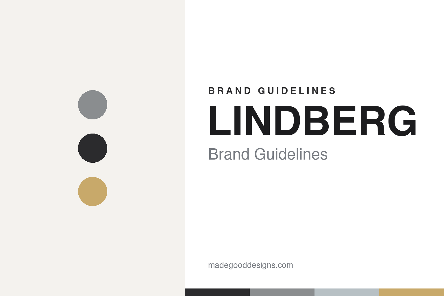
LINDBERG lives in a titanium-and-champagne palette. Click a swatch to copy the hex.
LINDBERG’s identity is restrained, cool and Scandinavian — a brushed titanium grey, a graphite near-black, a steel blue-grey highlight, and a warm champagne gold borrowed from the Precious line, on an off-white ground. The palette reads like the material and the light: cold titanium, Nordic negative space, and a single warm metallic. It signals engineering and minimalism rather than colour or ornament. The honest caveat: with no published brand hex, these tones are an original, unofficial interpretation, not first-party values.
The lesson is a titanium-and-champagne palette signals minimalist engineering. LINDBERG’s world reads as cool, precise and Scandinavian. For designers, it is a reminder that a near-neutral, metallic palette — titanium grey, graphite, one warm gold — can convey lightness and precision, matching a product defined by what has been removed. The takeaways: use cool metallic neutrals to signal engineering and minimalism; add a single warm metallic for humanity; and treat any single hex as unofficial when there is no published spec.
Typography
The wordmark spirit is a clean geometric sans — minimal and precise.
LINDBERG’s identity carries a minimal, precise, Scandinavian spirit — a restrained “lindberg” wordmark whose no-frills forms mirror the product’s reductive design. A clean geometric sans captures the mood: it is minimal and engineered, the register of Danish functionalism rather than decoration. Set against a titanium-and-champagne palette, the sans feels light and precise — exactly the screwless, ultralight personality LINDBERG carries. It is quiet and functional rather than expressive, mirroring frames stripped to essentials. (LINDBERG’s real wordmark is a trademark we describe but do not reproduce, and the exact typeface is not something we assert.) Because the specific mark is not ours to use, the honest description is “a clean geometric sans spirit,” not the LINDBERG logo. The type behaves like the brand: minimal, precise and functional.
Aa
A clean geometric sans spirit — minimal and precise. (Specimen set in Manrope, a geometric sans; NOT the LINDBERG logo, which is a trademark.)
Removing everything unnecessary as the difference
LINDBERG stands for essential design.
LINDBERG is a lesson in doing more by removing more. Its whole identity rests on a single radical idea — a frame with no screws, no rivets and no welds, held by a spiral hinge and made in ultralight titanium — that turned engineering restraint into a luxury signature. That is a defensible position: the design is patented, instantly recognisable to those who know it, and impossible to fully imitate without the same commitment to subtraction. Paired with deep per-wearer customization and Scandinavian minimalism, it made a small Aarhus optician into an internationally awarded, globally respected eyewear house.
For designers and brand-builders, LINDBERG offers a clear takeaway: a rigorously reductive idea can be the whole brand. The lessons: find the one thing to remove that others keep (screws, rivets, welds) and make it your signature; let materials and craft — titanium, horn, gold — carry luxury without ornament; and offer genuine personalization so minimalism still feels human. It is also a reminder to keep the facts honest: LINDBERG’s optical business dates to 1969, its Air Titanium was prototyped in 1983 and launched in 1986, it is screwless with a spiral hinge (not hingeless), and it has been owned by Kering Eyewear since 2021 rather than independent — with the palette here an unofficial interpretation. LINDBERG removed everything unnecessary — proof that subtraction can be the difference.
Explore & save
Keep LINDBERG’s identity on hand — save it to a board in the Made Good inspiration library.
LINDBERG identity set
Pin the titanium-and-champagne palette and the geometric-sans spirit to your own board.