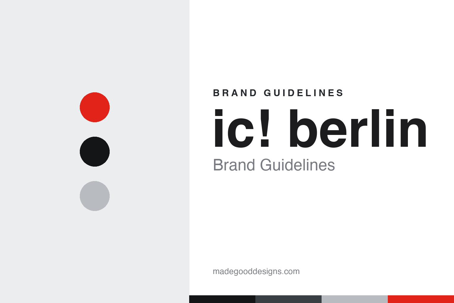
ic! berlin Brand Guidelines
Berlin eyewear cut from thin spring steel — no screws, no rivets, no glue.
Aa
Two constants: a steel-and-signal-red palette and an engineering sans. Abstract homage — not the ic! berlin wordmark or logo.
No screws, no glue
ic! berlin built frames from thin spring steel.
ic! berlin is a lesson in construction as identity. It was founded in 1996 in Berlin by Ralph Anderl, Philipp Haffmans and Harald Gottschling — Haffmans and Gottschling on the design and engineering side, Anderl handling business and distribution and becoming the public face. The first frame, “Jack,” weighed about 20 grams; the brand name settled as “ic! berlin” in the late 1990s.
Its signature is engineering you can feel: frames cut from ultra-thin (about 0.5 mm) stainless spring steel sheet metal, assembled with no screws, no rivets, no welds and no glue. The lenses and temples snap into a flat-spring, sliding-pin hinge — a patented mechanism marketed as almost indestructible and repairable by hand. Everything is handmade in Berlin, “100% Made in Germany.”
ic! berlin also has a notable shared lineage: in 2003 the founders split, Anderl stayed on to run ic! berlin, and Haffmans and Gottschling went on to co-found MYKITA — so the two Berlin houses share screwless DNA rather than one copying the other. Ownership then evolved: Anderl bought out his co-founders around 2016, sold a majority to a private-equity firm in 2017, and the brand was acquired by the Italian eyewear group Marcolin in 2023. (Honest notes: it was founded in 1996, not 1999; Anderl was one of three founders, not a solo founder; the signature material is stainless spring steel, not titanium; MYKITA’s founders came out of ic! berlin in 2003, so screwless heritage is a shared origin, not theft; a “near-bankruptcy” is not documented — the real story is a buyout then sales, ending with Marcolin in 2023; and no official brand hex is published.)
Colour
ic! berlin lives in a steel-and-signal-red industrial palette. Click a swatch to copy the hex.
ic! berlin’s identity is industrial, engineered and Berlin — a brushed steel, a cool gunmetal, a matte near-black, and a single signal-red accent, on paper white. The palette reads like the workshop: thin sheet steel, machined edges, and one red mark of engineering emphasis. It signals construction and function rather than decoration — fitting for frames defined by how they are built. The honest caveat: with no published brand hex, these tones are an original, unofficial interpretation, not first-party values.
The lesson is a steel-and-signal-red palette signals engineered function. ic! berlin’s world reads as industrial and precise. For designers, it is a reminder that a steel-grey system with one signal-red accent conveys engineering and confidence, matching a brand whose product is screwless sheet metal. The takeaways: use steel neutrals with one signal accent for an engineered feel; let construction inform the palette; and treat any single hex as unofficial when there is no published spec.
Typography
The wordmark spirit is an engineering sans — technical and grounded.
ic! berlin’s identity carries a technical, grounded, engineering spirit — an “ic! berlin” wordmark, lowercase with an exclamation mark, whose plain forms match a house that competes on construction. An engineering grotesque sans captures the mood: it is technical and matter-of-fact, the register of a workshop label rather than luxury ornament. Set against a steel-and-signal-red palette, the sans feels precise and industrial — exactly the screwless, sheet-metal personality ic! berlin carries. It is functional rather than expressive, mirroring frames stripped to structure. (ic! berlin’s real wordmark is a trademark we describe but do not reproduce, and the exact typeface is not something we assert.) Because the specific mark is not ours to use, the honest description is “an engineering sans spirit,” not the ic! berlin logo. The type behaves like the brand: technical, grounded and precise.
Aa
An engineering sans spirit — technical and grounded. (Specimen set in Chivo, a grotesque sans; NOT the ic! berlin logo, which is a trademark.)
How it’s built as the difference
ic! berlin stands for construction.
ic! berlin is a lesson in making construction the selling point. In a market of screws and welds, it built recognition on a screwless, glue-free sheet-metal frame that is light, springy and repairable by hand — an engineering story customers can feel and understand. That gave a small Berlin startup a genuine, defensible identity, enough to attract private-equity investment and, eventually, acquisition by a major Italian eyewear group. Its shared history with MYKITA even underlines the point: the screwless idea was strong enough to seed two respected brands.
For designers and brand-builders, ic! berlin offers a clear takeaway: a construction method can be the brand. The lessons: turn how a thing is made (screwless, glue-free) into a clear, ownable story; keep the visual language industrial so the engineering reads as intentional; and let function — light, durable, repairable — do the persuading. It is also a reminder to keep the facts honest: ic! berlin was founded in 1996 by three people in Berlin, makes screwless stainless spring-steel frames (not titanium), shares screwless lineage with MYKITA via the 2003 split, and has been owned by Marcolin since 2023 — with the palette here an unofficial interpretation. ic! berlin sold how it is built — proof that construction can be the difference.
Explore & save
Keep ic! berlin’s identity on hand — save it to a board in the Made Good inspiration library.
ic! berlin identity set
Pin the steel-and-signal-red palette and the engineering-sans spirit to your own board.