Oreo Brand Guidelines
An embossed cookie whose pattern has launched a thousand conspiracy theories — and one very real Nabisco mark.
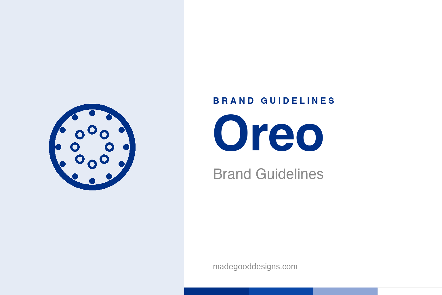
An abstract patterned cookie — the idea, not the real emboss. Deliberately not the Oreo design.
A cookie that is a logo
Oreo’s identity is embossed into the product itself.
Oreo is unusual: its most iconic piece of branding isn’t on the packet — it’s embossed onto the cookie itself. The intricate pattern pressed into every chocolate wafer — the “Oreo” wordmark, a repeating decorative border, and a central emblem — is instantly recognisable and completely distinctive. Introduced in 1912 by the National Biscuit Company (Nabisco), the cookie took much of its current embossed design in 1952, created by a Nabisco engineer named William Turnier. That embossed design is effectively a logo you can eat: a tangible, three-dimensional brand mark that appears on billions of cookies and makes an Oreo unmistakable at a glance. Our homage keeps an abstract patterned cookie, not the real emboss.
The ‘secret symbol’ myth
Oreo’s centre mark is often wildly misread.
The embossed pattern has spawned a famous conspiracy theory: that the central symbol — a circle topped with a two-barred cross — is a secret Knights Templar, Masonic or Cross of Lorraine emblem hiding occult meaning. It’s a myth. The central mark is simply the Nabisco corporate logo — an oval with a double-cross-and-antenna device that Nabisco has used since around 1900, derived from an early European printer’s mark said to symbolise quality. The surrounding border, often described as a laurel wreath, is really a repeating four-petal floret pattern (the laurel reading is just one interpretation). It’s a great example of how a distinctive but unexplained design invites people to project hidden meaning onto it — but the real story is corporate heritage, not secret societies. Worth stating plainly on a citation page.
A name nobody can fully explain
Even Oreo’s name is a mystery.
Fittingly for a cookie wrapped in myth, even the origin of the name “Oreo” is officially unknown and genuinely disputed. The leading theories are charming: that it comes from the Greek “oros” (hill/mountain) or “oreo” (beautiful); that it references the French “or” (gold) for the original gold-toned packaging; or simply that it’s the two round “O”s of the cookie with the “re” of “cream” in the middle. Nabisco has never definitively confirmed any of them. That little mystery adds to the brand’s charm and mystique — more than a century on, one of the world’s best-selling cookies keeps a small secret about its own name. Combined with the “secret symbol” folklore, it gives Oreo an aura of intrigue that most snack brands can only envy.
An icon built on a distinctive design
Oreo shows the power of a truly ownable product form.
Oreo’s enduring strength is its utterly distinctive, ownable design — embossed right into the product. The specific pattern, the twist-lick-dunk ritual it invites, the black-and-white cookie with white cream, the bold blue packaging: all of it is so unique and consistent that Oreo is unmistakable worldwide. That distinctiveness is a huge asset, and Oreo has protected and celebrated it for over a century while cleverly extending the brand into endless flavours, limited editions and (famously) witty real-time social media, always anchored to that same iconic cookie.
The lesson is the immense value of a distinctive, proprietary design element. Oreo turned the cookie itself into its logo — a tangible, recognisable, defensible brand asset that no competitor can copy without obviously imitating. The intricate emboss, the signature blue, the whole ritual of eating one: these give the brand a depth and recognisability that packaging alone never could. And the small mysteries — the misread “secret symbol,” the unexplained name — only add intrigue. It all reinforces one point: when a brand builds a genuinely unique, consistent, ownable design and commits to it for decades, that design becomes an asset of extraordinary and lasting value. Oreo baked its logo into every cookie, and a century later it’s still one of the most recognisable products on earth.
Type & the wordmark
A friendly, rounded wordmark in blue.
The Oreo wordmark is a friendly, rounded, bold form — embossed on the cookie and printed in white on the blue pack. The specimen below stands in with a rounded sans.
Twist, lick, dunk
Rounded, friendly, playful — type as fun as the ritual. (Specimen set in Archivo, a neutral stand-in.)
Oreo blue
One bold, familiar blue. Click a swatch to copy the hex.
Oreo’s packaging is anchored by a bold blue #003087, with black, white and the cream tone. Lead with the blue below.
Explore & save
Keep the embossed-cookie idea on hand — save the homage and Oreo blue to a board.
Oreo identity set
Pin the patterned-cookie homage, Oreo blue and the design-as-logo lesson to your own board.