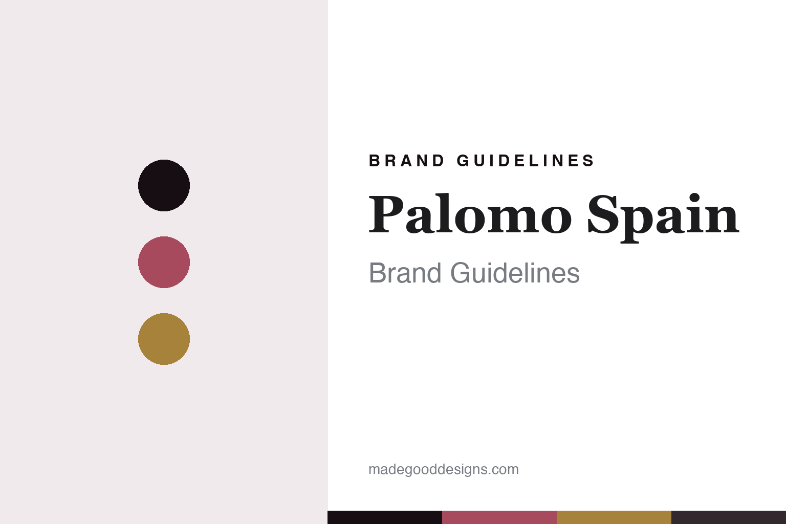
Palomo Spain Brand Guidelines
The genderfluid baroque.
Aa
Two constants: a rose-and-gold palette and a romantic serif register. Abstract homage — not a Palomo Spain piece, motif or wordmark.
The genderfluid baroque
Palomo Spain makes romantic, genderfluid menswear rooted in Andalusian craft.
Palomo Spain is a lesson in romantic subversion as the identity. A Spanish house from Andalusia, it makes ornate, genderfluid menswear — ruffles, lace, sheer fabrics — that challenges gender norms through the lens of Spanish baroque craft.
Its identity is the genderfluid baroque. Palomo Spain’s theatrical, hand-crafted garments, romantic and transgressive at once, are the work it is known for. Menswear, made romantic. Craft as rebellion.
(Honest notes: Palomo Spain is a Spanish label whose founder, Alejandro Gómez Palomo, comes from Posadas, an inland town in the province of Córdoba, Andalusia — not a coastal one — with the atelier now moved to Madrid. He studied at the London College of Fashion, not Central Saint Martins, and founded the brand around 2015–2016, with its debut runway show in January 2017. Its signature is romantic, baroque, genderfluid menswear that challenges gender norms — intricate embroidery, lacework, corsetry, ruffles and sheer fabrics — pairing the baroque lyricism of Andalusia with a sharper London sensibility, under lines like Palomo Classics; it was an LVMH Prize shortlist name in 2017 and a semi-finalist in 2022, and has dressed Beyoncé and Harry Styles. On production, it is made in Spain, with Spanish artisans, though we don’t claim everything is still made in his home town now that it is scaling into womenswear and wholesale. On ownership, the founder retains majority control, but the brand took minority outside investment in 2024–25 and appointed a CEO, so it is founder-led rather than fully independent, and not conglomerate-owned. On heritage, an important note: it draws on Andalusian craft and Spanish Catholic and baroque imagery — the designer’s own native tradition, reworked — which we describe in general terms and never reproduce as specific religious or flamenco designs. Its wordmark is IP we describe but don’t reproduce, and there’s no official brand hex — these tones are an unofficial interpretation. This is design commentary and does not promote any product.)
Colour
Palomo Spain lives in a rose-and-gold palette. Click a swatch to copy the hex.
Palomo Spain’s identity is romantic, ornate and theatrical — a rose, an ink, a gold, a graphite, and a blush. The palette leans rose and gold — the register of baroque romance and gilded Andalusian ornament. It signals craft and romance rather than novelty. The honest caveat: with no published brand hex, these tones are an original, unofficial interpretation, not first-party values.
The lesson is a rose-and-gold palette signals a genderfluid baroque. Palomo Spain’s world is a romantic, ornate, theatrical object. For designers, it is a reminder that a point of view — reclaiming ornate, romantic craft for menswear, and challenging gender norms with it — can be the whole identity, and that a rich, romantic palette signals that intent. Because a mid rose can fail as small text, keep type dark and let the colour live in the accents, palette and band. The takeaways: take a real position; use ornate craft; root it in heritage; and treat any single hex as unofficial.
Typography
The register is a romantic serif — ornate, refined, theatrical.
Palomo Spain’s identity carries an ornate, refined, theatrical spirit — a romantic, hand-crafted object. A romantic serif captures the mood: it is elegant and expressive, the register of baroque romance. Set in a rose-and-gold palette, the romantic serif feels ornate and refined — exactly the personality Palomo Spain carries. It is theatrical rather than plain, mirroring an embroidered, romantic garment. (Palomo Spain’s real garments, any religious or flamenco motifs and its wordmark are things we describe but do not reproduce, and the exact typeface is not ours to use.) Because it is not ours to use, the honest description is “a romantic serif spirit,” shown here in a stand-in. The type behaves like the brand: ornate, refined and theatrical.
Aa
A romantic serif spirit — ornate and refined. (Specimen set in Cormorant Garamond, a romantic serif STAND-IN; NOT the Palomo Spain wordmark or any motif.)
Romantic subversion as identity
Palomo Spain stands for the genderfluid baroque.
Palomo Spain is a lesson in making romantic subversion the identity. A rose-and-gold palette, a romantic serif and an ornate garment make baroque, genderfluid craft the whole brand — romantic, theatrical, transgressive. The subversion is the differentiator. The differentiator is a reclamation: taking ornate, romantic, historically feminine-coded craft and making it menswear, rooted in the designer’s own Andalusian tradition.
Put to work, the identity is a point of view as design. A house building in this spirit would take a clear position — here, romance and gender fluidity — express it through real, demanding craft, and root it in a heritage it genuinely holds, so the work is meaningful rather than merely decorative. The lesson Palomo Spain teaches is that a point of view plus real craft can build a brand: a strong stance, ornate hand-work, and a genuine heritage give it an identity a copyist can’t. The subversion is the personality, and the craft is the substance.
For designers and brand-builders, Palomo Spain offers a clear takeaway: let a point of view carry the craft. The lessons: take a position; use real craft; root it in heritage; and be honest about the story. It is also a reminder to stay accurate: its founder studied at London College of Fashion, not Central Saint Martins, comes from inland Posadas, and founded the brand around 2015–2016; it is made in Spain but scaling; and it is founder-led with minority outside investment rather than fully independent — the palette here is an unofficial interpretation. And it is a reminder that its Andalusian and Catholic-baroque references are the designer’s own heritage, described here rather than reproduced. Palomo Spain made the genderfluid baroque the brand — proof that romantic subversion can be the difference.
Explore & save
Keep Palomo Spain’s identity on hand — save it to a board in the Made Good inspiration library.
Palomo Spain identity set
Pin the rose-and-gold palette and the romantic-serif register to your own board.