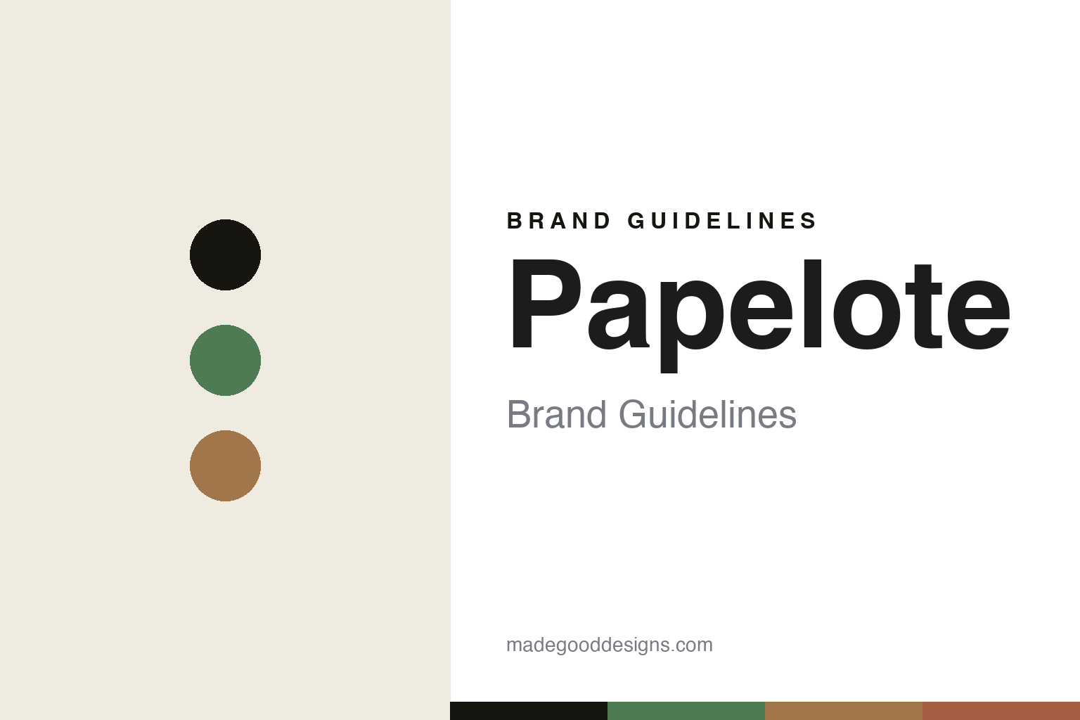
Papelote Brand Guidelines
The eco stationery.
Aa
Two constants: a green-and-kraft palette and an eco sans register. Abstract homage — not the Papelote designs or packaging.
The eco stationery
Papelote makes paper an honest material.
Papelote is a lesson in the material as the message. A Prague brand grown from a graphic-design graduate project by Kateřina Šachová (with Filip Šach and Denisa Havrdová), it makes eco-conscious, minimalist Czech stationery from honest, recycled materials.
Its identity is eco stationery. Papelote makes notebooks, sketchbooks, planners, pencil cases, felt goods and wrapping paper in recycled paper, wool felt and cotton, framing paper itself as something with, in its words, a scent, a sound and a colour. It runs its own Prague shop with an in-store workshop. Sustainable, sensory, local. Paper treated as a material worth caring about.
(Honest notes: Papelote was founded by Kateřina Šachová, Filip Šach and Denisa Havrdová, growing from Šachová’s graduate project at Prague’s UMPRUM (reported). We hedge the year — it is usually given as around 2009, with its Prague shop opening in 2010 and its e-shop in 2011. It makes eco-conscious stationery from recycled paper, 100% wool felt and cotton; we treat “made in the Czech Republic” and its eco claims as the brand’s own (we don’t assert an FSC certification), and “minimalist/muted” as our own read. It won a Czech Grand Design “Store of the Year” award in 2011. It is founder-led and independent (and unrelated to the Czech firm Kores). There’s no official brand hex, and we reproduce no logo or pattern — these tones are an unofficial interpretation. This is design commentary and does not promote any product.)
Colour
Papelote lives in a green-and-kraft palette. Click a swatch to copy the hex.
Papelote’s identity is eco, minimal and Czech — an eco green, an ink, a kraft, a clay, and a chalk. The palette pairs a green with a kraft — the register of recycled, honest stationery. It signals material and care rather than novelty. The honest caveat: with no published brand hex, these tones are an original, unofficial interpretation, not first-party values.
The lesson is a green with a kraft signals an eco stationery house. Papelote’s world is an honest, recycled object. For designers, it is a reminder that honest materials — recycled paper, wool felt, cotton — and a sensory love of paper can be a whole identity. Because a mid green can fail as small text, keep type dark and let the colour live in the accents, palette and band. The takeaways: choose honest materials; make paper sensory; produce locally; and treat any single hex as unofficial.
Typography
The register is an eco sans — honest, minimal, warm.
Papelote’s identity carries an honest, minimal, warm spirit — a recycled, tactile object. A clean, friendly sans captures the mood: it is unfussy and warm, the register of an eco-conscious studio. Set in a green-and-kraft palette, the eco sans feels honest and minimal — exactly the personality Papelote carries. It is understated rather than loud, mirroring recycled paper. (Papelote’s real designs and wordmark are works we describe but do not reproduce, and the exact typeface is not ours to use.) Because it is not ours to use, the honest description is “an eco sans spirit,” shown here in a stand-in. The type behaves like the brand: honest, minimal and warm.
Aa
An eco sans spirit — honest and minimal. (Specimen set in Spline Sans, a clean friendly sans STAND-IN; NOT the Papelote packaging.)
The material as the message
Papelote stands for the eco stationery.
Papelote is a lesson in making the material the identity. A green-and-kraft palette, an eco sans and a recycled object make honest materials the whole brand — eco, minimal, Czech. The material is the differentiator. The differentiator is recycled paper, wool felt and cotton, chosen and shown honestly.
Put to work, the identity is material honesty. A designer building in this spirit would let the substance lead — visible recycled stock, natural felt, an unbleached palette — and treat sustainability as a design language rather than a badge, the way Papelote frames paper as something with a scent, a sound and a colour. The lesson it teaches is that a values-led material choice can be an aesthetic: by making honest, local, recycled production the point and letting the materials look like what they are, it turns an ethic into a recognisable identity, and keeps its claims modest enough to stay credible. The restraint is strategic as well as ethical: an eco brand that oversells gets punished the moment a claim wobbles, so letting recycled paper and natural felt simply look like themselves — and pairing that with local production and a physical shop where people can touch the goods — builds a trust that slogans cannot. In a crowded sustainable-stationery field, honesty of material is itself the differentiator.
For designers and brand-builders, Papelote offers a clear takeaway: let the material speak. The lessons: choose honest materials; make paper sensory; produce locally; and be honest about the story. It is also a reminder to stay accurate: it was founded around 2009 in Prague by Kateřina Šachová and partners, from recycled paper, felt and cotton, and it won a Czech Grand Design award in 2011 — the palette here is an unofficial interpretation. Papelote made honest materials the brand — proof that a material can be the difference.
Explore & save
Keep Papelote’s identity on hand — save it to a board in the Made Good inspiration library.
Papelote identity set
Pin the green-and-kraft palette and the eco-sans register to your own board.


