PUTIEN Brand Guidelines
A Kitchener Road coffee shop that took the food of Putian abroad.
Aa
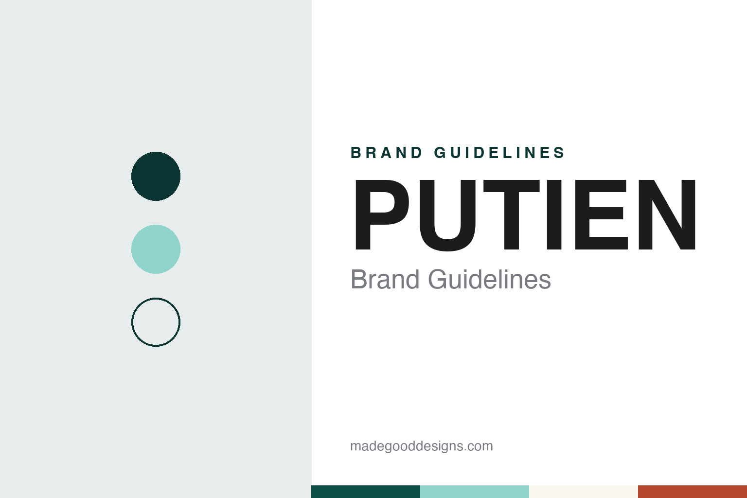
Two constants: a PUTIEN pale blue-green and deep teal palette and a Friendly sans register. Abstract homage — not a PUTIEN dish, sign or mark; no logo or menu is reproduced.
Kitchener Road
A coffee shop named after a home town.
PUTIEN began in Singapore in 2000, when Fong Chi Chung, often called Uncle Fong, opened a small eatery on Kitchener Road in the Jalan Besar area. Mothership, in a long interview published in January 2024, says Fong was born in Fujian province, studied art rather than cooking, and moved to Singapore in 2000. English Wikipedia says he arrived to set up an electronic-parts business with his brothers and left it after a few months to open the shop. Both accounts give the same reason for the switch: he could not find a place in Singapore that served the food of his home town.
That home town is Putian, a coastal city in Fujian, and the restaurant’s name is a romanised spelling of it, Mothership notes. The cooking is Henghwa (or Putian) cuisine, a style of Fujian cooking that English Wikipedia describes as built around seaweed, oysters, clams and other seafood, and eaten by the Chinese diaspora across South-East Asia. The same article says the Singapore restaurant started as a simple kopitiam, the local word for a coffee shop, before it grew into an international chain.
The Kitchener Road site is still the first branch. The MICHELIN Guide’s listing for it, read in November 2026, files it under Fujian cuisine, gives its opening year as 2000 and calls it the first branch of the chain.
Fong had no restaurant training. He told Mothership that his only kitchen experience before opening was cooking for classmates at home when he was at primary school, and that in the early years the team “didn’t know how to strategise” and simply concentrated on cooking the dishes of Putian as they remembered them, adjusting them over time to suit regular customers.
The brand writes its name in capital letters, PUTIEN, and this guide follows that spelling.
Colour
Lor mee, bian rou and a star that came and went.
The menu is built on everyday Fujian dishes rather than banquet cooking. The MICHELIN Guide’s description of Kitchener Road points to small plates and noodles, singling out bian rou, a Fujian wonton soup made with wrappers that contain pork, and a lor mee topped with seafood, and it notes that seasonal dishes sometimes use produce from Putian itself. English Wikipedia’s article on Putian cuisine names the Duotou clams farmed around Duotou village as one of the region’s known ingredients.
The lor mee is the dish the founder chose to cook for Mothership in 2024. The magazine reported that the Fujian Red Mushroom Seafood Lor Mee uses 18 ingredients, among them clams, scallops and prawns, and that its broth is boiled with a red mushroom which, according to PUTIEN, grows on the slopes of the Wuyi Mountains and gives the soup its colour.
Recognition came sixteen years after the shop opened. Mothership reported in June 2024 that the Kitchener Road branch held one MICHELIN star in the Singapore guide in 2016, 2017, 2018, 2019, 2021, 2022 and 2023, citing the company’s website for the list of years. In the Singapore guide released on 25 June 2024 the branch did not keep its star. The guide’s current listing still includes the restaurant, without a star.
Typography
Asian restaurant chains and their identities.
Asian restaurant chains tend to present themselves through what happens in the kitchen. Din Tai Fung’s own history page opens with the xiaolongbao and its count of 18 folds, and the Taipei Times traced that formula to the founder’s son working alongside the shop’s first dim sum chefs.
Names and shop fronts carry a lot of the identity. Tim Ho Wan’s Chinese name means “to add good luck,” English Wikipedia says, and Din Tai Fung’s joins the names of a former employer and an oil supplier, according to the company and the Taipei Times. Long-kept signs, such as the brushed board that Din Tai Fung says still hangs at its first restaurant on Xinyi Road, link a chain of many branches back to one room.
Dish naming is usually plain and descriptive: barbecue pork buns, steamed rice rolls, pan-fried turnip cake, soup dumplings. Groups can list signature dishes by name when they announce deals, as Jollibee Foods Corporation did for Tim Ho Wan in November 2024, GMA News reported. Guidebook recognition travels with a name too: Tim Ho Wan’s first shop in Mong Kok appeared with a star in the 2010 Michelin Guide, Gourmet Traveller reported in 2015, and that star still features in how the chain is introduced in press coverage.
The corporate side is published too. Company pages set out founders and founding years, parent groups describe their portfolios in stock exchange disclosures, and franchise partners appear in trade press when rights change hands. This guide sets out what can be checked about each brand — who founded it, who owns it and how it grew — and marks clearly what rests only on the company’s own word.
Aa
A rounded, friendly sans for a home-cooking brand. (Specimen set in Outfit, a sans STAND-IN; NOT the PUTIEN logo.)
PUTIEN
From one shop to a chain across Asia.
Growth beyond Kitchener Road was steady rather than sudden. A branch at Parkway Parade, in Singapore’s east, opened on 12 November 2009; Mothership reported that it closed on 15 September 2024, and a company spokesperson said the closure followed the end of its lease. Overseas, Inside Retail Asia reported in January 2020 that PUTIEN had opened in the Philippines at The Podium in Ortigas, brought into the country by the franchise partner The Vikings Group, and that it was the chain’s 67th location internationally. By January 2024 Mothership put the count at 101 outlets worldwide, and Fong described them as spread across dozens of cities in seven or eight countries.
The look of the restaurants is as plain as the food. Mothership, writing in 2024, said most Singaporeans link the chain with its “modern Tiffany blue” brand colour, and the name itself is set in capital letters. The palette below is an interpretation built around a pale blue-green of our own choosing rather than a copy of the chain’s colour.
The story the brand tells is a short one: an art student who missed his home town’s noodles opened a coffee shop, kept it going, and named a chain after the place he came from.
For a design guide, PUTIEN shows how a single, soft brand colour and an all-capitals name can carry a family restaurant from one coffee shop to more than a hundred sites. Compare BreadTalk, another Singapore food brand founded in 2000, and Crystal Jade, a Singapore Chinese restaurant group from the decade before. For this guide we use a pale blue-green and deep teal with rice-paper white and a clay red, set with a sans, an unofficial interpretation; no product or logo is reproduced.
Explore & save
Keep PUTIEN’s identity on hand — save it to a board in the Made Good inspiration library.
PUTIEN identity set
Pin the PUTIEN pale blue-green and deep teal palette and the Friendly sans register to your own board.