Tok&Stok Brand Guidelines
A 1978 São Paulo furniture store built on design kept in stock.
Aa
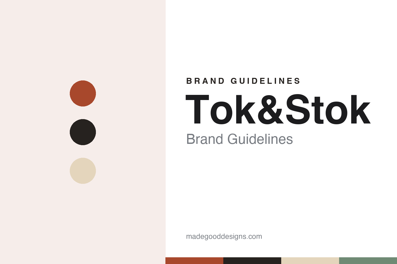
Two constants: a terracotta, graphite and birch palette and a geometric sans register. Abstract homage — not a Tok&Stok product or mark; no furniture, logo or shopfront is reproduced.
Design in stock
A couple from France and an 80-square-metre shop.
Tok&Stok opened in São Paulo in February 1978. Portuguese Wikipedia says it was founded by Régis and Ghislaine Dubrule, a couple who had recently arrived in Brazil from France, and that the first shop, on Avenida São Gabriel, covered 80 square metres; seven months later it had grown to 600 square metres to make room for a larger collection. O Estado de S. Paulo wrote in April 2025 that the Dubrules founded the chain at the end of the 1970s, during the oil shock, to meet the demand for furniture from Brazil’s rising middle class.
The name states the idea. According to Portuguese Wikipedia, “Tok” refers to the design of the products and “Stok” to the fact that the furniture was in stock and could be taken home straight away. Rather than selling furniture in matched sets, as most shops in the sector did at the time, Tok&Stok sold pieces individually, so that customers could put a room together in their own way and furnish it at their own pace, the encyclopaedia says.
The range grew in steps. Portuguese Wikipedia lists the BORG modular line of 1979, with a pale wooden base and loose zipped cushions; the first sofas in 1980, with foam frames that were light to carry and removable, washable covers in a choice of colours; a supervised play area for children, Babystok, in 1984; and a home-textiles department, Tok&Stok SOFT, in 1987, which included a line of patterns from the Finnish textile house Vuokko. The same year the shop began selling the collection of Disform, a Barcelona furniture publisher whose designers included Philippe Starck and Perry A. King.
Colour
Catalogues, store concepts and signed collections.
Much of Tok&Stok’s identity was built on paper and on the shop floor. In 1988, Portuguese Wikipedia says, it published a technical catalogue in magazine format, almost 50 pages on coated paper, which mixed photographs of furnished rooms with drawings of the products and served as a buying guide. Garden furniture followed in 1989, mostly in white lacquered wood, and an office range in 1992. In 1996 the company set up a telephone sales service, Tok&Stok Direct, with a full catalogue that listed every product code.
In 1998 it introduced a store concept called Tok&Stok 21, named both for the coming century and for the company’s age that year. The encyclopaedia describes new lighting and signage, with signs set into the floor, a predominance of white and a visually cleaner style of communication that let the colours of the products stand out. Online sales began in 2001. In 2008 a smaller format, Tok&Stok Compact, sold the accessories and decorative objects on a self-service basis, alongside furniture ordered through the website; it carried its own mark, a gift bag beside the word “compact,” placed next to the traditional Tok&Stok logotype. Small kiosks followed in 2018.
Collaborations with artists remain part of the offer. In September 2025 Mercado & Consumo reported a collection called “Tudo ou Tudo” made with the musician, poet and visual artist Arnaldo Antunes, covering tableware, cushions, rugs, lamps, furniture and office accessories. The trade title said the pieces played with typography, contrasting colours and unexpected shapes, features of Antunes’s own work, which draws on concrete poetry and the materiality of words.
Typography
Design and documentation.
Brazilian retail brands are read most easily through their store formats. The food format at the centre of this group is the atacarejo, a word that joins atacado, wholesale, and varejo, retail. In 2009 the consultant Alberto Serrentino told Estadão that it is a Brazilian hybrid: about half the shoppers are small food businesses and half are households, entry is open without a membership card, and the range is built on basic branded goods sold in bulk. Chains such as Assaí and Atacadão present themselves through big warehouse stores, large signs and services added inside them, such as butchers, bakeries and wine sections.
Group ownership shapes these brands as much as design does. Banners are bought, converted and spun off: Assaí left GPA in 2021, Carrefour bought Atacadão in 2007, and stores from Extra, Makro and Grupo BIG have been converted to other banners. For the pharmacy, home, stationery and book chains in this set, each guide names the owner, any merger and the dates as published sources give them.
Logos and campaigns are documented unevenly. Some changes are reported in detail by marketing titles, as with Assaí’s redrawn sun of 2024, made with Troiano Branding; for many banners the official colours and typefaces are not published at all, so the palettes in these guides are our own interpretations. Own-label ranges, loyalty programmes and apps appear here only as the companies or the press describe them.
Corporate pages fill in the rest: founders, owners, stock-market listings and delistings, and, for at least one bookseller in this set, judicial recovery, the Brazilian court-supervised restructuring process. These guides state such events plainly, with their dates, and say when a chain closed or changed hands rather than implying that it still trades as before.
Aa
A clean geometric sans for a design-led store. (Specimen set in Jost, a sans STAND-IN; NOT the Tok&Stok logo.)
Tok&Stok
From Carlyle to Mobly to judicial recovery.
Ownership changed in 2012, when the private-equity firm Carlyle bought 60% of the company, according to O Estado de S. Paulo, which reported that Tok&Stok had 35 stores and no debt in 2011. Portuguese Wikipedia dates the deal to September 2012 and says the chain had 54 stores and five kiosks in 33 cities in 2019. A planned stock-market listing did not happen and the company built up debt, the newspaper said. SPX, the asset manager that took over Carlyle’s business in Brazil, then arranged a combination with Mobly, an online furniture retailer listed on the São Paulo exchange since 2021.
The deal was announced in August 2024. On 8 November 2024, g1 reported, Mobly completed the purchase of the stake held by the SPX funds and became the controlling shareholder of Tok&Stok, with 61.1%; the combined business then had about 70 stores under both names. The same week a court approved an out-of-court restructuring plan for Tok&Stok. The merged company is called Grupo Toky.
In mid-May 2026 Grupo Toky filed for judicial recovery, Brazil’s court-supervised restructuring, for itself and its subsidiaries, citing high interest rates, household debt and tighter credit, Estadão reported; on 15 June 2026 the 3rd Bankruptcy and Judicial Recovery Court in São Paulo approved the processing of the request. Stores closed as part of the restructuring: according to InfoMoney, the group’s own-store network fell from 64 to 52 between December 2025 and June 2026, with closures including Pátio Batel in Curitiba, Santos, Sorocaba and D&D Shopping in São Paulo. In November 2026 Valor Econômico reported that the group, owner of both chains, remained in judicial recovery.
For a design guide, Tok&Stok shows how a retailer can build an identity around the shop itself: a name that states the offer, catalogues that read like magazines, and store formats with their own signage and sub-marks. Compare Kalunga, another São Paulo chain founded in the 1970s, and Dafiti, a Brazilian online retailer. For this guide we use a warm terracotta, a deep graphite and a pale birch with a geometric sans, an unofficial interpretation; no product or logo is reproduced.
Explore & save
Keep Tok&Stok’s identity on hand — save it to a board in the Made Good inspiration library.
Tok&Stok identity set
Pin the Tok&Stok terracotta, graphite and birch palette and the geometric sans register to your own board.