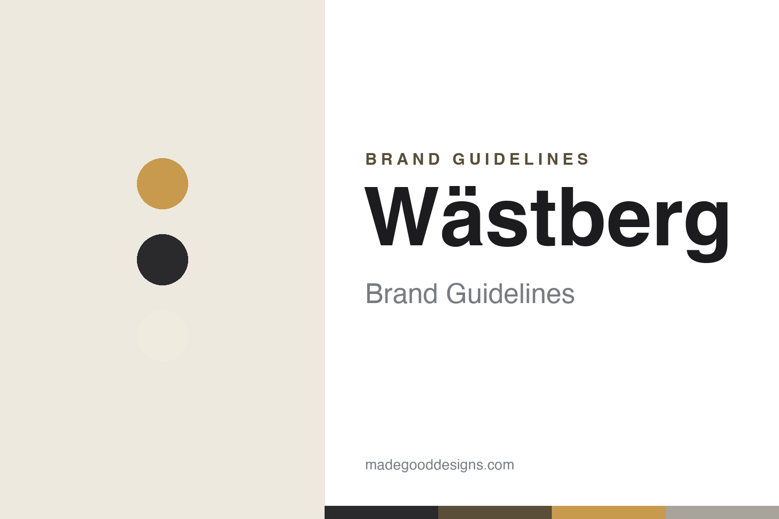
Wästberg Brand Guidelines
Well-being through good light — a Swedish house of designer task lamps for the LED age.
Aa
Two constants: a warm ochre-and-charcoal palette and a clean Scandinavian sans. Abstract homage — not the Wästberg wordmark.
Well-being through good light
Wästberg designs better light.
Wästberg is a lesson in good light as a design mission. The Swedish house was founded in 2008 by Magnus Wästberg (in Helsingborg; now based in Malmö). Its stated purpose is direct: “We create well-being through good light,” where good light is defined as functional, emotional, sustainable and affordable — a human-centred answer to the arrival of LED. (Two honest notes: no official brand hex is published, and the wordmark typeface is undocumented.)
Its differentiator is an unusually stellar designer roster. Wästberg’s very first product was the w101 (2008) by Claesson Koivisto Rune; from there it commissioned a remarkable line-up of architects and designers — David Chipperfield (the w102), Inga Sempé, Ilse Crawford (Ilumina), Industrial Facility (Sam Hecht & Kim Colin, the Pastille), John Pawson and Dirk Winkel, among others. The idea is simple and rare: hand the problem of good LED light to the best designers in the world.
Wästberg’s products live on desks, in hotels, homes and museum collections, and the brand claims dozens of design awards. On ownership, an honest and current note: what began as a purely founder-led company changed in February 2021, when Austria’s XAL Group took a stake; Wästberg has since operated as part of the XAL Group (rebranding toward “Wästberg+”), with Magnus Wästberg still leading — so it’s best described as founder-led but backed by a larger group rather than fully independent. (A quick myth to retire: despite frequent claims online, there is no Wästberg lamp by Jean Nouvel, and none by Dieter Rams — don’t attribute those.) Well-being through good light.
Colour
Wästberg lives in a warm ochre-and-charcoal palette. Click a swatch to copy the hex.
Wästberg’s identity is warm, functional and Scandinavian — a warm ochre glow, charcoal, umber and warm white on soft grey. The palette reads as human and precise: the colours of good task light and Nordic restraint, warm enough to feel humane and disciplined enough to feel functional. It matches a brand whose mission is well-being through light. It’s a warm, restrained world that signals function, warmth and quality. It’s an ochre-and-charcoal palette that signals good light, function and Scandinavian craft. The honest caveat: Wästberg publishes no official brand hex, so the ochre, charcoal and warm-white here are an original, unofficial interpretation of its light, not first-party values.
The lesson is a warm, restrained palette signals function and quality. Wästberg’s ochre-and-charcoal world reads as humane and precise. For designers, it’s a reminder that a warm-but-disciplined Nordic palette can express both the emotional and functional sides of good light. The takeaways: balance warmth with restraint; let the quality of light lead; and treat specific hexes as unofficial when there’s no published spec.
Typography
The wordmark is a clean Scandinavian sans — functional and warm.
Wästberg’s identity carries a functional, warm, Scandinavian spirit — a “wästberg” wordmark whose clean, even letterforms read as precise and Nordic. A clean Scandinavian sans captures the mood: it’s disciplined and quietly warm, matching a brand built on good, human-centred light. Set against a warm ochre-and-charcoal palette, the type feels functional and humane — exactly the “well-being through good light” personality Wästberg cultivates through its stellar designer roster. It’s clean and functional rather than decorative or loud, mirroring task lamps that solve the problem of good LED light. Because the exact wordmark face isn’t publicly documented, the honest description is “a Scandinavian sans spirit,” not a named font. The type behaves like the brand: functional, warm and precise.
Aa
A Scandinavian sans spirit — functional and warm. (Specimen set in Schibsted Grotesk, a clean Scandinavian sans in the spirit of the Wästberg identity; the real face is undocumented.)
The roster as the difference
Wästberg commissioned the best.
Wästberg is a lesson in curating the world’s best designers around one problem. Its differentiator isn’t a single signature product but a method: identify a real problem — how to make genuinely good light in the LED age — and hand it to an extraordinary roster of architects and designers, from Claesson Koivisto Rune (the founding w101) to David Chipperfield, Inga Sempé, Ilse Crawford, Industrial Facility and John Pawson. The result is a collection where each lamp is a serious answer to “what is good light?” by a different world-class mind, unified by the brand’s human-centred standard (functional, emotional, sustainable, affordable). That approach turns a small Swedish company into a design gravity well, and it means the brand’s value is its taste and its relationships as much as any one object. The lesson is that assembling the right people around a well-framed problem can be a more powerful strategy than any single hero product. Anyone can make a lamp; Wästberg convened the masters to make good light. Curate the talent, and the roster becomes the brand. Ask the best minds the right question.
For designers and brand-builders, Wästberg offers a clear takeaway: a well-framed problem plus great collaborators can define a brand. The lessons: frame a real, human problem (good light for the LED age); commission the best designers rather than chasing volume; and keep the facts precise — Wästberg was founded in 2008 by Magnus Wästberg, its first product was Claesson Koivisto Rune’s w101, and David Chipperfield designed the w102. It’s also a reminder to keep it honest: some widely-repeated collaborations are myths (no Jean Nouvel or Dieter Rams lamp), ownership now includes Austria’s XAL Group (from 2021), and no official brand hex or typeface is published, so the palette and type here are an interpretation. Wästberg commissioned the best — proof that the roster can be the difference.
Explore & save
Keep Wästberg’s identity on hand — save it to a board in the Made Good inspiration library.
Wästberg identity set
Pin the warm palette and the Scandinavian-sans spirit to your own board.


