Equity Bank Brand Guidelines
The 1984 building society that became one brand across six countries.
Aa
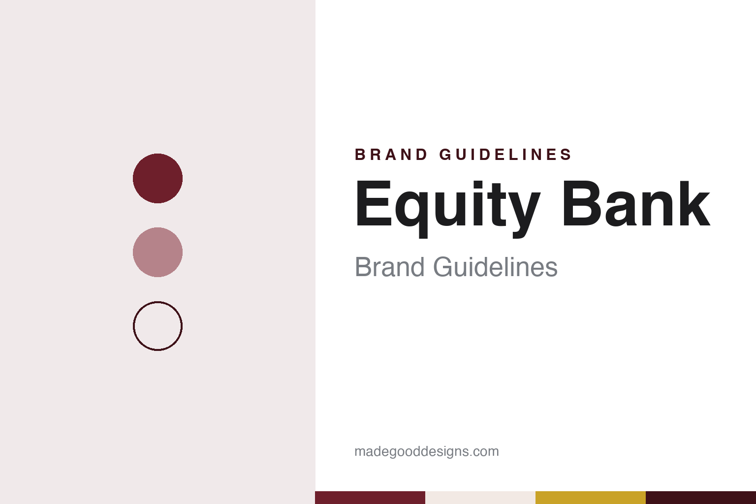
Two constants: an Equity maroon, gold and linen palette and a geometric sans register. Abstract homage — not an Equity asset; no logo, signage or card design is reproduced.
Equity Building Society
A mortgage lender for low-income customers.
Equity began in Kenya in October 1984 as the Equity Building Society, a provider of mortgage finance for customers on low incomes, English Wikipedia says. Its rural customer base pushed it towards farming, and the promotion of agribusiness became a strategic part of its lending, according to the same source.
The society’s founder chairman was Peter Munga, who held the post from 1984. When the board announced his retirement in June 2018, Capital FM reported, its statement described how the business had grown from a small village building society ranked 66th out of 66 at a time when about two per cent of Kenyans had access to banking services.
Over the following decades the society became a commercial bank and then a group. Before November 2014, Equity Bank was both a licensed bank and the holding company for its subsidiaries. In October 2014 it announced a plan to move its Kenyan banking business into a new wholly owned subsidiary, Equity Bank Kenya Limited, and shareholders approved the change at an extraordinary general meeting on 24 November 2014, English Wikipedia says. The parent, Equity Group Holdings, became a non-trading holding company that owns banking and non-banking subsidiaries and provides strategy, brand, risk and talent management to them.
The group’s shares trade on the Nairobi Securities Exchange under the symbol EQTY, and on 18 June 2009 the stock was cross-listed on the Uganda Securities Exchange, according to English Wikipedia.
Colour
One name, no entity labels.
The clearest brand decision came in October 2019. On 3 October, Capital FM reported, Equity unveiled a refreshed identity under which it would present itself as one unified brand, with banking, insurance and investment products under one roof. The new logo featured the word “Equity” on its own, without an entity name such as Group, Bank, Insurance or Investment Bank. The group’s chief executive said the refreshed positioning followed an extensive three-year process of sounding out current and future customer segments, and that new signage would appear in its branches from the following day as part of a refurbishment of branches, ATMs, online platforms and agent and merchant outlets. The change marked the group’s 35th anniversary, English Wikipedia says.
The roll-out was planned in stages: Kenya first, then Uganda, Tanzania, South Sudan, Rwanda and the Democratic Republic of the Congo, with Zambia, Mozambique and Ethiopia also named in the announcement, Capital FM reported. The group described the new look as matching its business model, its customer segments and the shift to digital channels, with customers using mobile and internet self-service and a large network of third-party agents and merchants.
Mobile telephony joined the brand in 2015. In July 2015 Equity launched Equitel, a thin SIM card offering voice, text, data and mobile-to-bank transfers, run by a subsidiary operating as a mobile virtual network operator with infrastructure support from Airtel, Capital FM reported at the launch. English Wikipedia lists the operator today as Finserve Africa.
The group’s social programmes carry the name too. The Equity Group Foundation was founded in 2006, English Wikipedia says, and runs the Wings to Fly secondary-school scholarship programme alongside enterprise, agriculture, energy and environment pillars. Its sustainability report for 2025, released in November 2026, said the group supported more than 60,000 scholarships and planted 9.1 million trees during the year, Capital FM reported.
Typography
How African banks present themselves.
African banks speak to very different audiences at once: city professionals and market traders, multinational companies and small farms, customers with a branch on the corner and customers whose nearest branch is a long journey away. Their identities tend to reflect that range. Bold geometric marks, simple enough to read on a branch sign, a card or a phone screen, sit alongside palettes built on strong blues, reds and greens.
Photography carries much of the message. Annual reports and campaign pages often pair city skylines with everyday customers photographed across the continent, from shop owners and farmers to students and young families. Many groups also publish footprint maps that show where they operate, a visual shorthand for a pan-African presence that may run through subsidiaries trading under different local names.
Digital channels have become a central part of the brand. Bank websites give prominent space to mobile apps and to USSD menus, the short dial codes that work on basic phones without data, alongside pages for small-business banking and agriculture lending programmes. The tone on these pages is usually practical, written to explain how to open an account, send money or apply for credit.
Reporting is the other half of the identity. Large banking groups publish integrated, sustainability and financial-inclusion reports, and these documents often carry the most considered typography and photography a bank produces. This guide looks at each brand’s history and what can be checked about how it presents itself, and treats the colours and type shown here as an unofficial interpretation rather than official brand assets.
Aa
A geometric sans — for a single-word wordmark. (Specimen set in Montserrat, a sans STAND-IN; NOT the Equity logo.)
Equity Bank
From Nairobi to Kinshasa and Kigali.
Equity’s growth outside Kenya has come largely through acquisitions. In September 2015 the group completed the purchase of 79 per cent of ProCredit Bank Congo, its entry into the Democratic Republic of the Congo. In August 2020 it bought a 66.5 per cent stake in the Banque Commerciale du Congo, and on 30 December 2020 it received regulatory approval to merge the two Congolese banks into Equity BCDC, English Wikipedia says. In Rwanda, Equity agreed in June 2023 to buy a controlling stake in Cogebanque; the group said all regulatory approvals had been received and that the merger with Equity Bank Rwanda would be effective on 31 December 2023, Capital FM reported in January 2024.
Today Equity Group Holdings has banking subsidiaries in Kenya, Uganda, Tanzania, Rwanda, South Sudan and the DR Congo, and a representative office in Ethiopia, according to English Wikipedia. Speaking at the B20 summit in Johannesburg in November 2025, the group’s chief executive said it was targeting operations in 15 countries by 2030 and named Ethiopia, where it has had a representative office for about six years, as a priority market, Capital FM reported.
The record includes a regulatory finding. In September 2018 the Central Bank of Kenya penalised five banks, including Equity Group, for violating anti-money-laundering rules in their handling of funds linked to the National Youth Service; the violations listed included failures to report large cash transactions and inadequate customer due diligence. The regulator said each bank had committed to time-bound action plans, Capital FM reported.
For a design guide, Equity Bank shows how a lender can simplify a crowded family of entity names into a single word that works on a branch sign, a SIM card and a scholarship programme alike. Compare Absa, another bank with a large East African presence, and Standard Chartered, which also banks in Kenya. For this guide we use a deep maroon, a harvest gold and a warm linen with a sans, an unofficial interpretation; no product or logo is reproduced.
Explore & save
Keep Equity Bank’s identity on hand — save it to a board in the Made Good inspiration library.
Equity Bank identity set
Pin the Equity maroon, gold and linen palette and the geometric sans register to your own board.