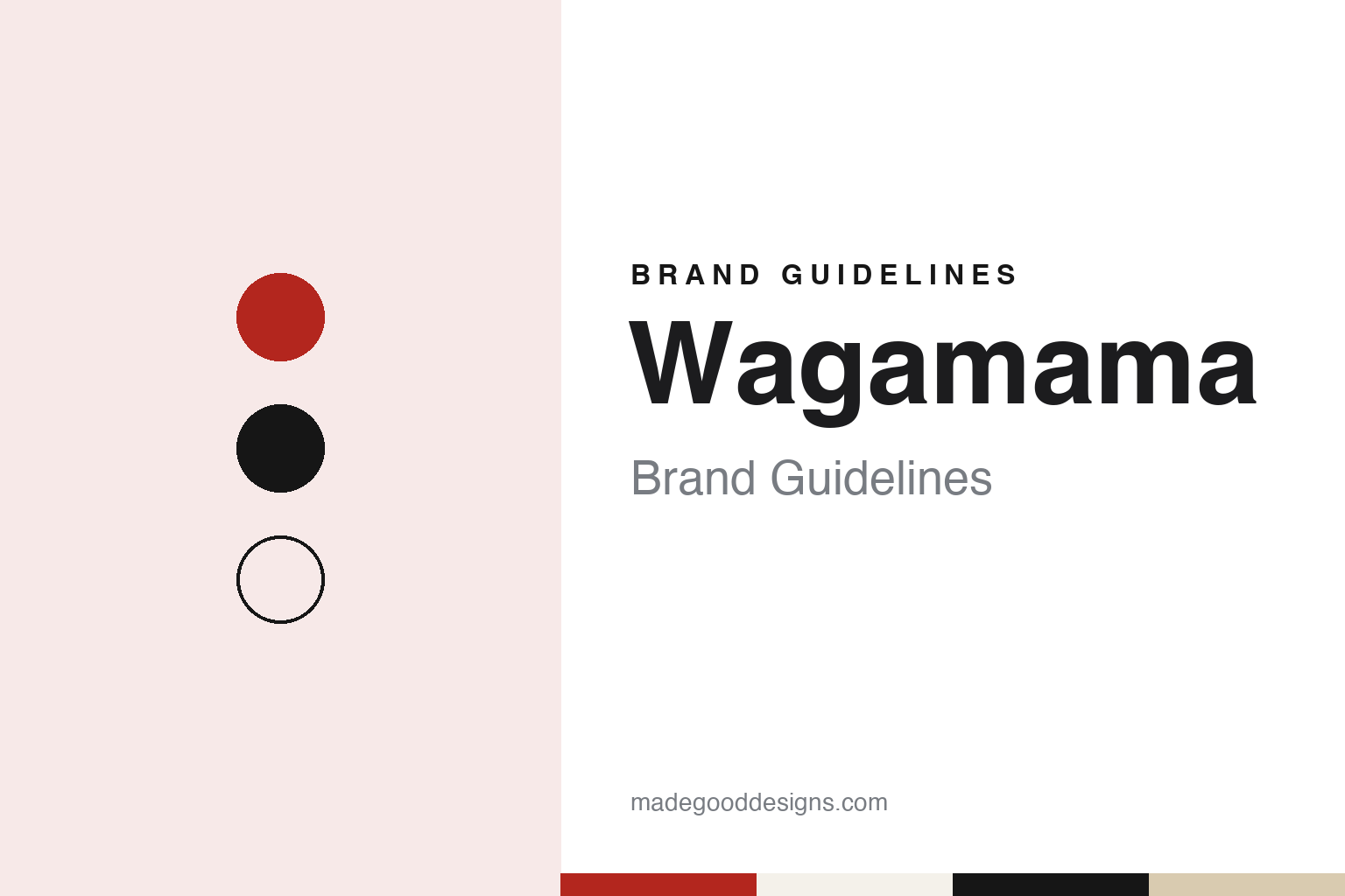
Wagamama Brand Guidelines
A 1992 Bloomsbury noodle bar built on shared benches and bowls.
Aa
Two constants: a red, black and rice-white palette and a rounded lowercase sans register. Abstract homage — not a Wagamama product or mark; no dish, logo or wordmark is reproduced.
Bloomsbury, 1992
A noodle bar with shared benches.
Wagamama opened its first restaurant in Bloomsbury, London, in 1992. English Wikipedia says the company behind it was incorporated in April 1991 under a different name, China Diner Limited, and names the founder as Alan Yau, who went on to create the Chinese restaurants Hakkasan and Yauatcha and the Thai chain Busaba Eathai. The restaurant guide Harden’s, writing in November 2018, also dates the founding to 1992 and credits it to Yau.
Wagamama’s own account of the start is a travel story. The company says Yau had journeyed around Japan and was taken with the ramen bars of Tokyo: quick service, food prepared by hand and brought out as soon as it was ready, and customers from every walk of life sitting shoulder to shoulder on communal benches. It says that in 1992 he brought the same format to Bloomsbury, with open kitchens, food cooked to order and meals served in bowls. That is the company’s version of its origin; the dates and the founder are confirmed independently, the motive is its own telling.
The name is a Japanese word. English Wikipedia translates “wagamama” as “self-indulgent,” “wilful,” “fussy” or “picky,” and notes that the company describes the way it works in terms of kaizen, the Japanese term for continuous improvement. The company writes it in lower case.
Harden’s gave the chain a place in British restaurant history. In its November 2018 report, the guide said the early Wagamama was “a totally novel venture,” credited it with bringing the word “ramen” into the British food vocabulary and with popularising communal, canteen-style dining in the UK, and said it offered Japanese and pan-Asian food at a price that had previously been hard to find outside specialist restaurants. The original Bloomsbury site, on Streatham Street, closed on 19 June 2016, according to English Wikipedia; by then the chain had spread far beyond that first room.
Colour
Benches, bowls and an open kitchen.
The design of a Wagamama is built around how people eat there. The company describes three things that have stayed constant since 1992: long communal benches where strangers sit side by side, open kitchens where the cooking happens in view, and food served in bowls as each dish is ready rather than in courses. Harden’s used the same vocabulary in 2018, calling the format communal and canteen-style. For a design system, those three ideas — shared seating, visible work and a single vessel — do more to define the brand than any one colour.
The menu follows the same logic. English Wikipedia lists dishes including bao, curries, donburi, teppanyaki noodles, ramen and pho, a range the company describes as Asian-inspired. In 2021, English Wikipedia says, Wagamama committed to a menu on which half the dishes would be vegan. The chain has also published three cookbooks, which English Wikipedia describes as a way of extending the brand beyond the restaurants.
The written voice is unusually consistent. Wagamama’s website sets almost everything in lower case: headings, the brand name and even the founder’s name appear without capitals, and the copy is short and conversational, with lines such as “life is like a noodle.” The wordmark is set in lower case too. A lowercase register is a simple device, but carried across signs, menus and pages it gives a chain of well over a hundred restaurants a recognisably informal tone of voice.
Colour is harder to pin down. No official colour specification is published, and nothing here is copied from the company’s materials. The palette in this guide is our own reading of the noodle-bar idea: a strong chilli red, a near-black for benches and type, a warm rice white and a pale bamboo tone, with a rounded sans as the type stand-in.
For designers, the useful lesson is how much of the identity lives in the room rather than on the logo. A shared bench, a pass where the kitchen can be seen and a menu written as plainly as a conversation all carry the brand, even where the wordmark is small.
Typography
The category.
Britain’s fast-casual and restaurant-group chains sit between the quick-service counter and the traditional sit-down restaurant. Many of them began as a single London room and grew into groups of dozens or hundreds of sites, and their identities are built as much from the room, the menu and the tone of voice as from a logo. Wagamama’s website, for example, describes its format through communal benches, open kitchens and food served in bowls as soon as it is ready.
The format often comes from somewhere else. Some chains borrow a setting from abroad — a Tokyo ramen bar, a Bombay Irani café, a street-food stall — and rebuild it for British high streets, shopping centres and railway stations. The restaurant guide Harden’s, writing in 2018, credited one such chain with popularising communal, canteen-style dining in Britain. Others are built around a single dish, such as a burger, a bowl of noodles or a plate of sushi, and keep the menu short enough to repeat across many sites.
Naming is usually plain and descriptive. Dishes are listed by what they are, sometimes in the language of the food’s home country, and restaurants are named after their street or district. Some groups give each site its own story or decorative theme; others keep every branch close to a single template so that a guest knows what to expect anywhere in the estate.
Ownership is part of the story. Founders often appear on the companies’ own pages, while trade titles such as Restaurant Online record the private-equity owners, listed groups, takeovers and restructurings that follow. This guide sets out what can be checked about each brand — who founded it, who owns it, and where it trades — and marks clearly what rests only on the company’s own word.
Aa
A rounded lowercase sans — an informal register. (Specimen set in Nunito, a sans STAND-IN; NOT the Wagamama logo or wordmark.)
wagamama
Private equity, a listed group and Apollo.
Wagamama has changed hands several times. English Wikipedia says that in June 2005 its owner, Graphite Capital, sold a majority stake to Lion Capital, and that in April 2011 the chain was sold to Duke Street Capital. In 2018 the listed Restaurant Group, then the owner of Frankie & Benny’s and Chiquito, bought Wagamama from Duke Street; Harden’s reported on 1 November 2018 that the chain had around 133 UK branches and about 200 sites in all, and that some of the group’s other restaurants might be converted into Wagamamas.
The Restaurant Group was itself taken private five years later. Restaurant Online reported on 12 October 2023 that the group, which it described as the Wagamama owner, had agreed to be bought by funds managed by the US private-equity firm Apollo, a month after announcing the sale of its leisure division to the Big Table Group. Verdict Food Service reported on 22 December 2023 that the deal had completed: a scheme of arrangement was sanctioned by the Court of Session in Edinburgh, and the shares were cancelled from trading on 22 December 2023. In September 2024 Restaurant Online reported that the leisure sale had taken 75 sites, mainly Frankie & Benny’s and Chiquito, out of the group, that Wagamama had 161 UK restaurants and eight in the US, and that the group had taken full control of the brand’s US business.
Outside Britain, much of the chain is franchised. English Wikipedia says that as of 2025 Wagamama had franchised restaurants in 22 countries across Europe and the Middle East, alongside the company-owned US sites, and that it has left some markets: Australia, where it traded from 2002 to 2014, New Zealand, until 2019, and Belgium, from 2005 to 2024.
For a design guide, Wagamama shows how a restaurant format — shared benches, an open kitchen and food in bowls — can carry a brand through more than three decades and several owners. Compare itsu, another London chain built on Asian-inspired food, and YO! Sushi, which turned a conveyor belt into its signature. For this guide we use chilli red, near-black and rice white with a rounded sans, an unofficial interpretation; no product or logo is reproduced.
Explore & save
Keep Wagamama’s identity on hand — save it to a board in the Made Good inspiration library.
Wagamama identity set
Pin the Wagamama red, black and rice-white palette and the rounded lowercase sans register to your own board.