Berry Bros. & Rudd Brand Guidelines
A St James’s Street shop of 1698, read through its own labels.
Aa
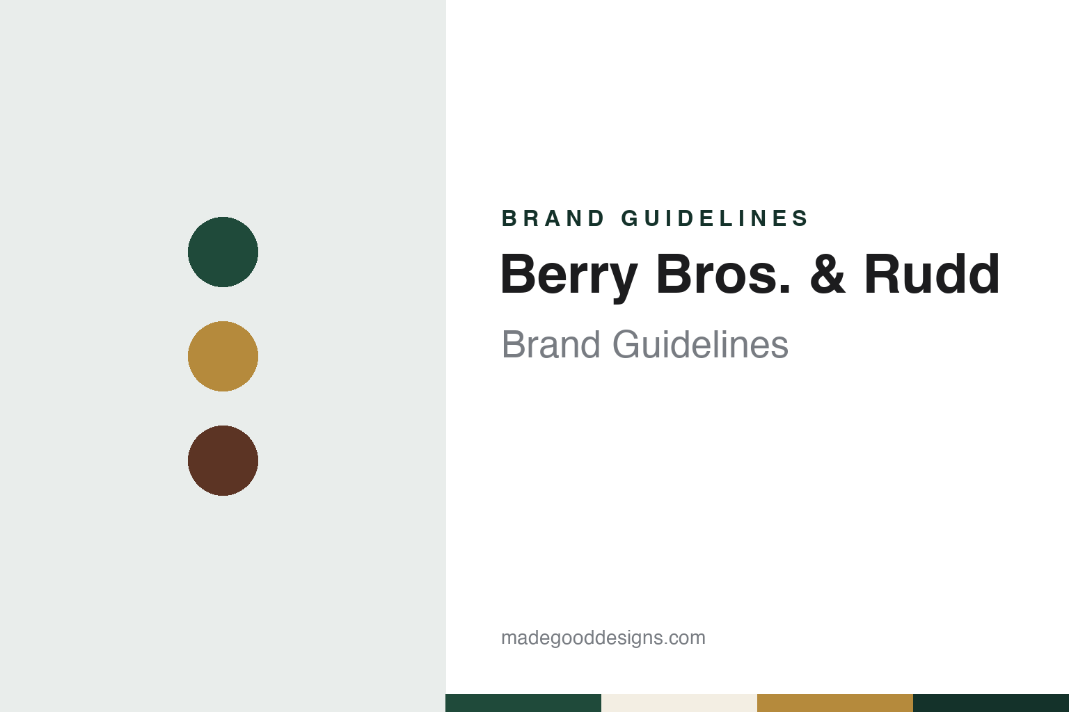
Two constants: a green, gold and mahogany palette and an old-style serif register. Abstract homage — not a Berry Bros. & Rudd product or mark; no label, logo or shop front is reproduced.
No. 3 St James’s Street
A grocer’s shop that turned to wine.
Berry Bros. & Rudd traces itself to 1698, when a shop opened at No. 3 St James’s Street in London. English Wikipedia names the founder as the Widow Bourne and says the business began by selling coffee, then added cocoa, tea, snuff, spices and other imported goods, becoming a fashionable West End grocer; it turned to wine only in the late eighteenth century. The building, which English Wikipedia describes as Grade II* listed, is still the company’s headquarters.
Its position near St James’s Palace shaped its customer list. English Wikipedia says the firm has supplied wine to the British royal family since the reign of George III, received its first royal warrant from Edward VII in 1903, and was granted warrants by Elizabeth II in 1952 and by Charles, then Prince of Wales, in 1998. Also in 1903 the company formulated a ginger liqueur for Edward VII, still sold as The King’s Ginger.
Spirits became a second line of business. In 1923 Berry Bros. & Rudd launched Cutty Sark Scotch whisky, English Wikipedia says; the brand later belonged to Robertson and Baxter while Berry Bros. & Rudd kept marketing it, and in 2010 it was sold to The Edrington Group. Under that deal Berry Bros. & Rudd took The Glenrothes single malt, which went back to Edrington in 2017. Behind the London shop sits a working operation: in 1967 the company moved its bottling and warehousing to purpose-built premises in Basingstoke, Hampshire, and in spring 2014 it reopened a warehouse shop there, on the site of the former bottling hall, selling bin-ends and reduced wines and spirits alongside fine wine.
Colour
From No. 3 to Pall Mall.
For more than three centuries the retail business ran from No. 3. In mid-2017 the main shop moved around the corner to a purpose-built space at 63 Pall Mall, which English Wikipedia says is joined to the original premises by a walk-through hall and was the company’s first new London shop since 1698. The fit-out was designed by Mowat & Company, and the external and internal signage repeated the original identity, with lettering by the signwriter Nick Garrett of NGS Signwriting and by the design studio Pentagram. In March 2024, Harpers reported, the merchant opened its first dedicated Spirits Shop at No. 1 St James’s, with a range of about 1,000 products.
The company also trades wine that never reaches a shelf. Its online exchange BBX, which Harpers dates to 2010, lets customers sell wines held in the company’s bonded storage to other buyers. In September 2024 Harpers reported the launch of Berry Bros. & Rudd Auctions, with the first sale to be held online that autumn as an extra route for larger collections; the company told the magazine that an in-house team inspects the provenance of every bottle before it goes into storage. Alongside en primeur offers from regions such as Bordeaux, Burgundy, the Rhône and Italy, it sells wines and spirits under its own label, Own Selection, and runs wine storage, tastings, events and courses, according to English Wikipedia.
English Wikipedia describes the business as family-run, with offices in Battersea in London and in Japan, Hong Kong and Singapore. It has also bought into producers. In 2023, English Wikipedia says, it took a minority stake in the Cotswolds Distillery and a half share of Hambledon Vineyard in Hampshire; The Grocer reported in August 2025 that Hambledon Wine Estate is jointly owned by Berry Bros. & Rudd and Symington Family Estates, the Portuguese family wine business.
Typography
Merchants and monopolies.
Wine merchants and alcohol retailers sell a product that shoppers cannot always taste before they pay, so their identities lean on words, place and guidance more than on packaging of their own. A shop name, a fascia and a few lines of handwriting on a card next to a bottle carry much of the work. For a designer, the useful material is what these companies show in public: their shop fronts, shelf cards, tasting areas, catalogues and the corporate pages that explain who founded and who owns them.
The physical shop is the first layer. Some chains began in warehouse-style units where wine was stacked in cases, and later refits moved towards shelving and tasting areas, as Decanter reported of one British chain in 2019. Shelf talkers, the small cards that describe a wine’s style and origin, sit beside the bottles and can be written in a personal, conversational voice. Tasting counters and by-the-glass machines turn part of the shop into a place to try before buying.
Mail-order and online merchants work through a different set of objects: printed catalogues, mixed cases, club mailings and order pages. Their own-label wines, sold under invented names rather than the merchant’s own, are part of the range and are presented much like any producer’s bottle. A founder’s story, such as a first trip to a vineyard or a single van, can be retold in these materials.
Corporate pages fill in the rest: founding dates, changes of ownership, parent groups and, for state retailers, the legal basis on which they operate. This guide uses dated, independent sources for those facts and treats the company’s own descriptions as its own words. The palette and type on each page are an unofficial interpretation chosen for the guide, not a copy of any retailer’s signage, labels or logo.
Aa
An old-style serif — the register of a signwritten fascia. (Specimen set in Libre Caslon Text, a serif STAND-IN; NOT the Berry Bros. & Rudd logotype.)
Berry Bros. & Rudd
An identity drawn from its own archive.
The leadership has changed several times in recent years. English Wikipedia says Emma Fox became chief executive in 2020, after a period in which Lizzy Rudd, who chairs the board, served as interim executive chair. In August 2025 The Grocer reported that Rob Symington, until then co-chief executive of Symington Family Estates, would join as UK managing director, reporting to Fox. English Wikipedia says it was announced in May 2026 that Fox would step down as chief executive, with Symington and Emily Rae appointed co-chief executives.
The visual identity comes from the building. Pentagram, whose London partner Harry Pearce led the project, says on its project page that the previous identity dated from the 1980s and made no reference to the company’s history, so the studio photographed labels, walls and old publications at No. 3 and in the cellars, archives and warehouses. Pentagram says the logotype was drawn from several of those historic pieces of type and keeps quirks such as the comma after “No. 3”. It says the corporate green was taken from the shop fascia and a warm gold from the fascia lettering, with cool greys from the walls of the Basingstoke warehouse and the polished mahogany of the boardroom table at No. 3 completing the palette. The photography is reportage, showing the company’s own rooms and its growers, and the studio has since designed labels for the Own Selection, Fortified Wines and Exceptional Casks ranges.
For a design guide, Berry Bros. & Rudd shows how a shop front, a signwriter’s lettering and a cellar of old labels can supply an identity without inventing one. Compare it with two other British wine merchants, Majestic and Laithwaites. For this guide we use a deep green, a warm gold, a mahogany brown and a pale label paper with a serif, an unofficial interpretation; no product or logo is reproduced.
Explore & save
Keep Berry Bros. & Rudd’s identity on hand — save it to a board in the Made Good inspiration library.
Berry Bros. & Rudd identity set
Pin the Berry Bros. & Rudd green, gold and mahogany palette and the old-style serif register to your own board.