Kia Brand Guidelines
The logo so stylish nobody could read it — and how ‘KN’ became one of the most-searched cars that never existed.
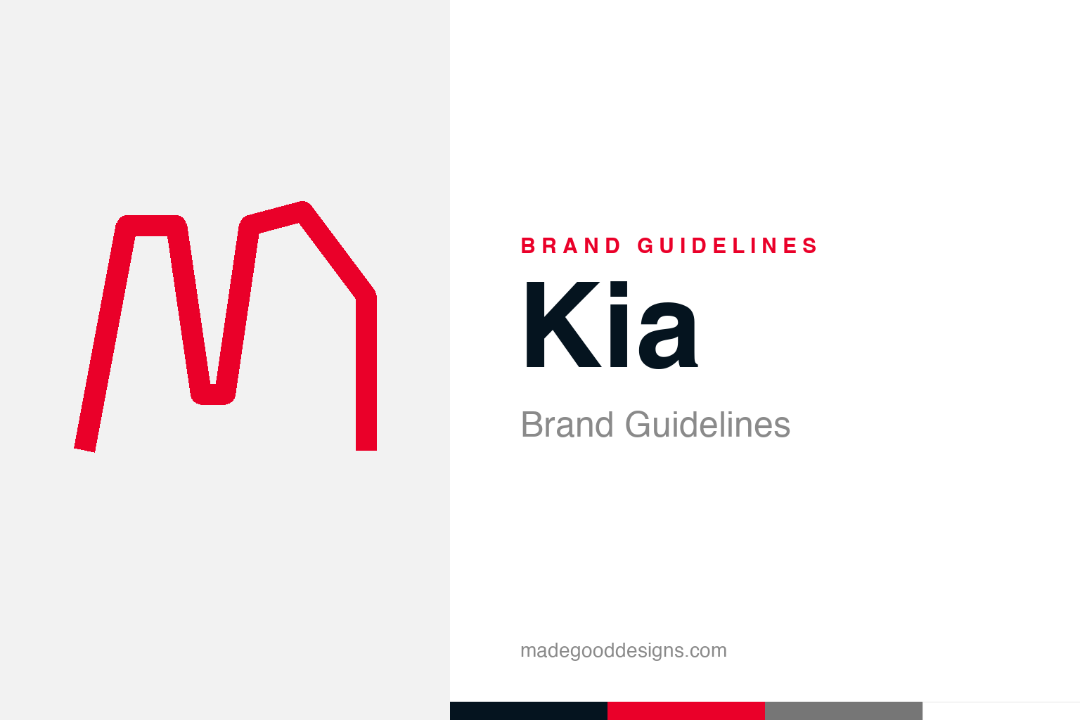
An abstract single continuous line — the one-stroke idea, not the logo. Deliberately not the Kia mark.
One unbroken line
Kia’s 2021 logo redraws the name as a single rhythmic stroke.
In January 2021, Kia replaced its old red oval with a bold new wordmark: the letters K-I-A rendered as a single, continuous, unbroken line, full of rhythm and motion, under the slogan “Movement that inspires.” It was a deliberate signal of reinvention as Kia pushed upmarket and into electric vehicles — a sharper, more premium, more design-led identity. On its own terms the mark is genuinely striking: energetic, modern, unmistakably a fresh start. Our homage keeps the “one continuous line” idea as an abstract stroke that doesn’t spell anything.
The logo people read as ‘KN’
Kia’s redesign produced the internet’s favourite accidental car brand.
There was a catch. The continuous-line styling merges the letters so tightly that a great many people simply can’t read it as “KIA” — they see “KN.” The result became a genuine internet phenomenon: “KN car” reportedly drew on the order of 30,000 searches a month from people trying to identify a brand that doesn’t exist. (That figure comes from a widely-repeated survey estimate, so it’s best cited as “reportedly.”) It’s a fascinating, almost paradoxical outcome: a legibility “failure” that generated enormous free awareness. Depending on how you look at it, the ambiguous logo is either a cautionary tale about readability or a sly piece of engagement marketing — and the honest answer is probably a bit of both.
A flaw, or a feature?
The KN confusion is the most interesting design debate of the rebrand.
Designers are genuinely split on the KN effect. The purist view is clear: a logo’s first job is legibility, and a wordmark a quarter of your audience misreads has failed at the one thing it must do. The contrarian view is just as sharp: the confusion drove tens of thousands of people to actively look Kia up, earning attention and search traffic no ad budget could easily buy — and once you learn it says “KIA,” you never un-see it, which fixes the name in memory. There’s no settled verdict, which is exactly why it’s such a good teaching case. It forces the question: is a logo a label that must be instantly readable, or a symbol that can be a little cryptic if it’s distinctive and memorable enough?
From bicycle parts to a global brand
Kia’s confidence is built on an underrated 80-year story.
The rebrand makes more sense against Kia’s history. The company was founded in 1944 as Kyungsung Precision Industry, originally making bicycle parts before moving into motorcycles, trucks and eventually cars; the name roughly means “to arise or come up from Asia.” For decades Kia was seen as a budget brand, so the 2021 identity is really an act of repositioning — a company that had quietly become a serious maker of well-designed cars (and a design-award magnet under Peter Schreyer) announcing that its image should finally match its ambition.
Read that way, even the KN controversy fits the strategy. A safe, perfectly legible logo would have signalled “same old Kia”; a bold, slightly cryptic, design-forward mark signals a brand that now takes design seriously enough to take a risk. Whether the gamble was wise is still debated, but the intent is coherent: the logo is a statement that Kia has changed. Sometimes a mark’s job isn’t just to be read — it’s to announce that everything is different now, and to make you look twice while it does.
Seen in the round, Kia’s identity rewards the same discipline every strong brand demands: decide what you stand for, express it in the simplest, most distinctive form you can, and then apply that form with almost stubborn consistency until its meaning compounds. The temptation is always to add, to chase trends, to complicate; the harder and more valuable choice is to protect a clear idea over years. That patience is what turns a mark from mere decoration into a genuine asset — recognised, trusted, and impossible to confuse with anyone else.
Type & the wordmark
The logo is the type — a bespoke continuous letterform.
The Kia mark is itself a piece of custom lettering — the continuous line is the wordmark — supported by a clean modern sans (KiaSignature) across its communications. The specimen below stands in with a neutral sans.
Movement that inspires
Rhythmic, connected, modern — a wordmark drawn as one energetic gesture. (Specimen set in Archivo, a neutral stand-in.)
Black & Live Red
Midnight black, with one point of red. Click a swatch to copy the hex.
Kia’s system pairs Midnight Black #05141F and Polar White with a single “Live Red” #EA0029 point colour. Lead with black and Live Red below.
Explore & save
Keep the one-line idea on hand — save the homage and the palette to a board.
Kia identity set
Pin the continuous-line homage, Kia’s black-and-Live-Red palette and the KN lesson to your own board.


